
Components Overview
Components provide a powerful way to create complex applications quickly. You can download a rich assortment of components from Kony Marketplace, or create your own reusable components, and then drag and drop the components into your application to create sophisticated, full-featured applications without writing all of the code. From V8 SP4 Fixpack 20 onwards, you can also leverage several Data panel features for components.
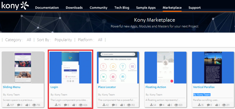
For example, suppose you want to create a digital application that lets users log in to their account and display an account overview. You can build a log-in screen by downloading a log-in component from Kony Marketplace, and then dragging and dropping it onto a form.
First, navigate to the Kony Marketplace site, either by selecting Browse from the Marketplace menu in Kony Visualizer or opening the site in your web browser. Then download the Login component.
You can easily import the component into your Kony Visualizer library, and then drag and drop it onto a form.
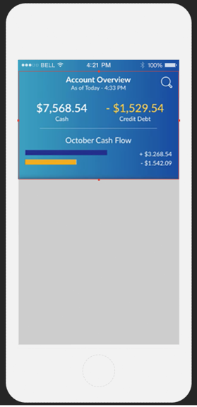
You could then create an account overview component that can be used in multiple applications, and drag and drop that component onto a form to display an account overview in your application. Your library can contain multiple collections of components that can be used and reused, serving as building blocks for your applications.
If you are familiar with earlier versions of Kony Visualizer, you may recognize components as an extension of masters. Masters helped streamline digital application developing by letting you define multiple user interface elements and action sequences as a single entity. Components extend that ability by providing self-contained and reusable entities that include:
- Code modules
- Kony Fabric services
- A component contract to simplify usage and enable rapid digital application development
Because components are self-contained entities, you can:
- Reuse a component within a project, or across projects in your workspace.
- Download components created by the Marketplace Assets team and other developers from Kony Marketplace, and use them in your projects.
- Share your components with a wider audience via Kony Marketplace or a local share.
Components are also fully customizable. You can choose which properties, events, and methods of a component are exposed to users, or create your own custom properties, events and methods.
For example, you can specify which properties of the Login component are exposed to users by enabling them in the Manage Properties dialog box:
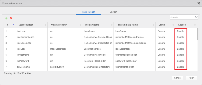
These are called pass through properties.
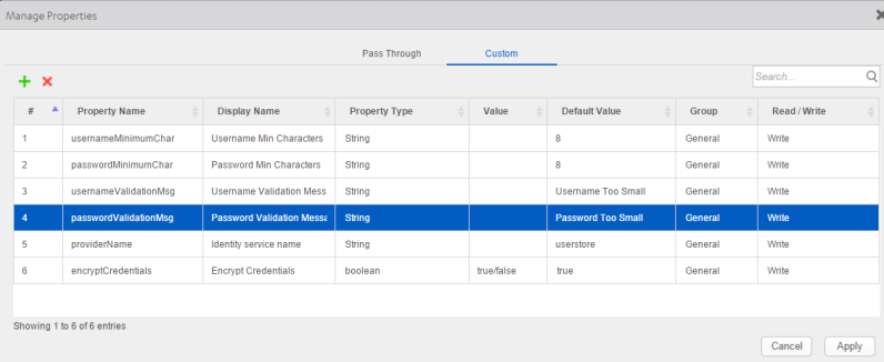
The Login component also includes custom properties. You can specify custom properties on the Custom tab of the Manage Properties dialog box, and then define their behavior in the component's controller module, loginController.js:
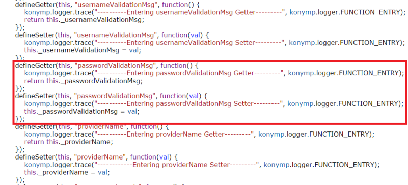
Here is the code that defines the passwordValidationMsg property:
There are two types of Kony Visualizer components:
- Components with a contract.
- Components without a contract.
The contract is a JSON file that specifies the component's exposed properties, events, and methods. You specify those properties, events, and methods within the Visualizer interface using the Manage Properties, Manage Events, and Manage Methods dialog boxes. You can then define the behavior of custom properties, events, and methods by adding code to the component's controller module.
You can also create a component without contract. A component without contract is similar to a master in earlier versions of Kony Visualizer, except that it includes a controller module. You can publish either a component with contract or a component without contract to Kony Marketplace, but not a master. However, you can convert a master into either a component with contract or a component without component.
For more information about using components, refer Using Components. For details about creating a component, refer Creating a Component.
| Rev | Author | Edits |
| 8.0 | SHS | SHS |
| Copyright © 2013 Kony, Inc. All rights reserved. |