Welcome to Kony Visualization Cloud Video Series
| Tutorial 2: Working with Advanced Widgets |
|
About this Video:
This tutorial introduces the commonly used Segment Widget so that you can quickly and easily create an application form that has multiple rows of data. In this example, you will build an Orders screen that uses simple UI widgets to achieve a tabbed pane interface.
Resources
Sample Application
Requirements
Windows: Windows 7 or Windows 8
Mac: OS X 10.8 or OS X 10.9
Visualizer: 1.0.2 (or later)
Steps for importing a sample project
1.In the Kony Visualizer, from the top-menu, click Project > Import Project.
2. In the Open dialog box, navigate to the folder where you have saved the sample application zip file and double-click it.
Visualizer imports and opens the project.
Supported Platforms
This application is supported on Mac and Windows platforms.
|
|
|
|
Introduction
Welcome to the second tutorial in our series on Kony Visualizer, an easy to use and highly interactive designing tool that allows you to build UI/UX designs for mobile and tablet devices.
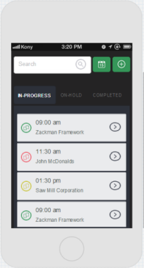
In this tutorial, you will build a “My Orders” page.
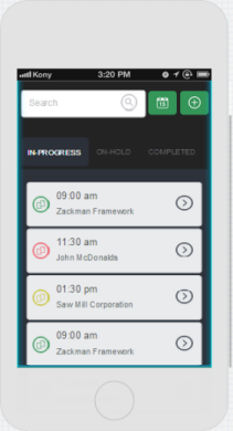
Here is the screenshot of the page you are about to create.
To create this page, you will perform the following steps:
- Creating a Project and Adding a Form
- Adding a Header
- Building a Search Panel
- Creating Tabs
- Arranging Segment Widgets
It is recommended that you complete the first tutorial to get a basic understanding of Visualizer before starting this tutorial.
Without any further delay, let’s start our adventurous journey into the world of Kony Visualizer!
Creating a Project and Adding a Form
As we have done in our first tutorial, this section involves two stages. They are:
- Creating a project
- Adding a form
Creating a Project
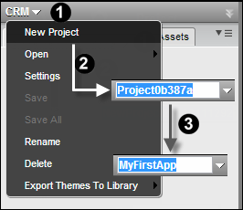
- Click the down arrow beside the project name to open its menu list.
- Click New Project. By default, a name is assigned to the project and is in edit mode.
- Give the project a meaningful name like MySecondApp.
Now you have a project to work with. Let us add a form.
Adding a Form
A project can contain multiple forms or pages. For this tutorial, add a mobile form.
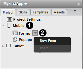
- From the available channels, expand Mobile folder to display its subitems in a tree view.
- Click the Forms down arrow, and then click New Form to add a form to the project.
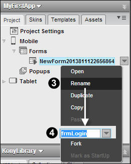
- Right-click the newly created form, and then click Rename.
- Rename the form by giving it a meaningful name like frmWorkOrders.
For our form, we do not require the Title Bar or the App Menu so let us hide them by following these steps.
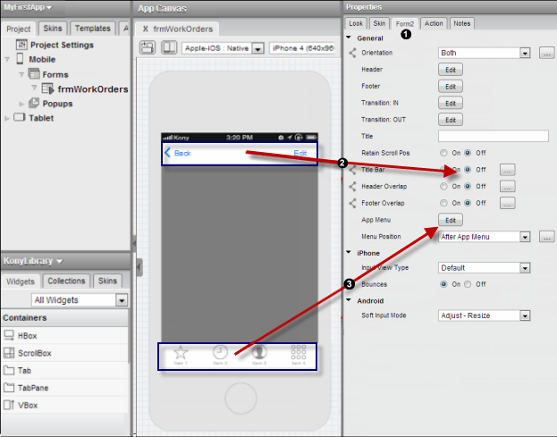
- Select your form, and from its properties pane select the Form2 tab.
- Find the option labeled Title Bar and select the Off button.
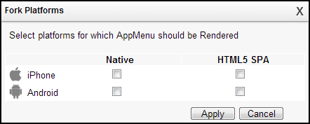
- Click the Edit button next to the App Menu to open the Fork Platforms dialog. Uncheck the platforms on which App Menu option is not required.
Now that we have the desired form, let’s give it a pretty gradient background.
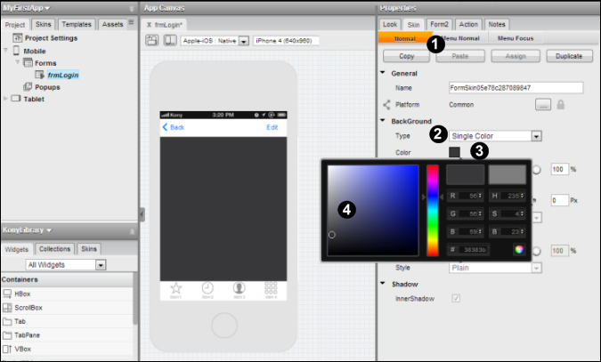
- Go to the form’s property pane and click the Skin tab.
- From the BackGround > Type drop-down list, select Single Color.
- Click the Color Picker icon.
- From the Color Picker dialog, select a desired color.
Adding a Header
The header section of this page contains the following widgets: a (Back) Button, a Label (My Orders), and one more Button (Date selector). To hold all these widgets together, they are placed inside an HBox container widget.
So the first widget to be dropped onto the form is a Button widget, correct? Actually NO, as mentioned in the previous sentence, we need an HBox container widget to hold the other widgets.
So the first widget dropped onto the form is an HBox. Follow the steps below to add an HBox and update its properties:
- From the Library Explorer pane, drag an HBox onto the form.
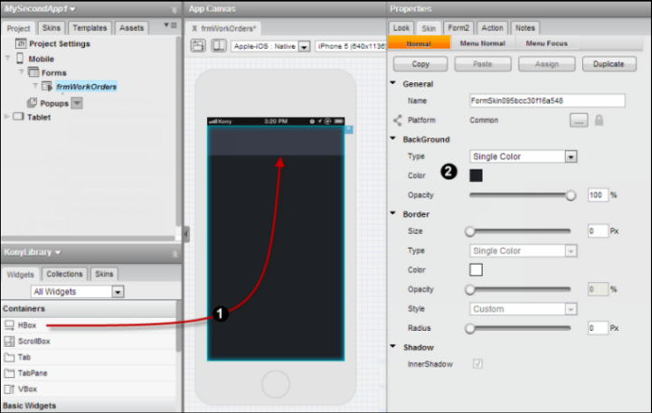
- From HBox Properties pane, click Skin tab and update its BackGround properties by selecting the following values:
- Type as Single Color
- Click the Color Picker icon to open the Color Picker dialog and select a desired color.
- Increase the Opacity to 100 percent.
-
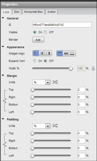
Click the Look tab, and adjust the margin and padding of the HBox widget.
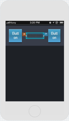
- Now its time to bring the child widgets into the picture. From the Library Explorer,
- Drag a Button widget, and place it inside the HBox widget.
- From the Project Explorer, click the HBox widget, and from the Library Explorer, drag a Label widget and place it to the right of the Button widget inside the HBox widget.
Repeat the previous step, but this time drag a Button widget, and place it to the right of the Label widget inside the HBox widget.
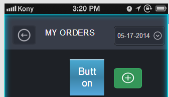
The current state of our design will look like the image shown below.
It is time we update the properties of the widgets added to the HBox.
-
Click the left Button widget and from its properties pane,
- In Skin tab > BackGround and update the following:
- Select Image as background Type.
- Click the Choose Image button to open the Background Image dialog.
- Select the iPhone platform.
- Click inside the corresponding Value field to open the Select Image dialog.
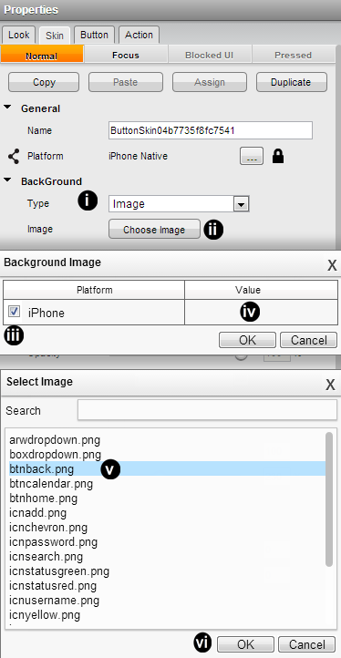
- From the list of available images, select a desired image.
- Click OK.
- From the Skin tab > Shadow properties, ensure that you provide values for Dist X, Dist Y and Blur as zero.
-
From the Properties pane, click the Look tab. Take the following steps:
-
Delete the value in the Text field.
-
Adjust Margin and Padding of the widget.
-
Decrease the Width % .
-
Now that we have completed updating the Button widget properties, it is time to updating the Label widget. From the Project Explorer, click the Label widget. In the Properties pane,
- Click Skin tab and update the following Font properties:
Click the Color Picker icon to the open the Color Picker dialog, and select a desired font color.
Adjust the font size.
Select a font type, by clicking Edit button next to the Font Family to open the Font Family dialog.
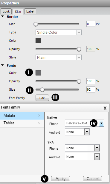
In the default screen (that is, Mobile > Native), from the iPhone drop-down list select a desired font.
- Click Apply.
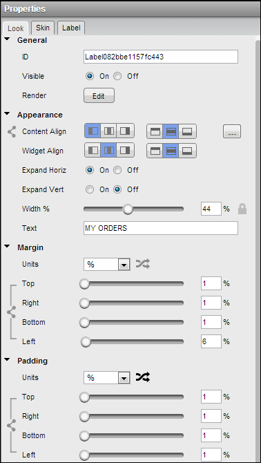
- From the Properties pane, click the Look tab. Then take the following steps:
Rename the text in the Text field.
Adjust Margin and Padding of the widget.
- Decrease the Width %.
The Look tab of the Label widget is displayed below for reference.
-
Now we will update the right Button widget properties by following similar steps used to update the left Button widget. Click right Button widget from the Project Explorer, then follow these steps:
- In the Properties pane, from Skin tab > BackGround properties:
Select Image as background Type.
Click the Choose Image button to open the Background Image dialog.
Check the iPhone platform, and click inside the corresponding Value field to open the Select Image dialog. From the list of available images, select a desired image and click OK.
- In the Skin tab > Font properties, update the following:
Adjust font Opacity.
- Adjust font Size.
Select a font type by clicking the Edit button next to the Font Family field to open the Font Family dialog. In the default screen (that is, Mobile > Native), from the iPhone drop-down list select a desired font, and then click Apply.
- In the Skin tab > Shadow properties, ensure that you provide values for Dist X, Dist Y and Blur as zero.
- From the properties pane, click the Look tab. Then take the following steps:
- Provide a date in the Text field (for example, 05-17-2013).
- Adjust Margin and Padding of the widget.
- Decrease the Width %.
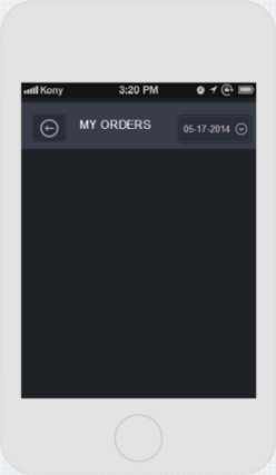
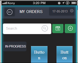
This completes our Header section for the page.
Our page will look like the image below.
Building a Search Panel
Now it is time to build the Search Panel!
Note that we will use four levels of nested widgets.
We are certain that you would want to know how to create multilevel designs in Visualizer. Let us begin:
- From the Library Explorer, drag an HBox and place it below the Header in the form.
- Again from Library Explorer, drag a VBox and place it inside the HBox widget.
- In the Project Explorer, click the HBox widget (parent of VBox widget). From the Library Explorer, drag a Button widget and place it to the right of VBox widget.
- Repeat the above step (that is, step 3) to add another Button widget.
Instead of updating the widgets starting from the left (that is, starting from the VBox), update the widgets from the right.
Updating the Widget on the Far Right
- Click the Button Widget on the far right in the Project Explorer.
- From its Properties pane:
- In Skin tab, update the following BackGround properties:
- Select Image as background Type.
- Click the Choose Image button to open the Background Image dialog.
- Select the iPhone platform and click inside the corresponding Value field to open the Select Image dialog. From the list of available images, select a desired image and click OK.
- Update Skin tab > Shadow properties. Ensure that you provide values for Dist X, Dist Y and Blur as zero.
- From the properties pane, click the Look tab. Then take the following steps:
- Delete the value in the Text field.
- Adjust Margin and Padding of the widget.
- Adjust the Width %.
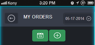
In the App Canvas, the Search Panel will appear as shown below. Do not worry about the alignment of the widgets. Before we complete this section (Building a Search Panel), they will be aligned properly.
Updating the Central Widget
- Click the central widget (that is, Button widget) in the Project Explorer.
- From its Properties pane,
- Click the Skin tab and update the following BackGround properties:
- Select Image as background Type.
- Click the Choose Image button to open the Background Image dialog.
- Select the iPhone platform and click inside the corresponding Value field to open the Select Image dialog. From the list of available images, select a desired image and click OK.
- In the Skin tab > Shadow properties, ensure that you provide values for Dist X, Dist Y and Blur as zero.
- From the properties pane, click the Look tab. Then take the following steps:
- Delete the value in the Text field.
- Adjust Margin and Padding of the widget.
- Adjust the Width %.
In the App Canvas, the Search Panel will appear would look as shown below. Do not worry about the alignment of the widgets. Before we complete this section (Building a Search Panel), they will be aligned properly.
Updating the Left Widget
- Click the left widget (that is, VBox widget) in the Project Explorer.
- From the Library Explorer, drag an HBox widget, and place it inside the VBox widget.
- From the HBox Properties pane:
- Click the Skin tab and update the following BackGround properties:
- Select Single Color as background Type.
- Click the Color Picker icon and from the Color Picker dialog, select a desired color.
- Increase the Opacity to 100 percent.
- From the Skin tab >Border properties, update the following values:
- Provide a small value ( for example, 1 Px) for the border Size.
- Click the Color Picker icon, and from the Color Picker dialog, select a desired color.
- From the Style drop-down list, select Custom.
- Adjust the Radius.
- From the properties pane, click the Look tab and adjust the Margins.
- While the HBox is selected, drag a TextBox Widget from the Library Explorer, and place it inside the HBox Widget. Add an Image widget to the HBox, and place it to the right of TextBox widget.
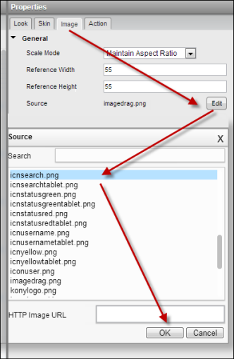
- Update the Image widget by following these steps:
- From the Image widget's Properties pane, click the Image tab and then click the Source to open the Source dialog. Select a desired image and click OK.
- Provide desired Reference Width and Reference Height to this image.
- Update the TextBox widget by following these steps:
- From the TextBox widget properties pane, click the Skin tab. Under Font properties, adjust the Opacity and the Size of font.
- From the TextBox widget's Properties pane, click the Look tab. Take the following steps:
- Replace the value in the Text Field.
- Provide a desired left margin.
- Provide desired padding for the widget.
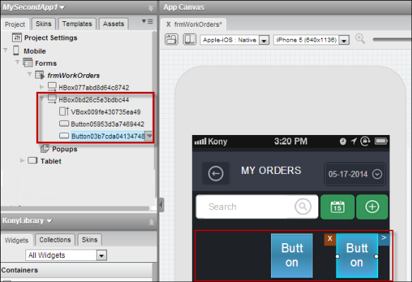
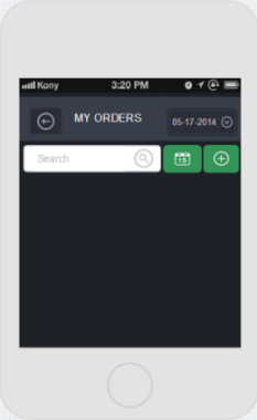
Our design is currently at the following stage:
Creating Tabs
For achieving the tablike look, we need three levels of nested widgets. So without further delay, we will proceed to explain the steps involved!
- From the Library Explorer, drag an HBox and place it below the Search Panel. From the HBox Properties > Look tab, provide a small Top margin so that there is enough space below the Search Panel.
- Within this HBox, insert a VBox widget and two Button widgets.
- Now we will modify the VBox properties by following these steps:
- From the VBox properties > Skin:
- Update the BackGround color using the Single Color as Type. Ensure the Opacity is set to 100 percent.
- Update the Border by giving a small value (for example, 1 Px) as the Size of border, Single Color as Type, with 100 percent Opacity, and a Custom Radius.
- From the VBox Properties > Look, provide a small Left margin.
- Within the VBox widget, place an HBox widget.
- Finally, within this HBox, place a Label widget. Update the Label widget properties by following below steps.
- In Label widget properties > Skin tab, update the Font properties by adjusting the Color, Opacity and Size. It is good to update the font family as well.
- In the Label widget Properties > Look tab, update the value in the Text field and also update Margin and Padding.
The Tab section design looks as shown below. Do not worry about the alignment of the widgets. Before we complete this section, they will be aligned properly.
- Now, from the Project Explorer, click the second widget within the HBox. This corresponds to a Button widget. Update the Button widget's properties by following these steps:
- From the Button widget's Properties, click Skin tab, and update the following BackGround properties:
- Select Single Color as Type and then modify the background color.
- Update the Font properties by changing the font Color, Opacity, Size, and Type.
- From the Button widget properties > Look tab, change the value in the Text field, and adjust the Margin and Padding of the widget.
- For the widget on the far right (Button widget) repeat the same process as described in the previous step that is step 6).
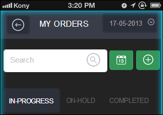
The Tab design in App Canvas will appear as shown below:
Arranging Segment Widgets
A Segment widget allows you to repeat a set of widgets numerous times and produces the same look and feel. Segments can be a bit tricky, and you should be careful using this widget.
Before we place a Segment widget in the form, we will add a couple of more widgets. Let us begin:
- From the Library Explorer, drag an HBox and place it below the newly created tabs. From the HBox Properties > Look tab, adjust the Left and Right Margins.
- Within this HBox, add a VBox widget.
- Next add a Segment Widget. From the Library Explorer, drag a Segment widget, and place it inside the VBox widget. Update the Segment widget properties as explained below.
- From the Segment widget Properties > Skin, using Single Color as the BackGround Type, modify the color.
- From the Segment widget Properties > Look, adjust the Margin and Padding of the widget.
- Add an HBox to the Segment widget, and update the HBox properties as explained below.
- From the HBox widget Properties > Skin, using Single Color as the BackGround Type, modify the color. Similarly, update the widget border using a small value (for example, 1 Px) for the border Size, and a custom Radius of 5 Px. Use the background color for borders as well.
- From the HBox widget Properties > Look, provide a small bottom Margin for the widget.
- To this HBox add the following widgets: Image, VBox and Button.
Our design will appear as shown below
- Update the Button properties by following these steps:
- In the Button widget Properties pane > Skin tab > BackGround, using Image as the Type, modify the Button widget background.
- Click the Button widget properties > Look tab. Modify the Margin and Padding of the widget.
- After updating the Button widget, lets look at the VBox widget. Add two Label widgets to VBox widget.
- Click the first Label widget and update its properties by following these steps:
- In the Label widget Properties pane > Skin tab, update the Font properties by changing the font color, opacity, size and type.
- In the Label widget Properties pane > Look tab, modify the Margin and Padding of the widget.
- Follow the above step for updating the second Label widget (that is placed inside the VBox widget).
Take a look at the progress of our design:
- Next modify the Segment Master Data. From the Project Explorer, click the Segment widget. In the App Canvas, the Segment widget is selected. Click the right arrow (>) and then select Action: Edit Master Data.
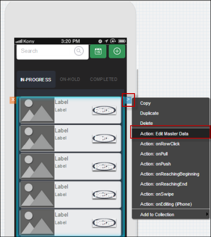
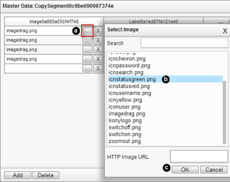
- The Master Date displays all the widgets added to it (except for Container Widgets) and allows you to modify the properties of these widgets through the following steps::
- For the Image widget, click the Ellipsis button (...) to open the Select Image dialog. Select an image and click OK. Repeat this step for all images in the same column.
- For the Label widget, overwrite the value directly in the respective Label text field. Repeat this step for all the Labels in the same column.
- For updating the second Label widget, follow the above step.
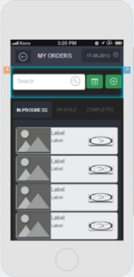
Segment Master Data Design after updating images and label will appear as below:
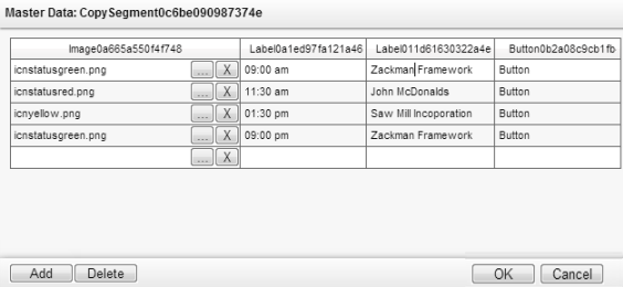
- For the Button widget, we have used an image as background (refer to step 6 in this section), and we do not want any text on these beautiful buttons. So delete the text from all the Button cells within the same column .
- Once you have updated the details of the widgets, click OK in the Master Data dialog to apply the changes.
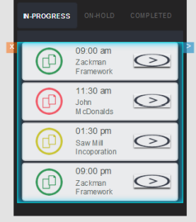
Take a look at our Segment section of the design.
- Adjust the Width % of the individual widgets.
Final Outcome
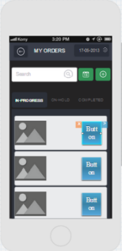
The resulting page will look something like this.
Congratulations! You have completed the tutorial on Segment widgets.
We hope you enjoyed the tutorial that familiarized you with an advanced widget such as Segment.
We can’t wait to see what you build next.
Congratulations on completing tutorial on Segment widget.