Welcome to Kony Visualization Cloud Video Series
| Tutorial 1: Getting Started with Visualizer |
|
About this Video:
Welcome to the Kony Visualization Cloud, this tutorial introduces the Visualizer tool by creating a sample login form using step by step instructions. After completing the tutorial, you will be able to work with of many of the basic widgets and be able to apply UI styling for margins and padding, borders, and shadows to deliver a rich native UI application.
Resources
Sample Application
Requirements
Windows: Windows 7 or Windows 8
Mac: OS X 10.8 or OS X 10.9
Visualizer: 1.0.2 (or later)
Steps for importing a sample project
1.In the Kony Visualizer, from the top-menu, click Project > Import Project.
2. In the Open dialog box, navigate to the folder where you have saved the sample application zip file and double-click it.
Visualizer imports and opens the project.
Supported Platforms
This application is supported on Mac and Windows platforms.
|
|
|
|
Introduction
Welcome to Kony Visualizer, a workspace designed to help you envision and create interactive application designs across various platforms and devices.
You will be designing within device form-factors in a fully What-You-See-Is-What-You-Get (WYSIWYG) environment. Choose from the full pallet of built-in designing elements to create rich, device-optimized designs.
In this tutorial we will be building a basic login page.
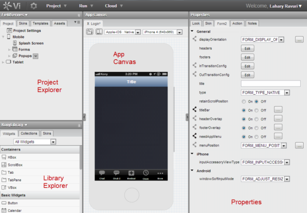
Before we begin, take a look at this product screenshot and get familiar with the various sections of the product as we will reference them throughout this tutorial.
Now, let’s get started by performing the following:
Creating a Project
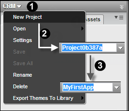
- Click the down arrow beside the project name to open its menu list.
- Click New Project . By default, a name is assigned to the project and is in edit mode.
- Give the project a meaningful name like MyFirstApp.
Now we have a project to work within. Let’s build out our login form.
Adding a Form
A project can contain multiple forms or pages. For this tutorial, we will create a mobile login form.
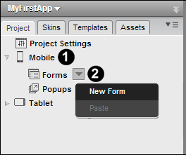
- From the available channels, expand Mobile folder to display its subitems in a tree view.
- Click the Forms down arrow, and then click New Form to add a form to the project.
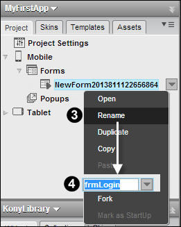
- Right-click the newly created form and then click Rename.
- Rename the form by giving a meaningful name like frmLogin.
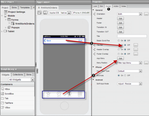
For our form, we do not require the Title Bar or the App Menu so let's hide them by following these steps.
-
Select your form, and from its properties tab select the Form2 tab.
-
Find the option labeled Title Bar and select the Off button.
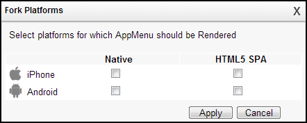
- Click the Edit button next App Menu property to open the Fork Platforms dialogue box. Uncheck the platforms on which App Menu option is not required.
Now that we have a form, let’s give it a pretty gradient background.
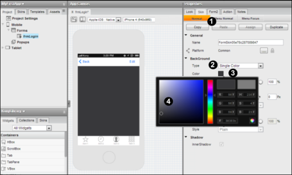
- Go to the form’s property tab and click the Skin tab.
- From the BackGround > Type drop-down list, select Single Color.
- Click the Color Picker icon.
- From the Color Picker window, select a desired color.
Adding an Image
Things are starting to shape up now. We have a canvas on which we can begin to paint our login form. The next thing we want to do is add a logo image. This could be any image, your app logo, or company logo. In this example, we are going to add the Kony logo.
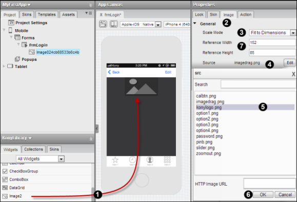
- On the left, in the Library Explorer pane, find the Image2 widget. Drag it onto your form. It will float to the top as it’s supposed to.
- On the properties page, click the Image tab.
- Select Fit to Dimensions as an option for the Scale Mode property.
- Click the Edit button next to the Source property.
- Select a proper graphic for your logo from the list of images.
- Click OK. You should now see the image on your forum.
- Provide desired reference width and height values for your logo.
Now that we have the image, lets make a few tweaks to it!
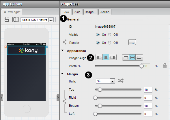
- From the Image properties, click the Look tab.
- Under the Appearance section, find the Widget Align property. In each of the two groups of buttons, select the middle button. This will center your image both vertically and horizontally within the widget.
- Finally, assign some reasonable margins for the image. Left and Right are fine at Zero, but go ahead and give both the Top and the Bottom margins of 10.
With each step we can see visually how things are shaping up. The Kony Visualizer allows you to not only see the design in real time but to experiment with different properties until you achieve the look that you want.
Adding an HBox
Now that we have the logo, let’s add our login and password fields.
This is where things get a little tricky if you aren’t used to designing software. Because devices and screens sizes change, our application needs to be dynamic enough to adapt to the majority of the cases. We do this by using containers called an HBox and a VBox that help you to align elements horizontally and vertically.
If you place an HBox on your form, any widgets you drop into it are all stacked horizontally; left to right by default. VBox is exactly the same except that items dropped in a VBox are stacked vertically from top to bottom. To achieve the look we want, many times we have to stack a VBox inside an HBox. That’s the case in this form. So let’s start with an HBox.
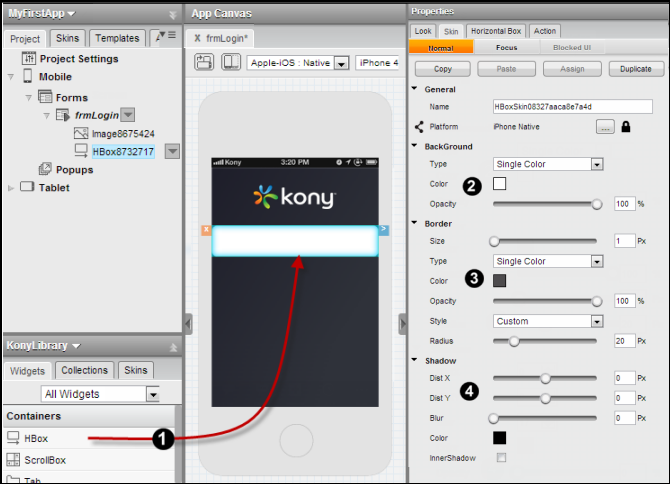
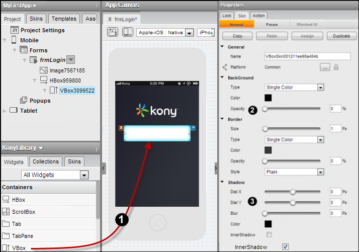
- From the Library Explorer pane, drag an HBox and drop it on your login form.
-
Now in the Properties pane, select the Skin tab and find the Background section. Select Single Color in the Type drop-down. Next, click on the color square to get the color picker and select a white background. Make sure Opacity stays at 100%. We don’t want the background bleeding through.
-
Further down the Skin tab, you will see a section for Border.
- Provide border size as 1.
- Select Single Color type and from the color picker icon, selecte a border color. Ensure you select the same color as that of form's background color.
- In the Style property drop-down, select Custom.
- Move the Radius slider and adjust it until the number to the right is 20.
- Next, down in the Shadow section, ensure that all the values are reduced to 0 px.
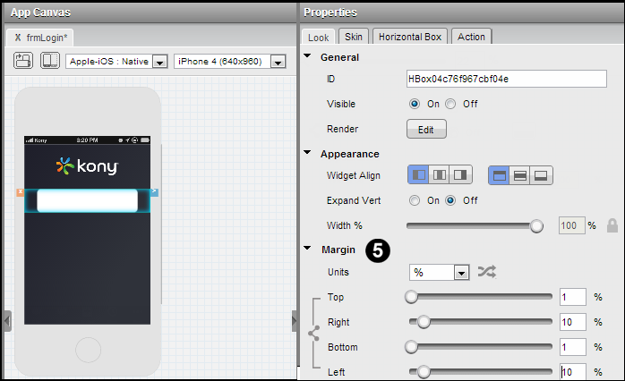
- Now, in the Properties pane, select the Look tab. Let’s give our HBox margins. Go ahead and select a margin for Top, Bottom, Left and Right. You can also enter the value of 10. for both Top and Bottom and enter a value of 1 for Left and Right enter a value of 10.
As we said earlier, at times it is necessary to stack VBox widgets inside of HBox widgets to get the effect we want.
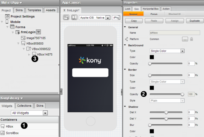
Adding a VBox
The next thing we need to do is drop a VBox into our HBox so that our fields get stacked vertically. In case you are curious, while an HBox can be dropped on a form by itself, a VBox cannot. It has to be inside of a container. So even if you want everything stacked vertically, you will have to start with an HBox.
- In the Library Explorer pane, find the VBox widget. Now drag it over and drop it on top of the HBox. This will place it inside the HBox. On the Project pane above the Library Explorer pane, you should see the VBox as a child of the HBox. If you do, you know you’ve done it correctly.
- Now, with the VBox selected, over in the Properties pane, click the Skin tab and set the Opacity property of the border to 0.
- As we do not want to prvoide any shadows, ensure that Shadow properties value remain at 0 px.
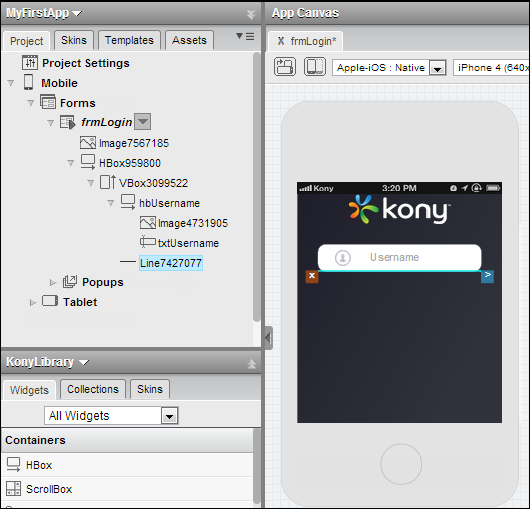
Adding an Inner HBox
We want our fields stacked vertically, but we have multiple elements inside what we are calling our ‘field’. To keep these lined up; we need one more HBox to contain them.
- So go ahead and drop another HBox inside of your VBox.
- You will need to set the Opacity values for Border, Background and Shadow to 0 for this new HBox.
- Finally, find the ID field in the General tab of the Properties pane and give this HBox a name of hbUsername. This is not strictly necessary but it makes it easier for us to reference it in this tutorial.
Adding an Image and a TextBox
It’s now time to start dropping visible widgets like labels and text fields onto our form and finishing the look and feel.
- First, find the Image2 widget in the Library Explorer and drag into our final inner HBox.
- Now give the Image widget an actual image to display. Like we did earlier, go ahead and assign a value to the Image widget’s source property. Select the username_ico.png image.
- Go ahead and set the width value of the image to 25%.
OK, our image is in. Now let’s insert the text field.
- Drag a Text Box over and drop it to the right of the Image widget.
- On the Properties pane, select the TextBox2 tab. There you will find the Text property. Go ahead and change that to txtUsername to let the user know what you are expecting to be entered there.
- On the Properties pane, select the Skin tab and set the Opacity values for Background, Border and Shadow to 0.
Adding a Line
Now that we have our Username field fleshed out, we will want a little space and a visual separator between it and the Password field we are about to build.
Select the innermost VBox from the Project Explorer and then drag a Line widget and drop it below the Drop it below the hbUsername widget.
Duplicating Widgets
Our hbUsername is set the way we want it. Now, we can either repeat all the steps above to build hbPassword by hand, hoping all along that we don’t miss a step or enter a wrong value.
or
We can use the built-in Copy and Paste feature of the Kony Visualizer.
- Right-click on hbUsername in the Project tab and select Copy. This will make a copy of hbUsername.
- Right-click the innermost VBox widget and select Paste. A duplicate of the hbUsername is placed below the Line widget.
- In the Properties pane, rename this new HBox to hbPassword.
- Rename the text field inside of it to txtPassword as well.
- Click on the image inside of hbPassword, select src from the Image2 of the Properties pane and select the password_ico.png image. Since it is the same size as the password_ico.png previously there, you don’t need to change any other settings.
- Now our line is out of place, we need to fix that. Find the Line in the Project pane, right-click on it and click on Move Up.
Remember Me
To add the Remember Me option that allows the user to save the Login credentials, follow the below steps:
- Drag an HBox widget and drop it below hbPassword HBox widget.
- Drag an Label widget and drop it inside this new HBox. Go to the Label widget propertis:
- Click Look tab and rename the Text as Remember Me.
- Click Skin tab, and select a desired font and font size, if required, change the color of the label.
- Drag and drop Image widget to the right of Label widget. From its properties,
- Go the Image Tab, and then the Source, select a desired image.
Adding a Button Widget
Now you have all your fields in place and looking the way you want them to. Now we need to add the login button to finish the page.
- Find the Button widget in the Library pane and drag it over onto our form.
- Over on the Properties pane, change the id of the button to btnLogin.
- Change the text property of the button to LOGIN.
- Adjust the margins of btnLogin to provide uniform margins of 10%.
- Click the Skin tab in the properties pane so we can adjust the color and font color.
- Select Single Color and then click the color box to select that color. Give it a nice forest green color.
- Below the Color section is the Border section.
- Set the border color to black.
- Set the size to 8pt.
- Set the opacity to 100%.
- Below the Border section you will find the in the Fonts section, select the color box and select white as the color of the font so it will show up nicely on your green button.
Final Outcome
If you’ve followed all the instructions as we’ve laid them out, then the result should look something like this.
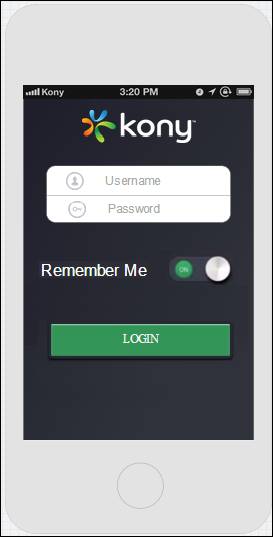
Congratulations! You have designed your first page.
We hope that this tutorial has helped you understand the basics of Kony Visualizer like creating forms, positioning items, and setting properties.
We can’t wait to see what you build next.
Congratulations on completing your first Kony FastTrack tutorial.
What's Next?
Go to our next tutorial on designing a page using advanced widgets.