You are here: Creating a FlexScrollContainer Using a Constructor: kony.ui.FlexScrollContainer
A FlexScrollContainer is a scrollable container which allows you to scroll the content in horizontal or vertical direction. It can contain any number of widgets within it.
You can add the FlexScrollContainer widget only to the FlexForm. This widget will be available in the Widgets palette when the FlexForm is selected in the app canvas.
Here are some scenarios where you can use the FlexScrollContainer widget:
You can display a lot of information in a single screen. You need not scroll the entire page.
Scroll bar can be enabled to the container widget area, and you need not scroll the entire page.
You can enable paging, and swipe to see a new screen in the place of old screen in the container widget.
Widgets are normally added to your Kony application using Kony Visualizer, but can also be added from code. For general information on using widgets in Visualizer, see Designing an Application in the Kony Visualizer User Guide .
For general information on the FlexScrollContainer widget see the FlexScrollContainer topic in the Kony Visualizer User Guide.
The FlexScrollContainer widget capabilities can be broadly categorized into the following:
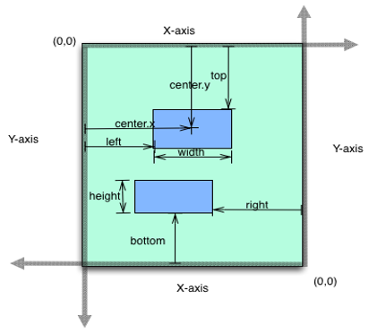
anchorPoint
Specifies the anchor point of the widget bounds rectangle using the widget's coordinate space.
centerX
Determines the center of a widget measured from the left bounds of the parent container.
centerY
Determines the center of a widget measured from the top bounds of the parent container.
clipBounds
Child widgets will be clipped to the bounds of the FlexScrollContainer if this property is set to true.
contentSize
Specifies the width and height of the container to accommodate all the widgets placed in it.
contentSizeMeasured
Specifies the width and height of the container measured in dp.
height
Determines the height of the widget and measured along the y-axis.
layoutType
Specifies if the arrangement of the widgets either in free form or horizontal or vertical direction.
left
Determines the lower left corner edge of the widget and is measured from the left bounds of the parent container.
maxHeight
Specifies the maximum height of the widget and is applicable only when the height property is not specified.
maxWidth
Specifies the maximum width of the widget and is applicable only when the width property is not specified.
minHeight
Specifies the minimum height of the widget and is applicable only when the height property is not specified.
minWidth
Specifies the minimum width of the widget and is applicable only when the width property is not specified.
top
Determines the top edge of the widget and measured from the top bounds of the parent container.
width
Determines the width of the widget and is measured along the x-axis.
zIndex
Specifies the stack order of a widget.
forceLayout When this method is called, underlying OS layout cycle is forced to layout the widgets of the FlexContainer.
animate Applies an animation to the widget.
transform Contains an animation transformation that can be used to animate the widget. widgetSwipeMove Used to enable and configure the left or right swipe actions for a widget.
allowHorizontalBounce Specifies whether the scroll bounce is enabled or disabled in the horizontal direction. allowVerticalBounce Specifies whether the scroll bounce is enabled or disabled in the vertical direction. animateIcons bounces Specifies whether the scroll bounce is enabled or disabled.
bouncesZoom Specifies whether the scroll view animates the content scaling when the scaling exceeds the maximum or minimum limits. decelerating Returns whether the content is moving in the scroll view after the user lifted their finger. enableGpuScrolling Enables you to specify how most of the property updates and events for the FlexScrollContainer are handled. enableOnScrollWidgetPositionForSubwidgets This property enables the FlexScrollContainer widget to iterate into all the widgets that make use of the onScrollWidgetPosition event. enableScrolling Specifies whether the scrolling is enabled on the container or not. horizontalScrollIndicator Specifies whether the scroll indicator to be shown or not in the horizontal direction.
pullToRefreshI18NKey Specifies the i18N key for the "Pull to refresh" text when the FlexScrollContainer is pulled from the top. pullToRefreshIcon Specifies the icon to be displayed when the FlexScrollContainer is pulled from the top. pullToRefreshSkin Specifies the skin to be applied to the text that is displayed when the FlexScrollContainer is pulled from the top. pushToRefreshI18NKey Specifies the i18N key for the "Push to refresh" text when the FlexScrollContainer is pushed from the bottom. pushToRefreshIcon Specifies the icon to be displayed when the FlexScrollContainer is pushed from the bottom. pushToRefreshSkin Specifies the skin to be applied to the text that is displayed when the FlexScrollContainer is pushed from the bottom. releaseToPullRefreshI18NKey Specifies the i18N key for the "Release to refresh" text, when the FlexScrollContainer is pulled from the top. releaseToPushRefreshI18NKey Specifies the i18N key for the "Release to refresh" text, when the FlexScrollContainer is pushed from the bottom. scrollDirection Specifies the direction in which the widget should scroll. scrollsToTop Enables you to scroll the FlexScrollCotainer to top on tapping a device’s status bar. tracking Specifies whether the user has touched the content to initiate scrolling. verticalScrollIndicator Specifies whether the scroll indicator must be shown in the vertical direction.
onScrollEnd An event callback is invoked by the platform when the scrolling is ended. scrollToEnd This method gives you the control to scroll to the end of the form. scrollToWidget This method gives you the control to scroll the FlexForm up to the position of selected widget.
onDecelerationStarted An event callback is invoked by the platform when the user stops scrolling but the content still moves before the content actually stops. onScrollEnd An event callback is invoked by the platform when the scrolling is ended. onScrolling An event callback is invoked by the platform when the scrolling is in progress. onScrollStart An event callback is invoked by the platform when the user starts scrolling the content. onScrollTouchReleased An event callback is invoked by the platform when the user touch is released from the touch surface. onScrollWidgetPosition
This event callback is invoked by the platform when the widget location position gets changed on scrolling. scrollingEvents This event callback is invoked while scrolling the FlexScrollContainer horizontally or vertically.
add Used to add widgets to the Form. addAt Used to add widgets to the Form at the specified index. clone When this method is used on a container widget, then all the widgets inside the container are cloned. remove Removes a widget from the form container. removeAt Removes a widget at the given index from the Form container. removeAll Removes all the widget on the container.
onZoomEnd An event callback is invoked by the platform when the zooming has ended. onZooming An event callback is invoked by the platform when the container is zooming. onZoomStart An event callback is invoked by the platform when the container is about to zoom. widgetToZoom An event callback is invoked by the platform to return one of the child widgets of source to zoom.
addGestureRecognizer Allows you to set a gesture recognizer for a specified gesture for a specified widget. removeGestureRecognizer Allows you to remove the specified gesture recognizer for the specified widget. setGestureRecognizer Allows you to set a gesture recognizer for a specified gesture for a specified widget. setZoomScale Allows you the zoom the widgets with an option to animate.
bouncesZoom
Specifies whether the scroll view animates the content scaling when the scaling exceeds the maximum or minimum limits. disableZoom Allows you to enable or disable zooming the FlexScrollContainer. maxZoomScale Specifies the maximum scale factor that can be applied to the scroll view's content. minZoomScale Specifies the minimum scale factor that can be applied to the scroll view's content. dragging Specify whether the user has begun scrolling the content. zooming A boolean value indicates whether the content view is currently zooming in or out. zoomScale Specifies the current scale factor applied to the FlexScrollContainer content.
backgroundColor Specifies the background color of the widget in hex format. opacity Specifies the opacity of the widget. showFadingEdges Enables you to define the display of fading edges for the FlexScrollForm widget.
setContentOffset Gives you the control to offset a portion of the content in a FlexScrollContainer to bring the widgets in invisible area to visible area.
contentOffset Returns the current coordinates of the top left corner of the scrollable region in the item. contentOffsetMeasured Specifies the x and y coordinates of the top-left of the scrollable region measured in dp. cursorType Specifies the type of the mouse pointer used. isMaster Specifies whether the container is a master container.
getBadge Enables you to read the badge value (if any) attached to the specified widget. setBadge Enables you to set the badge value to the given widget at the upper, right corner of the widget. setDefaultUnit Specifies the default unit to be used for interpretation of numbers with no qualifiers when passed to layout properties. widgets Returns an array of the widget references which are direct children of Form.
accessibilityConfig Enables you to control accessibility behavior and alternative text for the widget. blur Enables you to make the widget look unfocused. isVisible Controls the visibility of a widget on the FlexScrollContainer. parent Helps you access the parent of the widget. enableCache Enables you to improve the performance of Positional Dimension Animations. info A custom JSObject with the key value pairs that a developer can use to store the context with the widget.
convertPointFromWidget Allows you to convert the coordinate system from a widget to a point (receiver's coordinate system). convertPointToWidget Allows you to convert the coordinate system from a point (receiver's coordinate system) to a widget. removeFromParent Allows you to remove a child widget from a parent widget. setEnabled Specifies the widget that must be enabled or disabled. setFocus Specifies the widget on which there must be focus. setVisibility Use this method to set the visibility of the widget.
basicConf is an object with basic properties.layoutConf is an object with layout properties.pspConf is an object with platform specific properties.Note:
Example
You can customize the appearance of the FlexScrollContainer using the following properties:
Events : Defines the scrolling events for FlexScrollContainer widget.padding : Defines the space between the content of the widget and the widget boundaries.skin : Specify the skin to be applied to the FlexScrollContainer widget.The below image represents the flex layout properties:
The following are the important considerations of a FlexScrollContainer:
If you set the scrollDirection as kony.flex.SCROLL_VERTICAL or kony.flex.SCROLL_BOTH, you have to set a value in the height property. When a widget is placed inside a horizontal parent widget. For example: Box, Segment, it will take 40% of the parent widget or the available free space of the widget. prem © 2012 Kony, Inc. All rights reserved.
prem © 2012 Kony, Inc. All rights reserved.