Phone
Use a Phone widget to launch the native phone dialer and initiate a phone call to a specified phone number. When a user clicks the Phone widget, the native dialer launches to make a call.
To learn how to use this widget programmatically, refer Kony Visualizer Widget guide.
Look Properties
Look properties define the appearance of the widget. The following are the major properties you can set:
- Whether the widget is visible.
- The platforms on which the widget is rendered.
- How the widget aligns with its parent widget and neighboring widgets.
- If the widget displays content, where the content appears.
For descriptions of the properties available on the Look tab of the Properties pane, see Look.
Skin Properties
Skin properties define a skin for the widget, including background color, borders, and shadows. If the widget includes text, you can also specify the text font.
For the Phone widget, you can apply a skin and its associated properties for the following states:
| Skin | Definition |
|---|---|
| Normal | The default skin of the widget. |
| Focus | The skin applied when the widget has the focus. |
For more information about applying skins, see Understanding Skins and Themes.
Actions
Actions define what happens when an event occurs. On a Phone widget, you can run an action when the following events occur:
- onTouchStart: The action is triggered when the user touches the touch surface. This event occurs asynchronously.
- onTouchMove: The action is triggered when the touch moves on the touch surface continuously until movement ends. This event occurs asynchronously.
- onTouchEnd: The action is triggered when the user touch is released from the touch surface. This event occurs asynchronously.
For more information, see Add Actions.
Placement Inside a Widget
The following table summarizes where a Phone widget can be placed:
| Form | Yes |
| HBox | Yes |
| VBox | Yes |
| ScrollBox | Horizontal
Orientation -Yes Vertical Orientation- Yes |
| Tab | Yes |
| Segment | Yes |
| Popup | Yes |
| Template
|
Header- No Footer- No |
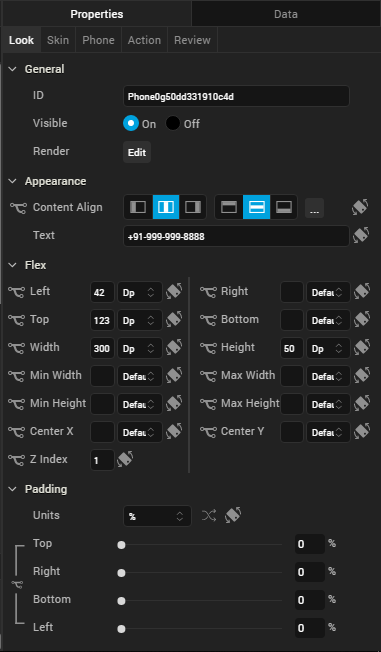
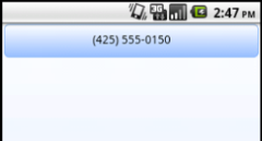
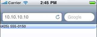
Widget Appearance on Platforms
The appearance of the Phone widget varies as follows:
| Platform | Appearance |
|---|---|
| Android |
|
| iOS |
|
| SPA |
|
| Rev | Author | Edits |
| 8 | SHS | SHS |
| 7.2.1 | SHS | SHS |
| Copyright © 2013 Kony, Inc. All rights reserved. |