Image
Use an Image widget to display a graphic image such as a company logo, photo, or illustration in PNG, JPEG, or GIF format.
To learn how to use this widget programmatically, refer Kony Visualizer Widget guide.
Important Considerations
The following are important considerations for an Image widget:
- Before using an image in a project, copy the image to a project subfolder. For more information, see Add and Manage Images and Other Media.
-
On an Android device, imported images from a drawable folder are ignored during functional preview.
- An Image file name must contain only lowercase characters and numbers, must begin with an alphabetic character, and can't be a JavaScript reserved word or keyword.
The following table shows examples of valid and invalid file names:
| Valid File Names | Invalid File Names | Remarks |
|---|---|---|
| myicon.png | Myicon.png | The file name is invalid because it contains an uppercase character. |
| icon2.png | Icon_2.png | The file name is invalid because it contains uppercase character and an underscore. |
| accntsummary.png | aCCNT&summary.png | The file name is invalid because it contains uppercase characters and special character. |
| accountdetails.png | Details.png | The file name is invalid because it contains an uppercase character. |
| flightstatus123.png | continue.png | The file name is invalid because it contains a Java keyword. |
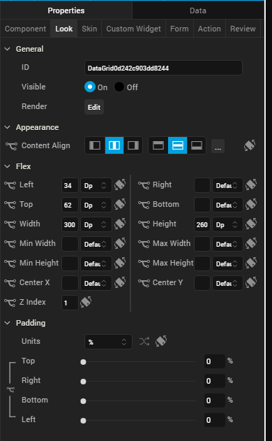
Look Properties
Look properties define the appearance of the widget. The following are the major properties you can set:
- Whether the widget is visible.
- The platforms on which the widget is rendered.
- How the widget aligns with its parent widget and neighboring widgets.
- If the widget displays content, where the content appears.
For descriptions of the properties available on the Look tab of the Properties pane, see Look.
Skin Properties
Skin properties define a skin for the widget, including background color, borders, and shadows. If the widget includes text, you can also specify the text font.
Note: On iOS and the Android platforms, rounded border skins are not supported.
For an Image widget, you can apply a skin and its associated properties for the following states:
| Skin | Definition |
|---|---|
| Normal | The default skin of the widget. |
| Hover Skin |
The look and feel of the widget when the cursor hovers over the widget. Note: Hover skins are available only on the Windows (native) Tablet platform. |
For more information about applying skins, see Understanding Skins and Themes.
Image Properties
Image properties specify properties that are available on any platform supported by Kony Visualizer, and assign platform-specific properties.
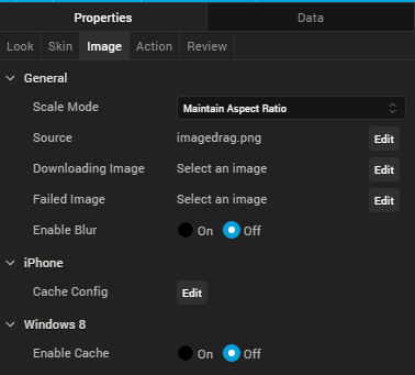
Scale Mode
Specifies how the image is scaled within the Image widget.
Default: Maintain Aspect Ratio
The following scale options are available:
- Fit To Dimensions
- Maintain Aspect Ration
- Crop
Source
Specifies the source of the image to be displayed. You can specify an image from the Resources folder or an image URL.
To specify an image:
- Click the Edit button to open the Source dialog box.
- Do one of the following:
- Locate and select the image you want from the list of available images.
- In the http Image URL text box, enter an image URL.
- Click Open. The Source property displays the file name or URL of the image.
Enter a partial file name in the Search box to narrow down the number of images listed. You can also change how the images are displayed by clicking the Layout icons in the upper-left portion of the Source dialog box. You can display the image files as a grid of small previews; a list that includes file names, dimensions, and sizes; or as a file list with a preview pane that displays a preview of the currently highlighted image.
Downloading Image
Specifies the image displayed when the remote source is being downloaded.
To specify an image, click the Edit button open the Downloading Image dialog box. You can either select an available image or specify an image URL.
Failed Image
Specifies the image to be displayed when the remote resource is not available.
To specify an image, click Edit button to open the Failed Image dialog box. You can either select an available image or specify an image URL.
Tool Tip
For the Windows Tablet platform, specifies a message that displays when you hover the mouse pointer over the widget .
Actions
Actions define what happens when an event occurs. On an Image widget, you can run an action when the following event occurs:
- onDownloadComplete: The action is triggered when the image download is complete.
- onTouchStart: The action is triggered when the user touches the touch surface. This event occurs asynchronously.
- onTouchMove: The action is triggered when the touch moves on the touch surface continuously until movement ends. This event occurs asynchronously.
- onTouchEnd: The action is triggered when the user touch is released from the touch surface. This event occurs asynchronously.
For more information, see Add Actions.
Placement Inside a Widget
The following table summarizes where an Image widget can be placed:
| Flex Form | Yes |
| VBox Form | Yes |
| FlexContainer | Yes |
| FlexScrollContainer | Yes |
| HBox | Yes |
| VBox | Yes |
| Scroll Box | Horizontal
Orientation - Yes Vertical Orientation- Yes |
| Tab | Yes |
| Segment | Yes |
| Popup | Yes |
| Template
|
Header- No Footer- No |
| Rev | Author | Edits |
| 8 | SHS | SHS |
| 7.2.1 | SHS | SHS |
| Copyright © 2013 Kony, Inc. All rights reserved. |