FlexContainer
Use a FlexContainer widget to create a layout area on a form that can contain other widgets. If you want the layout area to include scroll bars, use a FlexScrollContainer widget. For more information, see Convert Flex Container Widgets.
To learn how to use this widget programmatically, refer Kony Visualizer Widget guide.
Look Properties
Look properties define the appearance of the widget. The following are the major properties you can set:
- Whether the widget is visible.
- The platforms on which the widget is rendered.
- How the widget aligns with its parent widget and neighboring widgets.
- If the widget displays content, where the content appears.
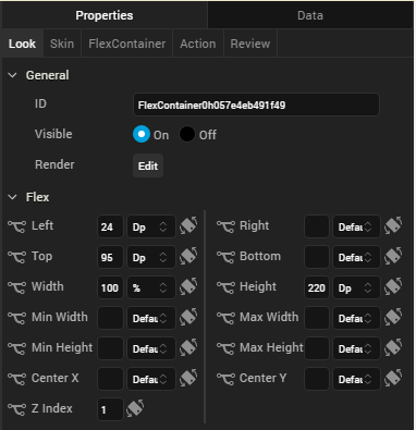
For descriptions of the properties available on the Look tab of the Properties pane, see Look.
Auto Growth of a FlexContainer Widget
You can specify that a FlexContainer widget dynamically adjusts its height based on the height of its child widgets by setting the Height property on the Look tab to Preferred. The height of the FlexContainer then adjusts when the height of any child widgets changes.
Following are important considerations for a FlexContainer that is set to adjust dynamically:
- A FlexContainer will not dynamically adjust it has a static height; for example, if Top and Bottom values are set.
- A FlexContainer that contains other dynamically-adjusting widgets adjusts it's height after the child widgets have adjusted. For example, if the FlexContainer contains another FlexContainer that is set to grow dynamically and a Segment2 widget with the Auto Grow property enabled, the height of the parent FlexContainer dynamically adjusts after the heights of the child FlexContainer and Segment2 widgets adjust.
The following table summarizes how to calculate the height of child widgets:
| Height | Center Y | Top | Bottom | Child Height |
|---|---|---|---|---|
| Yes | Yes | Yes | Yes | centerY + height/2 + bottom |
| Yes | Yes | No | Yes | centerY + height/2 + bottom |
| Yes | Yes | Yes | No | centerY+ height/2 |
| Yes | Yes | No | No | centerY+ height/2 |
| No | Yes | Yes | Yes | (centerY – top) * 2 + top + bottom |
| No | Yes | Yes | No | (centerY – top) * 2 + top |
| No | Yes | No | Yes | centerY + bottom + cph/2 |
| No | Yes | No | No | centerY + CPH/2 |
| Yes | No | Yes | Yes | top + height + bottom |
| No | No | Yes | Yes | top + CPH + bottom |
| Yes | No | Yes | No | top + height |
| No | No | Yes | No | top + CPH |
| Yes | No | No | Yes | height + bottom |
| No | No | No | Yes | cph + bottom |
| Yes | No | No | No | height |
| No | No | No | No | CPH |
Note: The Computed Preferred Height (CPH) is determined by the calculated height for the content-driven widget, the default value returned from the configuration file, and the calculated height of the Auto Grow Segment or FlexContainer.
Limitations:
- If top or bottom values of child widgets are not provided, then zero values are used when determining the height of a FlexContainer.
- If the height of a widget changes when the widget's skin state changes (for example, from normal to focus), the height of a FlexContainer will not grow dynamically.
- If a widget's top value is negative, then the widget will be clipped in case of Free Form and overlapped on the previous widget in Flow Vertical.
- A FlexContainer will not grow dynamically when placed inside an HBox or a VBox.
Note: You can place a FlexContainer inside an HBox or VBox only while creating a Map or Gridcalendars template.
- If clip bounds are disabled for a child FlexContainer, the children of the child FlexContainer that are out of the bounds do not affect the height of the parent FlexContainer. Only the heights of direct children of the parent FlexContainer are be used to determine its height.
- A Segment template created using a FlexContainer will dynamically grow only when the Segment2 view type is Table View.
- FlexContainer dynamic growth is not supported on a Tab Widget.
- In the Windows Platform, the Segment2 Auto Grow property is not supported if the Segment 2 widget is placed inside a FlexContainer.
Skin Properties
Skin properties define a skin for the widget, including background color, borders, and shadows. If the widget includes text, you can also specify the text font.
For a FlexContainer widget, you can apply a skin and its associated properties for the following states:
| Skin | Definition |
|---|---|
| Normal | The default skin of the widget. |
| Focus | The skin applied when the widget has the focus. |
| Blocked UI |
The skin applied to block the interface until the action in progress (for example, a service call) completes. Note: Blocked UI is available only for SPA platforms. |
For more information about applying skins, see Understanding Skins and Themes.
FlexContainer Properties
FlexContainer properties specify properties that are available on any platform supported by Kony Visualizer, and assign platform-specific properties.
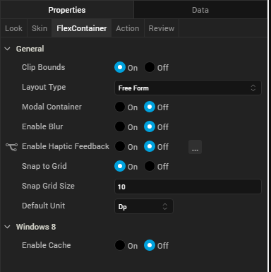
Clip Bounds
Specifies whether to clip child widgets when they go out of boundaries.
Layout Type
Specifies whether the arrangement of widgets in the FlexContainer flows horizontally, vertically, or in both directions.
Default: Vertical
Child Widget Align
Specifies whether the arrangement of widgets in the child widget of the FlexContainer flows horizontally, vertically, or in both directions.
Default: Right to Left.
Visualizer generates reverseLayoutDirection property with true for Right to Left and Bottom to Top. Visualizer generates this property with false for Left to Right and Top to Bottom.
Snap to Grid
Specifies whether the widget aligns to the nearest intersection of lines in the grid, or other widgets.
Snap Grid Size
Specifies the grid size. This option is available only when Snap to Grid is enabled.
Default Unit
Specifies the default unit used for interpretation of numbers with no qualifiers when passed to layout properties.
Following are the options:
- dp: Specifies the values in terms of device independent pixels.
- px: Specifies the values in terms of device hardware pixels.
- %: Specifies the values in percentage relative to the parent dimensions.
Action
Actions define what happens when an event occurs. On a FlexContainer widget, you can run an action when the following events occur:
- onTouchStart: The action is triggered when the user touches the touch surface. This event occurs asynchronously.
- onTouchMove: The action is triggered when the touch moves on the touch surface continuously until movement ends. This event occurs asynchronously.
- onTouchEnd: The action is triggered when the user touch is released from the touch surface. This event occurs asynchronously.
- onClick: The action is triggered when the user clicks on the widget.
For more information, see Add Actions.
| Rev | Author | Edits |
| V8 SP2 | PG | PG |
| 8 | SHS | SHS |
| 7.2.1 | SHS | SHS |
| Copyright © 2013 Kony, Inc. All rights reserved. |