DataGrid
Use a DataGrid widget to display a collection of data in rows and columns (tabular format). The DataGrid widget supports common table formatting options, such as alternating the row background color, customizing the grid line, and the ability to hide or show headers.
To learn how to use this widget programmatically, refer Kony Visualizer Widget guide.
Important Considerations
The following are important considerations for a DataGrid widget.
- To set the data, first specify the rows and columns using the Data property.
-
If the DataGrid supports the Multi-Select property, make sure to specify a Row - Focus property. Otherwise, you will not be able to distinguish multiple selections.
Look Properties
Look properties define the appearance of the widget. The following are the major properties you can set:
- Whether the widget is visible.
- The platforms on which the widget is rendered.
- How the widget aligns with its parent widget and neighboring widgets.
- If the widget displays content, where the content appears.
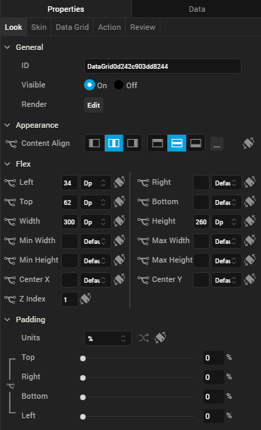
For descriptions of the properties available on the Look tab of the Properties pane, see Look.
Skin Properties
Skin properties define a skin for the widget, including background color, borders, and shadows. If the widget includes text, you can also specify the text font.
For a DataGrid widget, you can apply a skin and its associated properties for the following states:
For more information about applying skins, see Understanding Skins and Themes.
DataGrid Properties
DataGrid properties specify properties that are available on any platform supported by Kony Visualizer, and assign platform-specific properties.
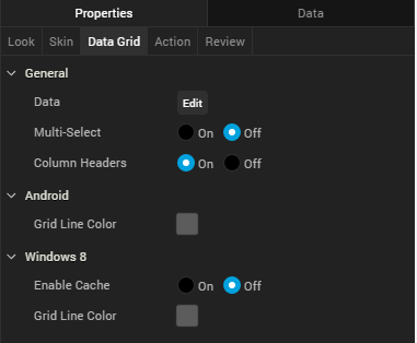
Data
Represents the data displayed in each cell of the data grid.
To input the data, click the Edit button to open the Master Data : DataGrid dialog box.
The Master Data : DataGrid dialog box includes two tabs:
- Columns
- Rows
Columns
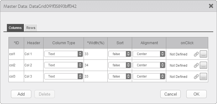
The Columns table lets you provide details such as:
- ID: Specifies the unique identifier of a column.
- Header: Specifies the Column header.
- Column Type: Specifies whether the column type is text or image.
- Width (%): Specifies the width of each column as percentage of the data grid.
- Sort: Specifies whether sorting is enabled for the column.
- Alignment: Specifies the alignment of the content in each column. The following alignment options are available:
Top-Left
- Top-Center
- Top-Right
- Middle-Left
Center
- Middle-Right
- Bottom-Left
Bottom-Center
Bottom-Right
- OnClick: Specifies an action that takes place when you click on the header of a column. To specify an OnClick action for a column, click the ellipses button (...).
Rows
The fields in the Rows tab are based on the inputs provided in the Columns tab and include:
- Column Headers are the Header values specified in the Columns tab.
- Table cells whose Column Type is Text are text fields. You can type the text within these cells.
- Table cells whose Column Type is Image are image fields. You can choose an image to be displayed in these cells. Click the ellipses button (...) in the image field to open theSelect Image dialog box, and then select an image or provide the URL of the image and click OK. The selected image displays in the cell.
- The text or image is aligned according to the Alignment setting.
Multi-Select
Specifies whether you can choose multiple rows of the DataGird. The Row - Focus skin is applied to selected rows.
Column Headers
Specifies the visibility of the DataGrid column headers.
Grid Line Color
Specifies the color of the grid line.
Note: This property is specific to the Android platform.
Tool Tip
For the Windows Tablet platform, specifies a message that displays when you hover the mouse pointer over the widget .
Actions
Actions define what happens when an event occurs. On a DataGrid widget, you can run an action when the following event occurs:
- onRowSelected: The action is triggered when a row is selected.
- onTouchStart: The action is triggered when the user touches the touch surface. This event occurs asynchronously.
- onTouchMove: The action is triggered when the touch moves on the touch surface continuously until movement ends. This event occurs asynchronously.
- onTouchEnd: The action is triggered when the user touch is released from the touch surface. This event occurs asynchronously.
For more information on using this action, see Add Actions.
Placement Inside a Widget
The following table summarizes where a DataGrid widget can be placed:
| Flex Form | Yes |
| VBox Form | Yes |
| FlexContainer | Yes |
| FlexScrollContainer | Yes |
| HBox | Yes |
| VBox | Yes |
| ScrollBox | Horizontal
Orientation - Yes Vertical Orientation - Yes |
| Tab | Yes |
| Segment | No |
| Popup | Yes |
| Template
|
Header- No Footer- No |
| Rev | Author | Edits |
| 8 | SHS | SHS |
| 7.2.1 | SHS | SHS |
| Copyright © 2013 Kony, Inc. All rights reserved. |