Button
Use a Button widget to trigger an action or set of actions; for example, clicking the button might open a form or dialog box, start an action or series of actions, or confirm an action.
To learn how to use this widget programmatically, refer Kony Visualizer Widget guide.
Important Considerations
The following are important considerations for a Button widget.
- You can specify different skins for normal and focus states of a button.
-
You can specify a background image for normal and focus states of a button.
- To avoid a jumping effect or toverlap of neighboring widgets, make sure the image for normal and focus skins are the same size.
Look Properties
Look properties define the appearance of the widget. The following are the major properties you can set:
- Whether the widget is visible.
- The platforms on which the widget is rendered.
- How the widget aligns with its parent widget and neighboring widgets.
- If the widget displays content, where the content appears.
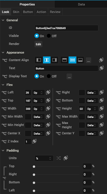
For descriptions of the properties available on the Look tab of the Properties pane, see Look.
Skin Properties
Skin properties define a skin for the widget, including background color, borders, and shadows. If the widget includes text, you can also specify the text font.
For a Button widget, you can apply a skin and its associated properties for the following states:
| Skin | Definition |
|---|---|
| Normal | The default skin of the widget. |
| Focus | The skin applied when the focus is on the widget. |
| Blocked UI |
The skin applied to block the interface until the action in progress is completed; for example, a service call . Note: The Blocked UI skin is available only for SPA platforms. |
| Pressed |
The skin to indicate that the widget is pressed or clicked. Note: The Pressed skin is available only on Android Native platforms. |
For more information about applying skins, see Understanding Skins and Themes.
Button Properties
Button properties specify properties that are available on any platform supported by Kony Visualizer, and assign platform-specific properties.
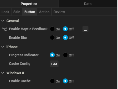
Progress Indicator
For the iOS platform, specifies whether to display the progress indicator when a user clicks the button. Enable this property when the loading time for an application is long.
Default: The progress indicator is enabled.
Tool Tip
For the Windows Tablet platform, specifies a message that displays when you hover the mouse pointer over the widget.
Actions
Actions define what happens when an event occurs. On a Button widget, you can run an action when the following event occurs:
- onClick: The action is triggered when the user clicks on the button.
- onTouchStart: The action is triggered when the user touches the touch surface. This event occurs asynchronously.
- onTouchMove: The action is triggered when the touch moves on the touch surface continuously until movement ends. This event occurs asynchronously.
- onTouchEnd: The action is triggered when the user touch is released from the touch surface. This event occurs asynchronously.
For more information, see Add Actions.
Placement inside a Widget
The following table summarizes where a Button widget can be placed:
| Flex Form | Yes |
| VBox Form | Yes |
| FlexContainer | Yes |
| FlexScrollContainer | Yes |
| HBox | Yes |
| VBox | Yes |
| ScrollBox | Horizontal
Orientation -Yes Vertical Orientation -Yes |
| Tab | Yes |
| Segment | Horizontal
Orientation -Yes Vertical Orientation -Yes |
| Popup | Yes |
| Template
|
Header- No Footer- No |
| Rev | Author | Edits |
| 8 | SHS | SHS |
| 7.2.1 | SHS | SHS |
| Copyright © 2013 Kony, Inc. All rights reserved. |