Button widget is a UI element that is used to trigger any actions. These actions can be navigating to another form, perform animations, interacting with a dialog box, etc.
NOTE: Quantum Visualizer V9 Service Pack 3 release, the Button widget is rendered with the <button></button> HTML tags in the DOM of web apps. In versions prior to the V9 Service Pack 3 release, the Button widget was rendered in the <label></label> HTML tags in the DOM.
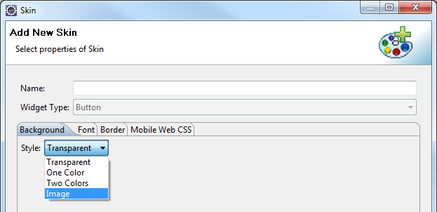
A button displays text with a background image or a background color.
Button widget is employed in many scenarios where the user performs an on-click action on a button. Some of them are:
Login and Logout: Login screen and Logout screen generally contain buttons to log in and log out of an application.Navigation: The previous and next buttons are used in applications to navigate to the previous form or next form.Dialog Box: Buttons are employed in dialog boxes to enable interaction between the user and the application.Modify Properties of other widgets: Button can modify properties of other widgets in the form, with an on-click action.Invoke Services: You can get data from the backend into the form, with an on-click action of a button. For instance, consider a form that contains a segment to be populated with employee details from the backend. A button in the form can be given an on-click action to invoke the services.Perform Animations: You can animate other widgets to move, rotate or scale using a button widget. The most common use case for this is the Hamburger menu. You can click on a hamburger menu to move a container which is not in the device frame to the visible area.
Widgets are normally added to your application using Quantum Visualizer , but can also be added from code. For general information on using widgets in Visualizer, see Designing an Application in the Visualizer User Guide .
For general information on the Button widget see the Button topic in the Quantum Visualizer User Guide.
The Button widget capabilities can be broadly categorized into the following:
doLayout
Invoked for every widget when the widget position and dimensions are computed.
anchorPoint Specifies the anchor point of the widget bounds rectangle using the widget's coordinate space. bottom Determines the bottom edge of the widget and is measured from the bottom bounds of the parent container. contentAlignment Specifies the alignment of the text for a widget with respect to its boundaries. centerX Determines the center of a widget measured from the left bounds of the parent container. centerY Determines the center of a widget measured from the top bounds of the parent container. height Determines the height of the widget and measured along the y-axis. left Determines the lower left corner edge of the widget and is measured from the left bounds of the parent container. maxHeight Specifies the maximum height of the widget and is applicable only when the height property is not specified. maxWidth Specifies the maximum width of the widget and is applicable only when the width property is not specified. minHeight Specifies the minimum height of the widget and is applicable only when the height property is not specified. minWidth Specifies the minimum width of the widget and is applicable only when the width property is not specified. padding Defines the space between the content of the widget and the widget boundaries. paddingInPixel Indicates if the padding is to be applied in pixels or in percentage. top Determines the top edge of the widget and measured from the top bounds of the parent container. width Determines the width of the widget and is measured along the x-axis. zIndex Specifies the stack order of a widget.
backgroundColor Specifies the background color of the widget in hex format. backgroundColorMultiStepGradient Specifies the multi-step gradient color for the background of the widget. backgroundColorTwoStepGradient Specifies the two-step gradient color for the background of the widget. backgroundImage Sets the image for the background of the widget. borderColor Specifies the border color of the widget. borderColorGradient Specifies the multi-step gradient color for the border of the widget. borderStyle Specifies the border style for the widget. borderWidth Specifies the width of the border for the widget in pixels. cornerRadius Specifies the radius of the border for the widget. disabledStateSkinProperties Specifies the skin properties that define the look and feel of the widget, when the widget is disabled or blocked. focusStateSkinProperties Specifies the skin properties that define the look and feel of the widget, when the widget is in focus. fontColor Specifies the font color of the widget. fontFamily Specifies the font family for the font of the widget. fontSize Specifies the font size for the widget in percentage (%) units. fontStyle Specifies the font style for the widget. fontWeight Specifies the weight for the font of the widget. hoverStateSkinProperties Specifies the skin properties that define the look and feel of the widget, when the cursor hovers on the widget. pressedStateSkinProperties Specifies the skin properties that define the look and feel of the widget, when the widget is pressed or clicked. shadowColor Specifies the color for the shadow of the widget. shadowOffset This property specifies the current coordinates of the shadow region in the widget. shadowRadius Specifies the radius for the blur value of the shadow. textShadowColor Specifies the color for the text shadow of the widget. textShadowOffset This property specifies the current coordinates of the text shadow region in the widget. textShadowRadius Specifies the radius for the blur value of the text shadow. clipView Defines a shape to clip the widget view. focusSkin Specifies the look and feel of the Button when in focus. glowEffect Specifies if there must be glow effect when you touch the button. hoverSkin Specifies the look and feel of a widget when the cursor hovers on the widget. pressedSkin Specifies the skin to indicate that the Button is pressed or clicked. rippleBackground Defines the ripple background for a Button Widget. shadowDepth Defines the depth of the shadow effect applied to the Button Widget. shadowType Sets a type of the shadow effect to apply to the Button Widget. showProgressIndicator Specifies if the progress indicator must be displayed when the button is clicked.
animate Applies an animation to the widget.
transform Contains an animation transformation that can be used to animate the widget. widgetSwipeMove Used to enable and configure the left or right swipe actions for a widget.
clone When this method is used on a container widget, then all the widgets inside the container are cloned.
cacheConfig Used to configure the cachePolicy and storagePolicy of the cache responses.
registerForPeekandPop Registers a widget to enable 3D Touch peek and pop gestures. setOnPeek Sets and overrides the existing onPeekCallback for the widget. setOnPop Sets and overrides the existing onPopCallback for the widget. unregisterForPeekandPop Unregisters a widget from 3D Touch peek and pop gestures.
onClick An event callback is invoked by the platform when the user performs a click action on the button. onScrollWidgetPosition An event callback is invoked by the platform when the widget location position gets changed on scrolling. onTouchEnd An event callback is invoked by the platform when the user touch is released from the touch surface. onTouchMove An event callback is invoked by the platform when the touch moves on the touch surface continuously until movement ends. onTouchStart An event callback is invoked by the platform when the user touches the touch surface.
addGestureRecognizer Allows you to set a gesture recognizer for a specified gesture for a specified widget. removeGestureRecognizer Allows you to remove the specified gesture recognizer for the specified widget. setGestureRecognizer Allows you to set a gesture recognizer for a specified gesture for a specified widget.
getBadge Enables you to read the badge value (if any) attached to the specified widget. setBadge Enables you to set the badge value to the given widget at the upper, right corner of the widget.
buttonType Supports native iOS button types. cursorType Specifies the type of mouse pointer used. enableHapticFeedback Allows you to enable or disable haptic feedback on the Button widget. externalURL Specifies that the URL must be opened directly from the web site without having to contact the Quantum Fabric . nativeButtonFocusImage Allows you to set an image to be used when the button has focus. nativeButtonNormalImage Allows you to set an image to be used for a button. rawBytes Specifies the rawbytes representing an image that can be used as a background for the button. text Specifies a general or descriptive text for the Button widget. toolTip Specifies the hint text when the cursor hovers over a widget, without clicking it.
blur Enables you to make the widget look unfocused. convertPointFromWidget Allows you to convert the coordinate system from a widget to a point (receiver's coordinate system). convertPointToWidget Allows you to convert the co-ordinate system from point(receiver's co-ordinate system) to a Widget. removeFromParent Allows you to remove a child widget from a parent widget. setEnabled Specifies the widget that must be enabled or disabled.
Syntax setFocus Specifies the widget on which there must be focus. setVisibility Use this method to set the visibility of the widget.
enable Allows you to make a widget visible but not actionable. enableCache Enables you to improve the performance of Positional Dimension Animations. info A custom JSObject with the key value pairs that a developer can use to store the context with the widget. isVisible Controls the visibility of a widget on the form. parent Helps you access the parent of the widget.
postOnclickJS Allows the developer to execute custom JavaScript function after the onClick callback of the widget is invoked. preOnclickJS Allows the developer to execute custom JavaScript function before the onClick callback of the widget is invoked.
basicConf is an object with basic properties.layoutConf is an object with layout properties.pspConf is an object with platform specific properties.NOTE:
Example
You can customize the appearance of the button using the following properties:
widgetAlignment: Specifies the alignment of the widget. margin: Defines the space around a widget. padding: Defines the space between the content of the widget and the widget boundaries. skin : Specifies the skin.focusSkin : Specifies the focus skin.hExpand: Expand the button horizontally. vExpand: Expand the button vertically. The Button Widget has the following considerations:
You can specify a background image for a Button. You can set the image from the Button skin for both normal and focus skins.
To avoid jumping effect or to avoid overlap of neighboring widgets, you must ensure that the image for normal and focus skins are of the same size.