PickerView
Use a PickerView widget to enable a user to select a single combination of values from multiple sets of values. A user rotates through each set of values with a selection indicator. For example, a user can select a single date from lists of months, days of the month, and years.
To learn how to use this widget programmatically, refer Quantum Visualizer Widget guide.
NOTE: The PickerView widget is not available on SPA platforms.
Look Properties
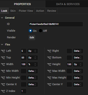
Look properties define the appearance of the widget. The following are the major properties you can set:
- Whether the widget is visible.
- The platforms on which the widget is rendered.
- How the widget aligns with its parent widget and neighboring widgets.
- If the widget displays content, where the content appears.

For descriptions of the properties available on the Look tab of the Properties pane, see Look.
Skin Properties
Skin properties define a skin for the widget, including background color, borders, and shadows. If the widget includes text, you can also specify the text font.
For the PickerView widget, you can apply a skin and its associated properties for the following states:
| Skin | Definition |
|---|---|
| Normal | The default skin of the widget. |
| Focus | The skin applied when the widget has the focus. |
For more information about applying skins, see Understanding Skins and Themes.
PickerView Properties
PickerView properties specify properties that are available on any platform supported by Quantum Visualizer, and assign platform-specific properties.
Master Data
Specifies the values displayed in the PickerView widget.
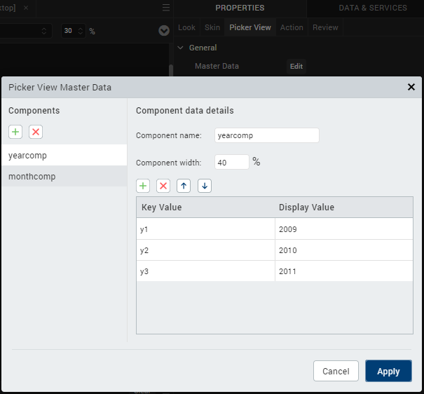
To specify values, click the Edit button to open the PickerView Master Data dialog box.
Specify key and display values for each component in the PickerView. Each component represents a set of data; for example, years and months. You can add a component or a key/value pair by clicking the appropriate + button.
NOTE: The combined component width should total 100 percent.
View Type
For the Android platform, specifies the picker view type.
Default: Flat
The following are the options:
- Flat: The picker appearance is flat.
- Wheel: The picker displays as a wheel.
Enable Cache
For the Windows 8 platform, specifies whether data is cached relative to the PickerView widget.
Default: Off
Actions
Actions define what happens when an event occurs. On a PickerView widget, you can run an action when the following event occurs:
- onSelection: The action is triggered when the component selection changes.
- onTouchStart: The action is triggered when the user touches the touch surface. This event occurs asynchronously.
- onTouchMove: The action is triggered when the touch moves on the touch surface continuously until movement ends. This event occurs asynchronously.
- onTouchEnd: The action is triggered when the user touch is released from the touch surface. This event occurs asynchronously.
For more information, see Add Actions.
Placement Inside a Widget
The following table summarizes where a PickerView widget can be placed:
| Form | Yes |
| HBox | Yes |
| VBox | Yes |
| Scroll Box | Horizontal
Orientation - Yes Vertical Orientation- Yes |
| Tab | Yes |
| Segment | No |
| Popup | Yes |
| Template
|
Header- No Footer- No |
Widget Appearance on Platforms
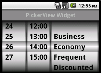
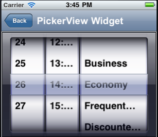
The appearance of the PickerView widget varies as follows
| Platform | Appearance |
|---|---|
| Android |

|
| iOS |

|

