Link - Layout Properties
The layout properties for Link widget are:
- containerWeight
- contentAlignment
- hExpand
- margin
- marginInPixel
- padding
- paddingInPixel
- widgetAlignment
containerWeight
Specifies the percentage of the parent width that should allocated to the widget. The parent widget space is distributed to its child widgets based on this weight factor. All its child widgets should sum up to 100% of width except when placed in kony.ui.ScrollBox.
Syntax
containerWeight
Type
Number
Read/Write
Yes - (Read and Write)
Example
//Defining properties for a link widget with containerWeight:100.
var linkBasic ={id:"link1", skin:"linkSkin", focusSkin:"linkFSkin", text:"Click here", isVisible:true};

var linkLayout={containerWeight:100, padding:[5,5,5,5], margin:[5,5,5,5], paddingInPixel:true, marginInPixel:true, hExpand:true};

var linkPSP = {};

//Creating link widget.
var link1 = new kony.ui.Link(linkBasic, linkLayout, linkPSP);

//Reading containerWeight of Link
alert("Link containerWeight::"+link1.containerWeight);
Accessible from IDE
No
Platform Availability
Available on all platforms
contentAlignment
Specifies the alignment of the text on the Link with respect to its boundaries. A default value CONTENT_ALIGN_CENTER is assigned for all platforms. To choose another alignment, click the drop-down arrow and select the desired alignment. However, to change the default value on a particular platform, select the button next to the drop-down and select respective platform and choose the value.
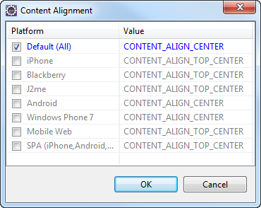
Default: CONTENT_ALIGN_CENTER (the default value for all platforms is center; content is aligned at the center of the button)
The following are the available options:
- CONTENT_ALIGN_TOP_LEFT - Specifies the text should align at top left corner of the button.
- CONTENT_ALIGN_TOP_CENTER - Specifies the text should align at top center of the button.
- CONTENT_ALIGN_TOP_RIGHT- Specifies the text should align at top right of the button.
- CONTENT_ALIGN_MIDDLE_LEFT- Specifies the text should align at middle left of the button.
- CONTENT_ALIGN_CENTER- Specifies the text should align at center of the button.
- CONTENT_ALIGN_MIDDLE_RIGHT- Specifies the text should align at middle right of the button.
- CONTENT_ALIGN_BOTTOM_LEFT- Specifies the text should align at bottom left of the button.
- CONTENT_ALIGN_BOTTOM_CENTER- Specifies the text should align at bottom center of the button.
- CONTENT_ALIGN_BOTTOM_RIGHT - Specifies the text should align at bottom right of the button.
Syntax
contentAlignment
Type
Number
Read/Write
No
Example
//Defining properties for a link widget with contentAlignment:CONTENT_ALIGN_TOP_LEFT
var linkBasic ={id:"link1", skin:"linkSkin", focusSkin:"linkFSkin", text:"Click here", isVisible:true};

var linkLayout={contentAlignment:constants.CONTENT_ALIGN_TOP_LEFT, containerWeight:100, padding:[5,5,5,5], margin:[5,5,5,5], paddingInPixel:true, marginInPixel:true, hExpand:true};

var linkPSP = {};

//Creating link widget.
var link1 = new kony.ui.Link(linkBasic, linkLayout, linkPSP);
Accessible from IDE
Yes
Platform Availability
Available on all platforms
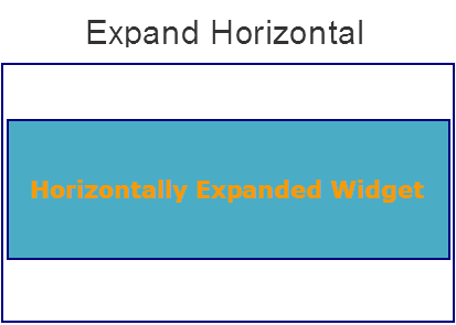
hExpand
Specifies if the widget should occupy all the width available to it.
Default: true
If set to false, the widget occupies the preferred width. The preferred width of a widget is the sum of its contents width, padding and margin.
If set to true, the widget ensures that the entire width available to it, is occupied.
Syntax
hExpand
Type
Boolean
Read/Write
No
Example
//Defining properties for a link widget with hExpand:true.
var linkBasic ={id:"link1", skin:"linkSkin", focusSkin:"linkFSkin", text:"Click here", isVisible:true};

var linkLayout={containerWeight:100, padding:[5,5,5,5], margin:[5,5,5,5], paddingInPixel:true, marginInPixel:true, hExpand:true};

var linkPSP = {};

//Creating link widget.
var link1 = new kony.ui.Link(linkBasic, linkLayout, linkPSP);
Accessible from IDE
Yes
Platform Availability
Available on all platforms except Desktop Web, and SPA
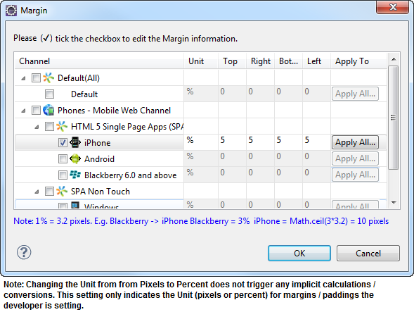
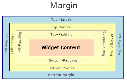
margin
Defines the space around a widget. You can use this option to define the left, top, right, and bottom distance between the widget and the next widget.
To define the margin values for a platform, click the ( ) button against the property to open the Margin screen. Select the checkbox against the platform for which you want to define the margins and enter the top, left, right, and bottom margin values.
If you want to use the margin values set for a platform across other platforms, you can click the Apply To button and select the platforms on which you want the margin values to be applied.
The following image illustrates the window to define the margins for platforms:
The following image illustrates a widget with a defined margin:
Syntax
margin
Type
Array of Numbers
Read/Write
Yes - (Read and Write)
Example
//Defining properties for a link widget with margin:[5,5,5,5].
var linkBasic ={id:"link1", skin:"linkSkin", focusSkin:"linkFSkin", text:"Click here", isVisible:true};

var linkLayout={containerWeight:100, padding:[5,5,5,5], margin:[5,5,5,5], paddingInPixel:true, marginInPixel:true, hExpand:true};

var linkPSP = {};

//Creating link widget.
var link1 = new kony.ui.Link(linkBasic, linkLayout, linkPSP);
Accessible from IDE
Yes
Platform Availability
Available on all platforms.
marginInPixel
Indicates if the margin is to be applied in pixels or in percentage.
Default: false
If set to true, the margins are applied in pixels.
If set to false, the margins are applied as set in margin property.
Syntax
marginInPixel
Type
Boolean
Read/Write
No
Example
//Defining properties for a link widget with marginInPixel:true.
var linkBasic ={id:"link",skin:"linkSkin", focusSkin:"linkFSkin", text:"Click here", isVisible:true};

var linkLayout={containerWeight:100, padding:[5,5,5,5], margin:[5,5,5,5], paddingInPixel:true, marginInPixel:true, hExpand:true};

var linkPSP = {};

//Creating link widget.
var link = new kony.ui.Link(linkBasic, linkLayout, linkPSP);
Accessible from IDE
Yes
Platform Availability
- iPhone
- iPad
- Android
- Windows Phone
- Windows Desktop
padding
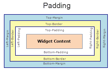
Defines the space between the content of the widget and the widget boundaries. You can use this option to define the top, left, right, and bottom distance between the widget content and the widget boundary.
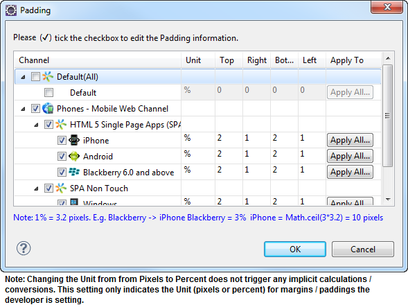
To define the padding values for a platform, click the () button against the property to open the Padding screen. Select the checkbox against the platform for which you want to define the padding's and enter the top, left, right, and bottom padding values.
If you want to use the padding values set for a platform across other platforms, you can click the Apply To button and select the platforms on which you want the padding values to be applied.
The following image illustrates the window to define the padding's for platforms:
The following image illustrates a widget with a defined padding:
Syntax
padding
Type
Array of Numbers
Read/Write
Yes - (Read and Write)
Example
//Defining properties for a link widget with padding:[5,5,5,5].
var linkBasic ={id:"link", skin:"linkSkin", focusSkin:"linkFSkin", text:"Click here", isVisible:true};

var linkLayout={containerWeight:100, padding:[5,5,5,5], margin:[5,5,5,5], paddingInPixel:true, marginInPixel:true, hExpand:true};

var linkPSP = {};

//Creating link widget.
var link = new kony.ui.Link(linkBasic, linkLayout, linkPSP);
Accessible from IDE
Yes
Platform Availability
Available on all platforms except Mobile Web (basic).
paddingInPixel
Indicates if the padding is to be applied in pixels or in percentage.
Default: false
If set to true, the padding are applied in pixels.
If set to false, the padding are applied as set in padding property.
Note: This property can be set to true or false only for iPhone, iPad, Android and Windows Phone. On other platforms this property does not give any results even when set to true.
Note: For backward compatibility on older projects, this property is will be made true for iPhone, iPad, Android and Windows Phone and for other platforms it will be false.
Syntax
paddingInPixel
Type
Boolean
Read/Write
No
Example
//Defining properties for a link widget with paddingInPixel:true.
var linkBasic ={id:"link", skin:"linkSkin", focusSkin:"linkFSkin", text:"Click here", isVisible:true};

var linkLayout={containerWeight:100, padding:[5,5,5,5], margin:[5,5,5,5], paddingInPixel:true, marginInPixel:true, hExpand:true};

var linkPSP = {};

//Creating link widget.
var link = new kony.ui.Link(linkBasic, linkLayout, linkPSP);
Accessible from IDE
Yes
Platform Availability
- iPhone
- iPad
- Android
- Windows Phone
- Windows Desktop
widgetAlignment
Indicates how a widget is to be anchored with respect to its parent. Each of these below options have a horizontal alignment attribute and a vertical alignment attribute. For example, WIDGET_ALIGN_TOP_LEFT specifies the vertical alignment as TOP and horizontal alignment as LEFT.
Horizontal alignment attributes are only applicable if hExpand is false.
Default: WIDGET_ALIGN_CENTER
The widget alignment can be controlled by the below options:
- WIDGET_ALIGN_TOP_LEFT - (BlackBerry 10 supports this option)
- WIDGET_ALIGN_TOP_CENTER
- WIDGET_ALIGN_TOP_RIGHT
- WIDGET_ALIGN_MIDDLE_LEFT
- WIDGET_ALIGN_CENTER - (BlackBerry 10 supports this option)
- WIDGET_ALIGN_MIDDLE_CENTER
- WIDGET_ALIGN_MIDDLE_RIGHT
- WIDGET_ALIGN_BOTTOM_LEFT
- WIDGET_ALIGN_BOTTOM_CENTER
- WIDGET_ALIGN_BOTTOM_RIGHT - (BlackBerry 10 supports this option)
Syntax
widgetAlignment
Type
Number
Read/Write
No
Example
//Defining properties for a link widget with widgetAlignment:constants.WIDGET_ALIGN_TOP_LEFT.
var linkBasic ={id:"link", skin:"linkSkin",focusSkin:"linkFSkin", text:"Click here",isVisible:true};

var linkLayout={widgetAlignment:constants.WIDGET_ALIGN_TOP_LEFT, contentAlignment:constants.CONTENT_ALIGN_TOP_LEFT, containerWeight:100, padding:[5,5,5,5], margin:[5,5,5,5], hExpand:true};

var linkPSP = {};

//Creating link widget.
var link = new kony.ui.Link(linkBasic, linkLayout, linkPSP);
Accessible from IDE
Yes
Platform Availability
Available on all platforms

| prem | Copyright © 2012 Kony, Inc. All rights reserved. |
| prem | Copyright © 2012 Kony, Inc. All rights reserved. |