CollectionView Properties
The properties for the CollectionView widget are:
 accessibilityConfig Property
Enables you to control accessibility behavior and alternative text for the widget.
For more information on using accessibility features in your app, refer Accessibility appendix.
Syntax
accessibilityConfig
Type
Object
Read/Write
Read + Write
Remarks
The accessibilityConfig property is enabled for all the widgets which are supported under the Flex Layout.
The accessibilityConfig property is a JavaScript object which can contain the following key-value pairs.
a11yLabel [String]
Optional. Specifies alternate text to identify the widget. Generally the label should be the text that is displayed on the screen.
a11yValue [String]
Optional. Specifies the current state/value associated with the widget so that the user can perform an action. For example, a checkbox is in selected state or unselected state. On the Android platform, the text specified for a11yLabel is prefixed to the a11yValue.
a11yHint [String]
Optional. Specifies the descriptive text that explains the action associated with the widget. On the Android platform, the text specified for a11yValue is prefixed to the a11yHint.
a11yHidden [Boolean]
Optional. Specifies if the widget should be ignored by assistive technology. The default option is set to false. This option is supported on iOS 5.0 and above, Android 4.1 and above, and SPA
Android limitations
- If the results of the concatenation of a11y fields result in an empty string, then accessibilityConfig is ignored and the text that is on widget is read out.
- The soft keypad does not gain accessibility focus during the right/left swipe gesture when the keypad appears.
SPA/Desktop Web limitations
- The behavior of accessibility depends on the Web browser, Web browser version, Voice Over Assistant, and Voice Over Assistant version.
- Currently SPA/Desktop web applications support only a few ARIA tags. To achieve more accessibility features, use the attribute a11yARIA. The corresponding tags will be added to the DOM as per these configurations.
Example
This example uses the button widget, but the principle remains the same for all widgets that have an accessibilityConfig property.
//This is a generic property that is applicable for various widgets.
//Here, we have shown how to use the accessibilityConfig Property for button widget.
/*You need to make a corresponding use of the accessibilityConfig property for other applicable widgets.*/

Form1.myButton.accessibilityConfig = {
    "a11yLabel": "Label",
    "a11yValue": "Value",
    "a11yHint": "Hint"
};
Platform Availability
- Available in the IDE
- iOS, Android, SPA, and Desktop Web
blockedUISkin Property
Specifies the skin that must be used to block the interface until the action in progress (for example, a service call) is completed.
Syntax
blockedUISkin
Type
String
Read/Write
Read + Write
Remarks
The default value for this property is none.
To specify a skin, select a skin from the list.
For the skin to be available in the list, you must add a skin for blockedUISkin under Widget Skins.
Example
//Sample code to define the blockedUISkin property for a CollectionView Widget.
frmCollection.myCollection.blockedUISkin="blockUiSkn";
Platform Availability
- iOS
- Android
- Windows 10
- SPA
bottom Property
This property determines the bottom edge of the widget and is measured from the bottom bounds of the parent container.
The bottom property determines the position of the bottom edge of the widget’s bounding box. The value may be set using DP (Device Independent Pixels), Percentage, or Pixels. In freeform layout, the distance is measured from the bottom edge of the parent container. In flow-vertical layout, the value is ignored. In flow-horizontal layout, the value is ignored.
The bottom property is used only if the Height property is not provided.
Syntax
bottom
Type
String
Read/Write
Read + Write
Remarks
The property determines the bottom edge of the widget and is measured from the bottom bounds of the parent container.
If the layoutType is set as kony.flex.FLOW_VERTICAL, the bottom property is measured from the top edge of bottom sibling widget. The vertical space between two widgets is measured from bottom of the top sibling widget and the top of the bottom sibling widget.
Example
//Sample code to set the bottom property for widgets by using DP, Percentage and Pixels.
frmHome.widgetID.bottom = "50dp";

frmHome.widgetID.bottom = "10%";

frmHome.widgetID.bottom = "10px";
Platform Availability
- Available in the IDE
- iOS, Android, Windows, SPA , and Desktop Web
centerX Property
This property determines the center of a widget measured from the left bounds of the parent container.
The centerX property determines the horizontal center of the widget’s bounding box. The value may be set using DP (Device Independent Pixels), Percentage, or Pixels. In freeform layout, the distance is measured from the left edge of the parent container. In flow-vertical layout, the distance is measured from the left edge of the parent container. In flow-horizontal layout, the distance is measured from the right edge of the previous sibling widget in the hierarchy.
Syntax
centerX
Type
String
Read/Write
Read + Write
Remarks
If the layoutType is set as kony.flex.FLOW_HORIZONTAL, the centerX property is measured from right edge of the left sibling widget.
Example
//Sample code to set the centerX property for widgets by using DP, Percentage and Pixels.
frmHome.widgetID.centerX = "50dp";

frmHome.widgetID.centerX = "10%";

frmHome.widgetID.centerX = "10px";
Platform Availability
- Available in the IDE
- iOS, Android, Windows, SPA, and Desktop Web
centerY Property
This property determines the center of a widget measured from the top bounds of the parent container.
The centerY property determines the vertical center of the widget’s bounding box. The value may be set using DP (Device Independent Pixels), Percentage, or Pixels. In freeform layout, the distance is measured from the top edge of the parent container. In flow-horizontal layout, the distance is measured from the top edge of the parent container. In flow-vertical layout, the distance is measured from the bottom edge of the previous sibling widget in the hierarchy.
Syntax
centerY
Type
String
Read/Write
Read + Write
Remarks
If the layoutType is set as kony.flex.FLOW_VERTICAL, the centerY property is measured from bottom edge of the top sibling widget.
Example
//Sample code to set the centerY property for widgets by using DP, Percentage and Pixels.
frmHome.widgetID.centerY = "50dp";

frmHome.widgetID.centerY = "10%";

frmHome.widgetID.centerY = "10px";
Platform Availability
- Available in the IDE
- iOS, Android, Windows, SPA, and Desktop Web
contentOffset Property
This property returns the current coordinates of the top left corner of the scrollable region in the item.
Syntax
contentOffset
Type
JavaScript Object
Read/Write
Read + Write
Remarks
Returns the following key:value pairs:
{x:valueInDP, y:valueInDP}
The values are numbers that represent device pixels (DP).
For android this property is disabled if any templates are marked as autogrow.
Example
Form1.widgetID.contentOffset = {
    "x": "3dp",
    "y": "4dp"
};
Platform Availability
- Available in the IDE
- iOS, Android, and Windows 10
contentOffsetMeasured Property
This property returns the current coordinates of the top left corner of the scrollable region in the item.
Syntax
contentOffsetMeasured
Type
JavaScript Object
Read/Write
Read only
Remarks
Returns the following key:value pairs:
{x:valueInDP, y:valueInDP}
The values are numbers that represent device pixels (DP).
For android this property is disabled if any templates are marked as autogrow.
Example
var offset = frmHome.coll.contentOffsetMeasured;
kony.print("contentOffsetMeasured:" + frmHome.coll.contentOffsetMeasured);
Platform Availability
- iOS
- Android
- Windows 10
contentSize Property
This property specifies the size of the scrollable area in the widget. Collection view items will appear in this area.
Syntax
contentSize
Type
JavaScript object
Read/Write
Read + Write
Remarks
This property is only used for kony.collectionview.LAYOUT_CUSTOM.
The object contains two key-value pairs:
- width in dp
- height in dp
If this value is not given, the scrollable area is determined by the actual contents in collection view.
The items are laid out according to flex layout rules.
Example
frmHome.coll.contentSize = {
    "width": "200dp",
    "height": "100dp"
};
Platform Availability
- iOS
- Android
- Windows 10
- SPA
contextMenu Property
A context menu is a menu that appears upon clicking a widget.
Syntax
contextMenu
Type
Array (kony.ui.MenuItem)
Read/Write
Read + Write
Remarks
A context menu typically offers a limited set of choices that are applicable for that widget. Usually these choices are actions, related to the widget.
If you define a context menu for a widget, the steps involved to invoke the context menu on a platform and the appearance of the context menu varies.
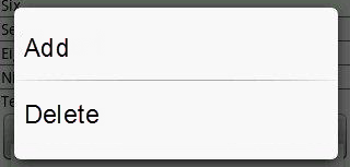
The following are the characteristics of a context menu on Android platform:
- You can invoke the context menu by a long press on the widget.
- The menu items are displayed as text (no support for icons).
- There is no support for sub-menus in a context menu.
The following image illustrates the context menu on Android platform:
Example
//Sample code to define contextMenu property for a CollectionView widget.

var appMenu1 = {
 id: "appmenuitemid1",
 text: "Add",
 image: "tc.png",
 onclick: callbackMenuItem1
};

var appMenu2 = {
 id: "appmenuitemid2",
 text: "Remove",
 image: "tc.png",
 onclick: callbackMenuItem2
};

var appMenu3 = {
 id: "appmenuitemid3",
 text: "Edit",
 image: "tc.png",
 onclick: callbackMenuItem3
};

var appMenu4 = {
 id: "appmenuitemid4",
 text: "Close",
 image: "tc.png",
 onclick: callbackMenuItem4
};

function callbackMenuItem1() {
 kony.print("Clicked on First menu item");
}

function callbackMenuItem2() {
 kony.print("Clicked on Second menu item");
}

function callbackMenuItem3() {
 kony.print("Clicked on Third menu item");
}

function callbackMenuItem4() {
 kony.print("Clicked on Fourth menu item");
}

frmCollection.myCollection.contextMenu = [appMenu1, appMenu2, appMenu3, appMenu4];
Note: On Android platform, the image icon, separator, and submenu properties are not supported.
Platform Availability
- iOS
- Android
- Windows 10
- SPA
cursorType Property
In Desktop Web applications, when you hover the mouse over any widget, a pointer appears. Using the cursorType property, you can specify the type of the mouse pointer in Visualizer.
Syntax
cursorType
Type
String.
You must provide a valid CSS cursor values such as wait, grab, help, etc. to the cursorType property.
Read/Write
Read + Write
Example
 //This is a generic property and is applicable for many widgets.

/*The example provided is for the Button widget. Make the required changes in the example while using other widgets.*/

frmButton.myButton.cursorType = "wait";
Platform Availability
- Desktop Web
data Property
Specifies the set of values for each item.
Syntax
data
Array
Read/Write
Read Only
Remarks
The data is categorized into Sections and items. The Sections information is optional. You can set the data in three different formats.
- Format1: Set the data without any sections.
- Format 2: Set the data with sections where section header is a name.
- Format 3: Set the data with sections where header is driven by template.
The below table explains the type and description of template key:
| Key |
Key | Type | Comments |
| template | Not Applicable |
JavaScript: Object |
Indicates the template to be used for the specific item |
Example
//Sample code to define data property for a CollectionView widget.
frmCollection.myCollection.data = [{
 "dataId1": "data1",
 "dataId2": "data2",
 "dataId3": "data3",
 "accessibilityConfig": "acObject"
}, {
 "dataId1": "datax",
 "dataId2": "datay",
 "dataId3": "dataz",
 "template": "box1",
 "accessibilityConfig": "acObject"
}];
Example of Format 1
[{
    "dataId1": "foo",
    "dataId2": "foo",
    "dataId3": "foo",
    "accessibilityConfig": "acObject"
}, {
    "dataId1": "bar",
    "dataId2": "bar",
    "dataId3": "bar",
    "template": "boxRef2",
    "accessibilityConfig": "acObject"
}, {
    "dataId1": "bar",
    "dataId2": "bar",
    "dataId3": {
        "isVisible" :true,
      "skin" : "nskin",
      "focusSkin": "fskin",
      "text" : "Foo"
    },
    "accessibilityConfig": "acObject"
}]
In the above example, template is the standard key which can be optionally to override the common itemTemplate provided with a specific template for the item. For template always the value has to be valid box reference, if not it falls back to the common itemTemplate. mentainfo is another standard key which can be used to specify meta information about the item. in iOS the specific standard parameter that metainfo can support isselectable.
In the above examples, the values of dataId1, dataId2 are shown as string, but dataId3 is key value pair. The key value pair format allows you to set the properties specific to the widget. In the above example, we are setting the isVisible property to ture and text property to "Foo", skin property with ID nskin and focusSkin to a skin with ID fskin. If a string is provided, typically is mapped to the text property for button and labels and the src property for the image.
Example of Format 2
/*set the data with sections where section header is a name.
This example has two sections and each section with two rows.*/
[
    ["section1", [{
        "dataId1": "foo",
        "dataId2": "foo",
        "dataId3": "foo",
        "accessibilityConfig": "acObject"
    }, {
        "dataId1": "bar",
        "dataId2": "bar",
        "dataId3": "bar",
        "accessibilityConfig": "acObject"
    }], "acObject"],
    ["section2", [{
        "dataId1": "foo",
        "dataId2": "foo",
        "dataId3": "foo",
        "accessibilityConfig": "acObject"
    }, {
        "dataId1": "bar",
        "dataId2": "bar",
        "dataId3": "bar",
        "accessibilityConfig": "acObject"
    }], "acObject"]
]
Example of Format 3
/*set the data with sections where section header driven by template. This example has two sections and each section with two rows.*/
[
    [{
            "secDataId1": "",
            "secDataId2": "",
            "template": "secHeaderBoxRef2",
            "accessibilityConfig": "acObject"
        },
        [{
            "dataId1": "foo",
            "dataId2": "foo",
            "dataId3": "foo",
            "accessibilityConfig": "acObject"
        }, {
            "dataId1": "bar",
            "dataId2": "bar",
            "dataId3": "bar",
            "accessibilityConfig": "acObject"
        }]
    ],
    [{
            "secDataId1": "",
            "secDataId2": "",
            "template": "secHeaderBoxRef2",
            "accessibilityConfig": "acObject"
        },
        [{
            "dataId1": "foo",
            "dataId2": "foo",
            "dataId3": "foo",
            "accessibilityConfig": "acObject"
        }, {
            "dataId1": "bar",
            "dataId2": "bar",
            "dataId3": "bar",
            "accessibilityConfig": "acObject"
        }]
    ]
]
Platform Availability
- iOS
- Android
- Windows 10
- SPA
enableCache Property
The property enables you to improve the performance of Positional Dimension Animations.
Syntax
enableCache
Type
Boolean
Read/Write
Read + Write
Remarks
The default value for this property is true.
Note: When the property is used, application consumes more memory. The usage of the property enables tradeoff between performance and visual quality of the content. Use the property cautiously.
Example
Form1.widgetID.enableCache = true;
Platform Availability
- Available in the IDE.
- Windows
height Property
It determines the height of the widget and measured along the y-axis.
The height property determines the height of the widget’s bounding box. The value may be set using DP (Device Independent Pixels), Percentage, or Pixels. For supported widgets, the height may be derived from either the widget or container’s contents by setting the height to “preferred”.
Syntax
height
Type
Number, String, and Constant
Read/Write
Read + Write
Remarks
Following are the available measurement options:
- %: Specifies the values in percentage relative to the parent dimensions.
- px: Specifies the values in terms of device hardware pixels.
- dp: Specifies the values in terms of device independent pixels.
- default: Specifies the default value of the widget.
- kony.flex.USE_PREFERED_SIZE: When this option is specified, the layout uses preferred height of the widget as height and preferred size of the widget is determined by the widget and may varies between platforms.
Example
//Sample code to set the height property for widgets by using DP, Percentage and Pixels.
frmHome.CollectionView1.height = "50dp";

frmHome.CollectionView1. height = "10%";

frmHome.CollectionView1. height = "10px";
Platform Availability
- iOS
- Android
- Windows 10
- SPA
id Property
A unique identifier of Segment consisting of alpha numeric characters. Every Segment should have a unique id within a Form.
Syntax
id
Type
String
Read/Write
Read only
Example
//Defining the properties for an item with id:"ItemId".

var itemBasic = {
    id: "segment",
    isVisible: true,
    widgetSkin: "widSkin",
    itemSkin: "itemSkn",
    itemFocusSkin: "itemFSkn",
    sectionHeaderSkin: "secHSkin",
    widgetDataMap: {
        widgetId1: "dataid1",
        widgetId2: "dataId2",
        widgetId3: "dataId3",
        widgetId4: "secDataId1",
        widgetId5: "secDataId2"
    },
    itemTemplate: box1
};
var itemLayout = {
    padding: [5, 5, 5, 5],
    margin: [5, 5, 5, 5],
    containerWeight: 100
};
var itemPSP = {};

//Creating the CollectionView.
var item = new kony.ui.collectionview(itemBasic, itemLayout, itemPSP);

//Reading the id of the CollectionView.
alert("CollectionView Id ::" + item.id);
Platform Availability
- iOS
- Android
- Windows 10
- SPA
info Property
A custom JSObject with the key value pairs that a developer can use to store the context with the widget.
Syntax
info
Type
JSObject
Read/Write
Read + Write
Remarks
This will help in avoiding the globals to most part of the programming.
This is a non-Constructor property. You cannot set this property through widget constructor. But you can read and write data to it.
Info property can hold any JSObject. After assigning the JSObject to info property, the JSObject should not be modified.
Example
//Sample code to set info property for a CollectionView widget

frmCollection.myCollection.info = {
    key: "segmentobjects"
};

//Reading the info of the CollectionView widget.
kony.print("CollectionView Widget info ::" +frmCollection.myCollection.info);
Platform Availability
- iOS
- Android
- Windows 10
- SPA
isMaster Property
Specifies whether the container is a master container.
Syntax
isMaster
Type
Boolean
Read/Write
Read Only after initialization.
Remarks
If the isMaster property is true, the current widget is a master container and all of the rules and limitations of master containers apply to it. For more information, please see Masters in the Overviews section of this guide, as well as Using Masters in the Kony Visualizer User Guide.
Your app can set the isMaster property in this container's constructor. After that, this property is read-only.
Example
var isMasterContainer = frmCollection.myCollection.isMaster;
Platform Availability
- iOS
- Android
- Windows 10
- SPA
isVisible Property
This property controls the visibility of a widget on the form.
Syntax
isVisible
Type
Boolean
Read/Write
Read + Write
Remarks
The default value for this property is true.
If set to false, the widget is not displayed.
If set to true, the widget is displayed.
Example
//Sample code to set isVisible property for a CollectionView widget
frmCollection.myCollection.isVisible=true;
Note: You can set the visibility of a widget dynamically from code using the setVisibility method.
Platform Availability
- iOS
- Android
- Windows 10
- SPA
itemSelectedSkin Property
Specifies the skin that must be applied when user selects the item.
Syntax
itemSelectedSkin
Type
String
Read/Write
Read + Write
Example
//Sample code to set itemSelectedSkin property for a CollectionView widget
frmCollection.myCollection.itemSelectedSkin="itemFSkn";
Platform Availability
- iOS
- Android
- Windows 10
- SPA
itemSkin Property
The default skin for each item.
Syntax
itemSkin
Type
String
Read/Write
Read + Write
Remarks
This skin will be overridden is a skin is specified in the item template, or in item data.
Example
//Sample code to set itemSkin property for a CollectionView widget
frmCollection.myCollection.itemSkin="itemSkn";
Platform Availability
- iOS
- Android
- Windows
- SPA
itemTemplate Property
Indicates the common template to be used for each item while creating the item and filling the data.
Syntax
itemTemplate
Type
kony.ui.FlexContainer
Read/Write
Read + Write
Remarks
This can be overridden at the item level when setting the data using the template key. Only a FlexContainer can be used here.
On iOS platform, when a FlexContainer is used as a template for CollectionView, the below properties are not applicable:
- left
- right
- centerX
- centerY
- minWidth
- maxWidth
- minHeight
- maxHeight
Note: If you are switching between the templates of the item, ensure that the widgetDataMap property is defined after the itemtemplate is set. The mapping of the widgets needs to be refreshed after setting the template on a item.
Example
//Sample code to set itemTemplate property for a CollectionView widget.
/*Here, flexContainerTemplate, is the template that is assigned to the myCollection CollectionView widget.*/
frmCollection.myCollection.itemTemplate=flexContainerTemplate;
Platform Availability
- iOS
- Android
- Windows 10
- SPA
layout Property
This property determines how the items get arranged within the CollectionView widget.
Syntax
layout
Type
Constant
Read/Write
Read + Write
Remarks
The value is a constant using one of the following values:
- kony.collectionview.LAYOUT_HORIZONTAL. (Default). Items are laid out horizontally and wrap at the widget frame's boundary. The view scrolls vertically and scrollable area is determined by the underlying control so that all items fit.
- kony.collectionview.LAYOUT_VERTICAL. Items are laid out vertically and wrap at the widget frame's boundary. The view scrolls horizontally and scrollable area is decided by the underlying control so that all items fit.
- kony.collectionview.LAYOUT_CUSTOM. ContentSize is set to define the scrollable area. Items are laid out according to flex layout rules.
Platform Availability
- iOS
- Android
- Windows 10
- SPA
maxHeight Property
This property specifies the maximum height of the widget and is applicable only when the height property is not specified.
The maxHeight property determines the maximum height of the widget’s bounding box. The value may be set using DP (Device Independent Pixels), Percentage, or Pixels. The maxHeight value overrides the preferred, or “autogrow” height, if the maxHeight is less than the derived content height of the widget.
Syntax
maxHeight
Type
Number
Read/Write
Read + Write
Example
//Sample code to set the maxHeight property for widgets by using DP, Percentage and Pixels.
frmHome.widgetID.maxHeight = "50dp";

frmHome.widgetID.maxHeight = "10%";

frmHome.widgetID.maxHeight = "10px";
Platform Availability
- Available in the IDE
- iOS, Android, Windows, SPA, and Desktop Web
maxWidth Property
This property specifies the maximum width of the widget and is applicable only when the width property is not specified.
The Width property determines the maximum width of the widget’s bounding box. The value may be set using DP (Device Independent Pixels), Percentage, or Pixels. The maxWidth value overrides the preferred, or “autogrow” width, if the maxWidth is less than the derived content width of the widget.
Syntax
maxWidth
Type
Number
Read/Write
Read + Write
Example
//Sample code to set the maxWidth property for widgets by using DP, Percentage and Pixels.
frmHome.widgetID.maxWidth = "50dp";

frmHome.widgetID.maxWidth = "10%";

frmHome.widgetID.maxWidth = "10px";
Platform Availability
- Available in the IDE
- iOS, Android, Windows, SPA, and Desktop Web
minHeight Property
This property specifies the minimum height of the widget and is applicable only when the height property is not specified.
The minHeight property determines the minimum height of the widget’s bounding box. The value may be set using DP (Device Independent Pixels), Percentage, or Pixels. The minHeight value overrides the preferred, or “autogrow” height, if the minHeight is larger than the derived content height of the widget.
Syntax
minHeight
Type
Number
Read/Write
Read + Write
Example
//Sample code to set the minHeight property for widgets by using DP, Percentage and Pixels.
frmHome.widgetID.minHeight = "50dp";

frmHome.widgetID.minHeight = "10%";

frmHome.widgetID.minHeight = "10px";
Platform Availability
- Available in the IDE
- iOS, Android, Windows, SPA, and Desktop Web
minItemSpace Property
This property specifies the minimum spacing between items.
Syntax
minItemSpace
Type
String
Read/Write
Read + Write
Remarks
All units, such as DP, %, PX are supported.
This property is only supported at the widget level. It can not be overridden.
Platform Availability
- iOS
- Android
- Windows
- SPA
minLineSpace Property
This property specifies the minimum spacing between lines of items.
Syntax
minLineSpace
Type
String
Read/Write
Read + Write
Remarks
All units, such as DP, %, PX are supported.
This property is only supported at the widget level. It can not be overridden.
Platform Availability
- iOS
- Android
- Windows
- SPA
minWidth Property
This property specifies the minimum width of the widget and is applicable only when the width property is not specified.
The minWidth property determines the minimum width of the widget’s bounding box. The value may be set using DP (Device Independent Pixels), Percentage, or Pixels. The minWidth value overrides the preferred, or “autogrow” width, if the minWidth is larger than the derived content width of the widget.
Syntax
minWidth
Type
Number
Read/Write
Read only
Example
//Sample code to set the minWidth property for widgets by using DP, Percentage and Pixels.
frmHome.widgetID.minWidth = "50dp";

frmHome.widgetID.minWidth = "10%";

frmHome.widgetID.minWidth = "10px";
Platform Availability
- Available in the IDE
- iOS, Android, Windows, SPA, and Desktop Web
opacity Property
Specifies the opacity of the widget. The value of this property must be in the range 0.0 (transparent) to 1.0 (opaque). Any values outside this range are fixed to the nearest minimum or maximum value.
Specifies the opacity of the widget. Valid opacity values range from 0.0 (transparent), to 1.0 (opaque). Values set to less than zero will default to zero. Values more than 1.0 will default to 1. Interaction events set on a transparent widget will still be fired. To disable the events, also set the “isVisible” property to “false”.
Syntax
opacity
Type
Number
Read/Write
Read + Write
Remarks
Note: This property has more priority compared to the values coming from the configured skin.
Example
//Sample code to make the widget transparent by using the opacity property.
frmHome.widgetID.opacity = 0;

//Sample code to make the widget opaque by using the opacity property.
frmHome.widgetID.opacity = 1;
Platform Availability
- Not available in the IDE.
- iOS, Android, Windows, SPA, and Desktop Web
parent Property
Gives you the ability to access the parent of the widget.
Syntax
parent
Read/Write
Read only
Remarks
If the widget is not part of the widget hierarchy, then this property returns null.
This property works for all the widgets whether they are placed inside a FlexContainer or Form.
Platform Availability
- iOS
- Android
- Windows 10
- SPA
pressedSkin Property
Specifies the skin to indicate that an item of the collection is pressed or clicked.
Syntax
pressedSkin
Type
String
Read/Write
Read + Write
Remarks
If you do not specify the pressedSkin, the itemFocusSkin is applied.
Example
//Sample code to set pressedSkin property for a CollectionView widget
frmCollection.myCollection.pressedSkin="pressedSkn";
Platform Availability
- Android
pullToRefreshView Property
Displays a Flex Container above the content area of the CollectionView widget when the widget is pulled down from the top.
Syntax
pullToRefreshView
Type
A Flex Container reference
Read/Write
Read + Write
Remarks
This property is valid only in horizontal and vertical layouts.
In the horizontal layout:
- The width of the view is set to collectionview's width
- Height is based on the height configured for the widget. If not given, 50dp is the default
- The view is docked at the extreme beginning or end of the collection view
In case of vertical layout:
- The height of the view is set to collectionview's height
- Width is based on the width configured for the widget. If not given, 50dp is the default
- The view is docked at the extreme beginning or end of the collection view
Example
var fc = kony.ui.FlexContainer({
    "id": "myc"
}, {}, {});

collview.pullToRefreshView = fc;
Platform Availability
- iOS
- Android
- Windows 10
- SPA
pushToRefreshView Property
Displays a Flex Container below the content area of the CollectionView widget when the widget is pushed up from the bottom.
Syntax
pushToRefreshView
Type
A Flex Container reference
Read/Write
Read + Write
Remarks
This property is valid only in horizontal and vertical layouts.
In case of horizontal layout:
- The width of the view is set to collectionview's width
- Height is based on the height configured for the widget. If not given, 50dp is the default
- The view is docked at the extreme beginning or end of the collection view
In case of vertical layout:
- The height of the view is set to collectionview's height
- Width is based on the width configured for the widget. If not given, 50dp is the default
- The view is docked at the extreme beginning or end of the collection view
Example
var fc = kony.ui.FlexContainer({
    "id": "myc"
}, {}, {});

collview.pushToRefreshView = fc;
Platform Availability
- iOS
- Android
- Windows 10
- SPA
releaseToPullRefreshView Property
Displays a Flex Container above the content area of the CollectionView widget when the widget is pulled down from the top and then released.
Syntax
releaseToPullRefreshView
Type
A Flex Container reference
Read/Write
Read + Write
Remarks
This property is valid only in horizontal and vertical layouts.
In case of horizontal layout:
- The width of the view is set to collectionview's width
- Height is based on the height configured for the widget. If not given, 50dp is the default
- The view is docked at the extreme beginning or end of the collection view
In case of vertical layout:
- The height of the view is set to collectionview's height
- Width is based on the width configured for the widget. If not given, 50dp is the default
- The view is docked at the extreme beginning or end of the collection view
The height of the Flex Container must be set to match the height of the Flex Container in pullToRefreshView .
Replaces pullToRefreshView when the client area of the CollectionView has been pulled enough to trigger the onPull callback.
Example
var fc = kony.ui.FlexContainer({
    "id": "myc"
}, {}, {});

collview.releaseToPullRefreshView = fc;
Platform Availability
- iOS
- Android
- Windows 10
- SPA
releaseToPushRefreshView Property
Displays a Flex Container below the content area of the CollectionView widget when the widget is pushed up from the bottom and released.
Syntax
releaseToPushRefreshView
Type
A Flex Container reference
Read/Write
Read + Write
Remarks
This property is valid only in horizontal and vertical layouts.
In case of horizontal layout:
- The width of the view is set to collectionview's width
- Height is based on the height configured for the widget. If not given, 50dp is the default
- The view is docked at the extreme beginning or end of the collection view
In case of vertical layout:
- The height of the view is set to collectionview's height
- Width is based on the width configured for the widget. If not given, 50dp is the default
- The view is docked at the extreme beginning or end of the collection view
The height of the Flex Container must be set to match the height of the Flex Container in pushToRefreshView.
Replaces pushToRefreshView when the client area of the CollectionView has been pushed enough to trigger the onPush callback.
Example
var fc = kony.ui.FlexContainer({
    "id": "myc"
}, {}, {});

collview.releaseToPushRefreshView = fc;
Platform Availability
- iOS
- Android
- Windows 10
- SPA
retainContentAlignment Property
This property is used to retain the content alignment property value, as it was defined.
Note: Locale-level configurations take priority when invalid values are given to this property, or if it is not defined.
The mirroring widget layout properties should be defined as follows.
function getIsFlexPositionalShouldMirror(widgetRetainFlexPositionPropertiesValue) {
    return (isI18nLayoutConfigEnabled &&
    localeLayoutConfig[defaultLocale]
    ["mirrorFlexPositionalProperties"] == true &&
    !widgetRetainFlexPositionPropertiesValue);
}
The following table illustrates how widgets consider Local flag and Widget flag values.
| Properties | Local Flag Value | Widget Flag Value | Action |
|---|---|---|---|
| Mirror/retain FlexPositionProperties | true | true | Use the designed layout from widget for all locales. Widget layout overrides everything else. |
| Mirror/retain FlexPositionProperties | true | false | Use Mirror FlexPositionProperties since locale-level Mirror is true. |
| Mirror/retain FlexPositionProperties | true | not specified | Use Mirror FlexPositionProperties since locale-level Mirror is true. |
| Mirror/retain FlexPositionProperties | false | true | Use the designed layout from widget for all locales. Widget layout overrides everything else. |
| Mirror/retain FlexPositionProperties | false | false | Use the Design/Model-specific default layout. |
| Mirror/retain FlexPositionProperties | false | not specified | Use the Design/Model-specific default layout. |
| Mirror/retain FlexPositionProperties | not specified | true | Use the designed layout from widget for all locales. Widget layout overrides everything else. |
| Mirror/retain FlexPositionProperties | not specified | false | Use the Design/Model-specific default layout. |
| Mirror/retain FlexPositionProperties | not specified | not specified | Use the Design/Model-specific default layout. |
Syntax
retainContentAlignment
Type
Boolean
Read/Write
No (only during widget-construction time)
Example
//This is a generic property that is applicable for various widgets.
//Here, we have shown how to use the retainContentAlignment property for Button widget.
/*You need to make a corresponding use of the
retainContentAlignment property for other applicable widgets.*/
var btn = new kony.ui.Button({
    "focusSkin": "defBtnFocus",
    "height": "50dp",
    "id": "myButton",
    "isVisible": true,
    "left": "0dp",
    "skin": "defBtnNormal",
    "text": "text always from top left",
    "top": "0dp",
    "width": "260dp",
    "zIndex": 1
}, {
    "contentAlignment": constants.CONTENT_ALIGN_TOP_LEFT,
    "displayText": true,
    "padding": [0, 0, 0, 0],
    "paddingInPixel": false,
    "retainFlexPositionProperties": false,
    "retainContentAlignment": true
}, {});
Platform Availability
- Available in IDE
- Windows 10, iOS, Android, and SPA
retainFlexPositionProperties Property
This property is used to retain flex positional property values as they were defined. The flex positional properties are left, right, and padding.
Note: Locale-level configurations take priority when invalid values are given to this property, or if it is not defined.
The mirroring widget layout properties should be defined as follows.
function getIsFlexPositionalShouldMirror(widgetRetainFlexPositionPropertiesValue) {
    return (isI18nLayoutConfigEnabled &&
    localeLayoutConfig[defaultLocale]
    ["mirrorFlexPositionalProperties"] == true &&
    !widgetRetainFlexPositionPropertiesValue);
}
The following table illustrates how widgets consider Local flag and Widget flag values.
| Properties | Local Flag Value | Widget Flag Value | Action |
|---|---|---|---|
| Mirror/retain FlexPositionProperties | true | true | Use the designed layout from widget for all locales. Widget layout overrides everything else. |
| Mirror/retain FlexPositionProperties | true | false | Use Mirror FlexPositionProperties since locale-level Mirror is true. |
| Mirror/retain FlexPositionProperties | true | not specified | Use Mirror FlexPositionProperties since locale-level Mirror is true. |
| Mirror/retain FlexPositionProperties | false | true | Use the designed layout from widget for all locales. Widget layout overrides everything else. |
| Mirror/retain FlexPositionProperties | false | false | Use the Design/Model-specific default layout. |
| Mirror/retain FlexPositionProperties | false | not specified | Use the Design/Model-specific default layout. |
| Mirror/retain FlexPositionProperties | not specified | true | Use the designed layout from widget for all locales. Widget layout overrides everything else. |
| Mirror/retain FlexPositionProperties | not specified | false | Use the Design/Model-specific default layout. |
| Mirror/retain FlexPositionProperties | not specified | not specified | Use the Design/Model-specific default layout. |
Syntax
retainFlexPositionProperties
Type
Boolean
Read/Write
No (only during widget-construction time)
Example
//This is a generic property that is applicable for various widgets.
//Here, we have shown how to use the retainFlexPositionProperties property for Button widget.
/*You need to make a corresponding use of the
retainFlexPositionProperties property for other applicable widgets.*/
var btn = new kony.ui.Button({
    "focusSkin": "defBtnFocus",
    "height": "50dp",
    "id": "myButton",
    "isVisible": true,
    "left": "0dp",
    "skin": "defBtnNormal",
    "text": "always left",
    "top": "0dp",
    "width": "260dp",
    "zIndex": 1
}, {
    "contentAlignment": constants.CONTENT_ALIGN_CENTER,
    "displayText": true,
    "padding": [0, 0, 0, 0],
    "paddingInPixel": false,
    "retainFlexPositionProperties": true,
    "retainContentAlignment": false
}, {});
Platform Availability
- Available in IDE
- Windows 10, iOS, Android, and SPA
retainFlowHorizontalAlignment Property
This property is used to convert Flow Horizontal Left to Flow Horizontal Right.
Note: Locale-level configurations take priority when invalid values are given to this property, or if it is not defined.
The mirroring widget layout properties should be defined as follows.
function getIsFlexPositionalShouldMirror(widgetRetainFlexPositionPropertiesValue) {
    return (isI18nLayoutConfigEnabled &&
    localeLayoutConfig[defaultLocale]
    ["mirrorFlexPositionalProperties"] == true &&
    !widgetRetainFlexPositionPropertiesValue);
}
The following table illustrates how widgets consider Local flag and Widget flag values.
| Properties | Local Flag Value | Widget Flag Value | Action |
|---|---|---|---|
| Mirror/retain FlexPositionProperties | true | true | Use the designed layout from widget for all locales. Widget layout overrides everything else. |
| Mirror/retain FlexPositionProperties | true | false | Use Mirror FlexPositionProperties since locale-level Mirror is true. |
| Mirror/retain FlexPositionProperties | true | not specified | Use Mirror FlexPositionProperties since locale-level Mirror is true. |
| Mirror/retain FlexPositionProperties | false | true | Use the designed layout from widget for all locales. Widget layout overrides everything else. |
| Mirror/retain FlexPositionProperties | false | false | Use the Design/Model-specific default layout. |
| Mirror/retain FlexPositionProperties | false | not specified | Use the Design/Model-specific default layout. |
| Mirror/retain FlexPositionProperties | not specified | true | Use the designed layout from widget for all locales. Widget layout overrides everything else. |
| Mirror/retain FlexPositionProperties | not specified | false | Use the Design/Model-specific default layout. |
| Mirror/retain FlexPositionProperties | not specified | not specified | Use the Design/Model-specific default layout. |
Syntax
retainFlowHorizontalAlignment
Type
Boolean
Read/Write
No (only during widget-construction time)
Example
//This is a generic property that is applicable for various widgets.
//Here, we have shown how to use the retainFlowHorizontalAlignment property for Button widget.
/*You need to make a corresponding use of the
retainFlowHorizontalAlignment property for other applicable widgets. */
var btn = new kony.ui.Button({
 "focusSkin": "defBtnFocus",
 "height": "50dp",
 "id": "myButton",
 "isVisible": true,
 "left": "0dp",
 "skin": "defBtnNormal",
 "text": "always left",
 "top": "0dp",
 "width": "260dp",
 "zIndex": 1
}, {
 "contentAlignment": constants.CONTENT_ALIGN_CENTER,
 "displayText": true,
 "padding": [0, 0, 0, 0],
 "paddingInPixel": false,
 "retainFlexPositionProperties": true,
 "retainContentAlignment": false,
 "retainFlowHorizontalAlignment ": false
}, {});
Platform Availability
- Available in IDE
- Windows 10, iOS, Android, and SPA
retainSelection Property
Specifies if the segment should retain the selection made even when the user navigates out and back to the form.
Syntax
retainSelection
Type
Boolean
Read/Write
Read + Write
Remarks
The default value for this property is false,.
If set to false,, selection behaves like button click; the focus skin shows and goes off. If set to true,, the focus skin shows when you tap and selected state keeps showing after releasing the finger.
If set to true, the selection is retained when the user navigates to different form. If set to false, the selection is not retained.
Example
//Sample code to enable retainSelection property for a CollectionView widget
frmCollection.myCollection.retainSelection=true;
Platform Availability
- iOS
- Android
- Windows 10
- SPA
reachingBeginningOffset Property
This property specifies an offset from the top of the content area of the CollectionView widget. This offset allows scrolling to continue past the start of content.
Syntax
reachingBeginningOffset
Type
JavaScript object
Read/Write
Read + Write
Remarks
The object consists of two key-value pairs:
- x in dp, % or px
- y in dp, % or px
The onReachingBeginning event is sent only after the user has scrolled through this offset.
The default value for x and y is 0.
Example
Coll.reachingBeginningOffset = {
    "x": "10dp",
    "y": "0dp"
};
Platform Availability
- iOS
- Android
- Windows 10
- SPA
reachingEndOffset Property
This property specifies an offset from the bottom of the content area of the CollectionView widget. This offset allows scrolling to continue past the start of content.
Syntax
reachingEndOffset
Type
JavaScript object
Read/Write
Read + Write
Remarks
The object consists of two key-value pairs:
- x in dp, % or px
- y in dp, % or px
The onReachingEnd event is sent only after the user has scrolled through this offset.
The default value for x and y is 0.
Example
Coll.reachingEndOffset = {"x":"10dp", "y":"0dp"};
Platform Availability
- iOS
- Android
- Windows 10
- SPA
right Property
This property determines the lower right corner of the widget and is measured from the right bounds of the parent container.
The right property determines the position of the right edge of the widget’s bounding box. The value may be set using DP (Device Independent Pixels), Percentage, or Pixels. In freeform layout, the distance is measured from the left edge of the parent container. In flow-vertical layout, value is ignored. In flow-horizontal layout, the value is ignored.
The right property is used only if the width property is not provided.
Syntax
right
Type
String
Read/Write
Read + Write
Remarks
If the layoutType is set as kony.flex.FLOW_HORIZONTAL, the right property is measured from left edge of the right sibling widget. The horizontal space between two widgets is measured from right of the left sibling widget and left of the right sibling widget.
Example
//Sample code to set the right property for widgets by using DP, Percentage and Pixels.
frmHome.widgetID.right = "50dp";

frmHome.widgetID.right = "10%";

frmHome.widgetID.right = "10px";
Platform Availability
- Available in the IDE
- iOS, Android, Windows, SPA, and Desktop Web
scrollDirection Property
Specifies the direction in which the widget should scroll. This property is supported only when the scrollingEnabled property is set to true.
Syntax
scrollDirection
Type
Number
Read/Write
Read + Write
Remarks
The default value for this property is kony.flex.SCROLL_HORIZONTAL.
For CollectionView widget, this property is applicable only when layout is set to kony.collectionview.LAYOUT_CUSTOM.
The available options are:
- kony.flex.SCROLL_HORIZONTAL: Specifies the form to scroll in horizontal direction.
- kony.flex.SCROLL_VERTICAL: Specifies the form to scroll in vertical direction.
- kony.flex.SCROLL_BOTH: Specifies the form to scroll in both the horizontal and vertical directions.(default for CollectionView widget)
- kony.flex.SCROLL_NONE: Specifies the form not to scroll in any direction.
Example
Form1.widgetID.scrollDirection = kony.flex.SCROLL_BOTH;
Platform Availability
- Not available in the IDE
- iOS, Android, Windows, and SPA
scrollsToTop Property
This property enables you to scroll the view to the top by tapping a device’s status bar.
Syntax
scrollsToTop
Type
Boolean
Read/Write
Read + Write
Remarks
This property is supported only in horizontal layout on iOS (kony.collectionview.LAYOUT_HORIZONTAL).
The default value for this property is false.
Example
//Sample code to enable scrollsToTop property for a CollectionView widget
frmCollection.myCollection.scrollsToTop=true;
Platform Availability
- iOS
sectionFooterSkin Property
Specifies the skin to be applied to the Section footer.
Syntax
sectionFooterSkin
Type
String
Read/Write
Read + Write
Remarks
This skin is overwritten when the footer template or data has a skin configured.
Example
//Sample code to set sectionFooterSkin property for a CollectionView widget
frmCollection.myCollection.sectionFooterSkin="secFtSkin";
Platform Availability
- iOS
- Android
- Windows 10
- SPA
sectionFooterTemplate Property
Specifies the template to use for each section when creating the section footer and filling the data.
Syntax
sectionFooterTemplate
Type
string
Read/Write
Read + Write
Remarks
This is an optional parameter. If it is not provided the default template for each platform will be used.
Templates can also be provided at each section level when setting the data. Please refer data property for examples.
If used inside a data object, "template" continues to be the special key to set templates specific to any specific section header. Templates are mandatory to get headers and footers to function.
Example
//Sample code to set sectionFooterTemplate property as box2 for a CollectionView widget
frmCollection.myCollection.sectionFooterTemplate=box2;
Platform Availability
- iOS
- Android
- Windows 10
- SPA
sectionHeaderSkin Property
Specifies the skin to be applied to the Section Header.
Syntax
sectionHeaderSkin
Type
String
Read/Write
Read + Write
Remarks
This skin is overwritten when the header template or data template does not have a normal skin configured.
Example
//Sample code to set sectionHeaderSkin property for a CollectionView widget
frmCollection.myCollection.sectionHeaderSkin="secHSkin";
Platform Availability
- iOS
- Android
- Windows 10
- SPA
sectionHeaderTemplate Property
Specifies the common template to be used for each section when creating the section header and filling the data.
Syntax
sectionHeaderTemplate
Type
string
Read/Write
Read + Write
Remarks
This is an optional parameter. If it is not provided the default template for each platform will be used.
Templates can also be provided at each section level when setting the data. Please refer data property for examples.
If used inside a data object, "template" continues to be the special key to set templates specific to any specific section header. Templates are mandatory to get headers and footers to function.
When a Section Header is provided along with items/items, the Section Header is "clamped" to the top of the scrollable area (on the Form) as one scrolls through a long list of items.
This behavior of Section Headers is available on iOS and Android platform and is enabled when the screenLevelWidget has been set to true.
Example
//Sample code to set sectionHeaderTemplate property for a CollectionView widget.
frmCollection.CollectionView1.sectionHeaderTemplate = template1;
Platform Availability
- iOS
- Android
- Windows 10
- SPA
selectedItemIndex Property
Indicates the currently selected item in single select or multi select modes in the CollectionView widget.
Syntax
selectedItemIndex
Type
Array
Read/Write
Read + Write
Remarks
The index is with respect to the order in which data is set with data property.
Programmatically setting the selectedItem Index will not make any visible differences in the item, however it will bring the item at the index into the view able area on the screen.
Setting this value before the parent form is shown may result in the value not being changed. To avoid this you can set this value in the onDidFinishDataLoading callback for the CollectionView widget.
Setting this value it to null/nil clears the selection state.
The selectedItemIndex is not updated when clicked on any child widget of a itrem.
selectedItemIndex Array format:
[sectionIndex1, [itemIndex1],

For example,
[1,3] indicates 4th item in 2nd section.
[1,4] indicates 5th item in 2nd section.
If data contains the sections then the selectedIndex indicates the selected itemindex within the section.
Example
//Sample code to set the selectedItemIndex property for a CollectionView widget as four.
frmColl.myColl.selectedItemIndex= 4;

//Reading the selectedItemIndex of a CollectionView widget.
kony.print("CollectionView widget selectedItemIndex:" + frmColl.myColl.selectedItemIndex);
Platform Availability
Available on all platforms
selectedItemIndices Property
Specifies an array of indexes which indicates the selected items.
Syntax
selectedItemIndices
Type
Array
Read/Write
Read + Write
Remarks
Setting this value before the parent form is shown may result in the value not being changed. To avoid this you can set this value in the onDidFinishDataLoading callback for the CollectionView widget.
In case of MULTI_SELECT there can be more than one selected index and the array represents the same.
In case of SINGLE_SELECT and DEFAULT_BEHAVIOR the array contains only one element indicating the selectedIndex.
Setting it to null/nil clears the selection state and also sets the selectedIndices to null/nil.
The selectedItemIndices is not updated when clicked on any child widget of a item.
When this property is read from the SegmentedUI the list structure depends on the usage of sections.
selectedItemIndices Array format:
[
 [sectionIndex1, [itemIndex1, itemIndex2, ...],
 [sectionIndex3, [itemIndex4, itemIndex5, ...],
 .....
]
For example:
- [ [0, [2] ] ] indicates 3rd item is selected in the first selection.
- [ [0, [1, 4] ] ] indicates 2nd and 5th items are selected in the first section.
- [ [0, [0, 3] ], [2, [1, 3, 4] ] ] indicates the 1st, 4th items, of 1st section and also 2nd , 4th and 5th items in 3rd section.
Note: selectedItemIndices is not updated when a item is swiped in PAGE_VIEW or COVERFLOW_VIEW. It is updated only when clicked on a item.
Behavior when data is modified in the segment
Example
//Sample code to set the selectedItemIndices property for a CollectionView widget as [4,5].
frmColl.myColl.selectedItemIndices=[4, 5];

//Reading the selectedItemIndices of a CollectionView widget.
kony.print("CollectionView widget selectedItemIndices:"+ frmColl.myColl.selectedItemIndices);
Platform Availability
Available on all platforms.
showScrollbars Property
Specifies if the scrollbars are visible all the time.
Syntax
showScrollbars
Type
Boolean
Remarks
The default value for this property is per native platform behavior.
If set to true, the scrollbars are displayed.
If set to false, the scrollbars are not displayed.
Example
//Sample code to enable showScrollbars property for a CollectionView widget.
frmCollection.myCollection.showScrollbars=true;
Platform Availability
- iOS
- SPA
skin Property
Specifies the skin to be applied to the entire CollectionView.
Syntax
skin
Type
String
Read/Write
Read + Write
Example
//Sample code to set skin property for a CollectionView widget.
frmCollection.myCollection.skin="widSkin";
Platform Availability
- iOS
- Android
- Windows 10
- SPA
top Property
This property determines the top edge of the widget and measured from the top bounds of the parent container.
The top property determines the position of the top edge of the widget’s bounding box. The value may be set using DP (Device Independent Pixels), Percentage, or Pixels. In freeform layout, the distance is measured from the top edge of the parent container. In flow-vertical layout, the distance is measured from the bottom edge of the previous sibling widget in the hierarchy. In flow-horizontal layout, the distance is measured from the left edge of the parent container.
Syntax
top
Type
String
Read/Write
Read + Write
Remarks
If the layoutType is set as kony.flex.FLOW_VERTICAL, the top property is measured from the bottom edge of the top sibling widget. The vertical space between two widgets is measured from bottom of the top sibling widget and top of the bottom sibling widget.
Example
//Sample code to set the top property for widgets by using DP, Percentage and Pixels.
frmHome.widgetID.top = "50dp";

frmHome.widgetID.top = "10%";

frmHome.widgetID.top = "10px";
Platform Availability
- Available in the IDE
- iOS, Android, Windows, SPA,and Desktop Web
widgetDataMap Property
Specifies the mapping information between widget ids and the keys in the data.
Syntax
widgetDataMap
Type
JSObject
Read/Write
Read + Write
Remarks
It is the developers responsibility to ensure that the Widget datamap accommodates all widget ids, including widgets referred to in dynamic templates.
{
 widgetID1: "dataId1",
 widgetId2: "dataId2",
 widgetId3: "dtaId3",
 widgetId4: "secDataId1"
 widgetId5: "secDataId2"
}
Note: Only after you specify the mapping information, you can use the Methods applicable for a segment of a CollectionView widget.
Example
//Sample code to set widgetDataMap property for a CollectionView widget.
frmCollection.myCollection.widgetDataMap = {
 widgetId1: "dataid1",
 widgetId2: "dataId2",
 widgetId3: "dataId3",
 widgetId4: "secDataId1",
 widgetId5: "secDataId2"
};
Platform Availability
- iOS
- Android
- Windows 10
- SPA
widgetSwipeMove Property
This property is used to enable and configure left or right swipe actions for a widget. The widgetSwipeMove Property can be used for all widgets . The most common use case is for implementing swipe action for individual rows in Segment.
Syntax
widgetSwipeMove
Type
String
Read/Write
Read + Write
Input Parameters
| Parameter Name | Type | Default Value | Description |
| translate | Boolean | true | This is an optional parameter. When the value of this parameter is set as true, the widget moves along with the swipe in the same direction. |
| Xboundaries | Array | Size of the current widget | This is an optional parameter and it defines the boundaries of the swipe in the X-axis. |
| swipeLeft/swipeRight | JS Object | This is an optional parameter and it is used to define the configuration of the widget while swiping to the left/ right. Each swipeLeft or swipeRightparameter is an array of configuration attributes containing translateRange , callback , translatePos , and translate. This JS Object defines the behavior of the widget during the swipe action. | |
| translateRange | Array | Size of the current widget | This is an optional parameter and it defines the sub-boundaries for the action when the swipe action ends. |
| translatePos | Array | Previous position of the widget | This is an optional parameter and it determines the final translation position to be applied to the widget when the widget swipe reaches the translateRange value. |
| callback | JS Object | null | This is an optional parameter and it defines the callback which needs to be triggered when the finger swipe reaches the sub boundary defined in translateRange. The attributes inside this parameter are described in the following table. |
The following table consists of the parameters of the callback parameter:
| Parameter Name | Type | Description |
| widgetHandle | This parameter consists of the widget handle or ID of the widget on which the swipe action has been performed. | |
| context | JS Object | This is applicable only for widgets inside the Segment with row templates. Each context parameter consists of rowIndex, sectionIndex and widgetref |
| rowIndex | Number | This parameter stores the row index of the Segment containing the swiped widget. |
| sectionIndex | Number | This parameter stores the section index of the Segment containing the swiped widget. |
| widgetref | widgetHandle | This parameter stores the handle of the Segment containing the swiped widget. |
Remarks
- For a Segment, the widgetSwipeMove Property is configured while setting the data of the Segment.
Note: It is not recommended to assign the widgetSwipeMove property on a top Flex container of the segment template widget.
Limitations
- When a translation animation is applied to the same widget that has widgetSwipeMove already configured, the action which has been performed last takes precedence. For example, if you have set a translation animation on a FlexContainer and then set the widgetSwipeMove property, the actions set in widgetSwipeMove take precedence over the translation animation.
- The state of the swipe transition of the widget is not retained.
- In a Segment, the widgetSwipeMove Property must be configured for the rows so that they reset to the previous position.
- If the widgetSwipeMove property is configured on a top level Flex container of a segment template, the onRowClick event will not be triggered. - Applicable on iOS, Android, and SPA.
- Android limitation: On Android devices, when the user lifts their finger, the transition occurs immediately.
Example
Following is a code snippet for a mail app. Here we have used a Segment for listing the mail and the widgetSwipeMove Property has been configured for the SwipeFlex FlexContainer.
//This is a generic property that is applicable for various widgets.
//Here, we have shown how to use the widetSwipeMove property for Button widget.
/*You need to make a corresponding use of the
widgetSwipeMove property for other applicable widgets.*/
//Example of a swipe move configuration.

var swipeMoveConfig = {
 "translate": true,
 "Xboundaries": ["-60%", "60%"],
 "swipeLeft": [{
  "translateRange": ["-60%", "0%"],
  "callback": null,
  "translatePos": "-60%",
  "translate": true
 }, {
  "translateRange": ["0%", "60%"],
  "callback": null,
  "translatePos": "0%",
  "translate": true
 }],
 "swipeRight": [{
  "translateRange": ["-60%", "0%"],
  "callback": null,
  "translatePos": "0%",
  "translate": true
 }, {
  "translateRange": ["0%", "60%"],
  "callback": this.onCallback1,
  "translatePos": "60%",
  "translate": true
 }]
};

this.view.myButton.widgetSwipeMove=swipeMoveConfig;
Platform Availability
- Android, iOS, and SPA
width Property
This property determines the width of the widget and is measured along the x-axis.
The width property determines the width of the widget’s bounding box. The value may be set using DP (Device Independent Pixels), Percentage, or Pixels. For supported widgets, the width may be derived from either the widget or container’s contents by setting the width to “preferred”.
Syntax
width
Type
Number, String, and Constant
Read/Write
Read + Write
Remarks
Following are the options that can be used as units of width:
- %: Specifies the values in percentage relative to the parent dimensions.
- px: Specifies the values in terms of device hardware pixels.
- dp: Specifies the values in terms of device independent pixels.
- default: Specifies the default value of the widget.
- kony.flex.USE_PREFERED_SIZE: When this option is specified, the layout uses preferred width of the widget as width and preferred size of the widget is determined by the widget and may varies between platforms.
Example
//Sample code to set the width property for widgets by using DP, Percentage and Pixels.
frmHome.widgetID.width = "50dp";

frmHome.widgetID.width = "10%";

frmHome.widgetID.width = "10px";
Platform Availability
- Available in the IDE
- iOS, Android, Windows, SPA, and Desktop Web
zIndex Property
This property specifies the stack order of a widget. A widget with a higher zIndex is always in front of a widget with a lower zIndex.
The zIndex property is used to set the stack, or layer order of a widget. Widgets with higher values will appear “over”, or “on top of” widgets with lower values. Widgets layered over other widgets will override any interaction events tied to widgets beneath. Modifying the zIndex does not modify the order of the widgets in the Kony hierarchy, inside of a flexContainer or form. zIndex accepts both negative and positive values.
Syntax
zIndex
Type
Number
Read/Write
Read + Write
Remarks
The default value for this property is 1.
Note: Modifying the zIndex does not modify the order of the widgets inside the FlexContainer. If zIndex is same for group of overlapping widgets then widget order decides the order of overlapping. The last added widget is displayed on top.
Example
//Sample code to set the zIndex property for widgets.
frmHome.widgetID.zIndex = 300;
Platform Availability
- Available in the IDE
- iOS, Android, Windows, SPA, and Desktop Web

| prem | Copyright © 2012 Kony, Inc. All rights reserved. |
| prem | Copyright © 2012 Kony, Inc. All rights reserved. |