HBox Behavior
The behavior of a Box is governed by the property containerWeight and you must be aware of the following characteristics:
- An HBox can be placed within a Form, Vbox, Tabpane, a Segment or a ScrollBox(only if the orientation is vertical).
- An HBox supports three levels of nesting.
If percent is true, the HBox exhibits the following width characteristics:
- The width allocated to the child widget is dependent on the percentage allocated size (container weight) of the widget.
- The actual width occupied by the widget is determined by the content of the widget and the Expand horizontal property.
If percent property is false, the HBox exhibits the following width characteristics:
- The width of the widget is determined by its preferred width.
- The widget lay out direction set for a box does not work for Windows Mobile Web.
The HBox exhibits the following height characteristics (the containerWeight property does not matter):
- If an HBox contains multiple child widgets with varying heights, the height of the child widget with the maximum height is set as the height of the HBox.
- If a background image is specified (as part of the normal skin) for the HBox, and if the height of the child widgets is lesser than the height of the background image, the height of the HBox will be the height of the image.
The shadow effects applied directly on widgets do not work when placed inside a HBox. To achieve the shadow effects, apply the shadows at Box level.
Scenario 1 (General Layout)
Create an HBox with a width of 200 px and add five buttons (Button1, Button2, Button3, Button4, and Button5) with container weights of 20 each. Depending upon the properties set for the HBox (containerWeight) and for the individual buttons (Expand horizontal preserve">var var vertical), the layout varies.
Properties
Set the following property values for the HBox, Button1, Button2, Button3, Button4, and Button5:
HBox:
HBox width: 200 px
Use Widget Size %: true
Button1:
hExpand: false
vExpand: false
Allocated width: 40 px (20% of 200)
Text to be displayed: Kony
Width required to display the text 'Kony' (preferred width): 20 px
Height required to display the text 'Kony' (preferred height): 40 px
Button2:
hExpand: true
vExpand: false
Allocated width: 40 px (20% of 200)
Text to be displayed: Kony
Width required to display the text 'Kony' (preferred width): 20 px
Height required to display the text 'Kony' (preferred height): 40 px
Button3:
hExpand: false
vExpand: true
Allocated width: 40 px (20% of 200)
Text to be displayed: Kony
Width required to display the text 'Kony' (preferred width): 20 px
Height required to display the text 'Kony' (preferred height): 40 px
Button4:
Expand horizontal: true
Expand vertical: true
Allocated width: 40 px (20% of 200)
Text to be displayed: Kony
Width required to display the text 'Kony' (preferred width): 20 px
Height required to display the text 'Kony' (preferred height): 40 px
Button5:
hExpand: false
vExpand: true
Allocated width: 40 px (20% of 200)
Text to be displayed: Kony Solutions
Width required to display the text 'Kony Solutions' (preferred width): 60 px
Height required to display the text 'Kony Solutions' (preferred height): 80 px
Layout
The layout with the above properties appears as follows:
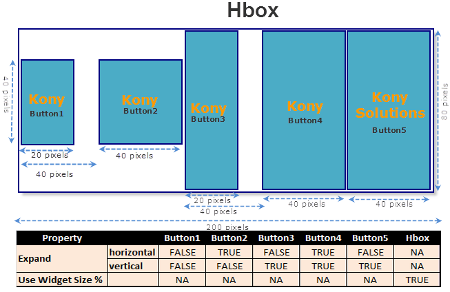
Explanation:
Button1
Width: The width occupied is 20 px (preferred width) and not 40 px (allocated width) as the hExpand property is set to false and horizontal expansion is not allowed.
Height: The height occupied is 40 px (preferred height) and not 80 px (height of the HBox) as the vExpand property is set to false and vertical expansion is not possible.
Button2
Width: The width occupied is 40 px (allocated width) and not 20 px (preferred width) as the hExpand property is set to true and horizontal expansion is allowed.
Height: The height occupied is 40 px (preferred height) and not that of the HBox (80 px) as the vExpand property is set to false and vertical expansion is not possible.
Note: Button2 does not begin immediately after Button1. This is because the Use Widget Size % property of the HBox is set to true.
Button3
Width: The width occupied is 20 px (preferred width) and not 40 px (allocated width) as the hExpand property is set to false and horizontal expansion is not allowed.
Height: The height occupied is 80 px (HBox height) and not 40 px (preferred height) as the vExpand property is set to true and vertical expansion is possible.
Button4
Width: The width occupied is 40 px (allocated width) and not 20 px (preferred width) as hExpand property is set to true and horizontal expansion is allowed.
Height: The height occupied is 80 px (HBox height) and not 40 px (preferred height) as vExpand property is set to true and vertical expansion is possible.
Button5
Width: The width occupied is 40 px (allocated width) and not 60 px (preferred width) even though the hExpand property is set to false.
This is because when the required width is more than the allocated width, the widget always occupies the complete allocated width irrespective of the Expand property setting and wraps the text to the next line.
Height: The height occupied is 80 px (preferred height).
HBox
Width: The width occupied is 200 px (container weight)
Height: The height occupied is 80 px.
If there are multiple child widgets with varying heights, the height of the child widget with the maximum height is set as the height for the HBox.
Here, Button5 has the maximum height. So, the height of Button5 is set as the height of the HBox.
Scenario 2 (Alignment)
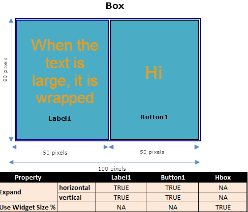
Create an HBox with a width 100 px and add two widgets (Label1and Button1) with container weights of 50 and 50 respectively, the following use cases are applicable:
Use Case 1
Set the following property values for the HBox, Label1, and Button1:
HBox:
HBox width: 100 px
Use Widget Size %: true
Label1
hExpand: true
vExpand: true
Allocated width: 50 px (50% of 100)
Text to be displayed: Large text (enter any text which wraps to four lines)
Height required to display the text (preferred height): 80 px
Button1:
hExpand: false
vExpand: false
Allocated width: 50 px (50% of 100)
Text to be displayed: Hi
Width required to display the text 'Hi' (preferred width): 20 px
Height required to display the text 'Hi' (preferred height): 30 px
Layout
The layout with the above properties appears as follows:
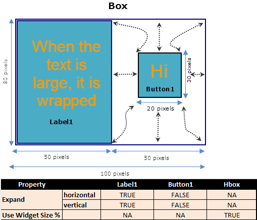
Explanation
The height of the HBox is the height of the child widget with the maximum height. Here Label1 has the maximum height, and so, the height of Label1 is set as the height of the HBox.
This means that the width and height available to Button1 are 50 px and 80 px respectively.
However, as the Expand horizontal preserve">var var vertical properties for Button1 are false, Button1 occupies a width of 20 px (preferred width) and a height of 30 px (preferred height) respectively. This gives an opportunity for Button1 to be aligned in the directions specified by the layoutAlignment property.
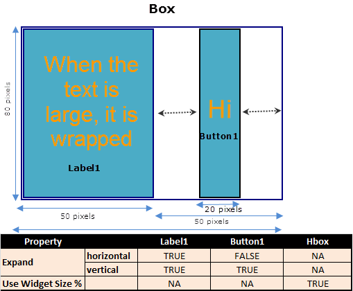
Use Case 2
Set the following property values for the HBox, Label1, and Button1:
HBox:
HBox width: 100 px
Use Widget Size %: true
Label1
hExpand: true
vExpand: true
Allocated width: 50 px (50% of 100)
Text to be displayed: Large text (enter any text which wraps to four lines)
Height required to display the text (preferred height): 80 px
Button1:
hExpand: true
vExpand: false
Allocated width: 50 px (50% of 100)
Text to be displayed: Hi
Width required to display the text 'Hi' (preferred width): 20 px
Height required to display the text 'Hi' (preferred height): 30 px
Layout
The layout with the above properties appears as follows:
Explanation
The height of the HBox is the height of the child widget with the maximum height. Here, Label1 has the maximum height, and so, the height of Label1 is set as the height of the HBox.
This means that the width and height available for Button1 are 50 px and 80 px respectively.
For Button1, as the Expand horizontal property is set to true, it occupies a width of 50 px (allocated width).
As the Expand vertical property is set to false, Button1 occupies a height of 30 px (preferred height). Alignment is possible only in the vertical direction.
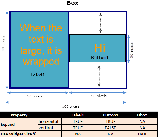
Use Case 3
Set the following property values for HBox, Label1, and Button1:
HBox:
HBox width: 100 px
Use Widget Size %: true
Label1
hExpand: true
vExpand: true
Allocated width: 50 px (50% of 100)
Text to be displayed: Large text (enter any text which wraps to four lines)
Height required to display the text (preferred height): 80 px
Button1:
hExpand: false
vExpand: true
Allocated width: 50 px (50% of 100)
Text to be displayed: Hi
Width required to display the text 'Hi' (preferred width): 20 px
Height required to display the text 'Hi' (preferred height): 30 px
Layout
The layout with the above properties appears as follows:
Explanation
The height of the HBox is the height of the child widget with the maximum height. Here, Label1 has the maximum height, and so, the height of Label1 is set as the height of the HBox.
This means that the width and height available for Button1 are 50 px and 80 px respectively.
For Button1, as the Expand vertical property is set to true, it occupies the entire available height of 80 px and not 30 px (preferred height). Alignment is possible only in the horizontal direction.
Use Case 4
Set the following property values for the HBox, Label1, and Button1:
HBox:
HBox width: 100 px
Use Widget Size %: true
Label1
hExpand: true
vExpand: true
Allocated width: 50 px (50% of 100)
Text to be displayed: Large text (enter any text which wraps to four lines)
Height required to display the text (preferred height): 80 px
Button1:
hExpand: true
vExpand: true
Allocated width: 50 px (50% of 100)
Text to be displayed: Hi
Width required to display the text 'Hi' (preferred width): 20 px
Height required to display the text 'Hi' (preferred height): 30 px
Layout
The layout with the above properties appears as follows:
Explanation
The height of the HBox is the height of the child widget with the maximum height. Here Label1 has the maximum height, and so, the height of Label1 is set as the height of the HBox.
This means that the width and height available for Button1 are 50 px and 80 px respectively.
However, as the Expand horizontal preserve">var var vertical properties for Button1 are true, Button1 occupies the complete available width and height and cannot be aligned in any direction.

| prem | Copyright © 2012 Kony, Inc. All rights reserved. |
| prem | Copyright © 2012 Kony, Inc. All rights reserved. |