Alert Properties
The properties of the Alert widget are:
 accessibilityConfig Property
Enables you to control accessibility behavior and alternative text for the widget.
For more information on using accessibility features in your app, refer Accessibility appendix.
Syntax
accessibilityConfig
Type
Object
Read/Write
Read + Write
Remarks
The accessibilityConfig property is enabled for all the widgets which are supported under the Flex Layout.
The accessibilityConfig property is a JavaScript object which can contain the following key-value pairs.
a11yLabel [String]
Optional. Specifies alternate text to identify the widget. Generally the label should be the text that is displayed on the screen.
a11yValue [String]
Optional. Specifies the current state/value associated with the widget so that the user can perform an action. For example, a checkbox is in selected state or unselected state. On the Android platform, the text specified for a11yLabel is prefixed to the a11yValue.
a11yHint [String]
Optional. Specifies the descriptive text that explains the action associated with the widget. On the Android platform, the text specified for a11yValue is prefixed to the a11yHint.
a11yHidden [Boolean]
Optional. Specifies if the widget should be ignored by assistive technology. The default option is set to false. This option is supported on iOS 5.0 and above, Android 4.1 and above, and SPA
Android limitations
- If the results of the concatenation of a11y fields result in an empty string, then accessibilityConfig is ignored and the text that is on widget is read out.
- The soft keypad does not gain accessibility focus during the right/left swipe gesture when the keypad appears.
SPA/Desktop Web limitations
- The behavior of accessibility depends on the Web browser, Web browser version, Voice Over Assistant, and Voice Over Assistant version.
- Currently SPA/Desktop web applications support only a few ARIA tags. To achieve more accessibility features, use the attribute a11yARIA. The corresponding tags will be added to the DOM as per these configurations.
Example
This example uses the button widget, but the principle remains the same for all widgets that have an accessibilityConfig property.
//This is a generic property that is applicable for various widgets.
//Here, we have shown how to use the accessibilityConfig Property for button widget.
/*You need to make a corresponding use of the accessibilityConfig property for other applicable widgets.*/

Form1.myButton.accessibilityConfig = {
    "a11yLabel": "Label",
    "a11yValue": "Value",
    "a11yHint": "Hint"
};
Platform Availability
- Available in the IDE
- iOS, Android, SPA, and Desktop Web
alertIcon Property
Specifies the Icon to be displayed to visually indicate the type of alert.
Syntax
alertIcon
Type
String
Read/Write
No
Remarks
The alert icon can be either a string specifying a local resource, or a Kony image object (kony.image).
iOS does not support the use of a Kony image object.
Examples
Using a local resource for the alert icon:
//Creating the alert with the alertIcon:"icon.png"
var alertBasic = {
    message: "Kony Alert",
    alertIcon: "icon.png"
};
//The icon.png should be available in resources folder.
var alertPSP = {};

var alert = kony.ui.Alert(alertBasic, alertPSP);
Using a kony image object:
//Creating the alert with a kony image object
imgObjRef = kony.image.createImage("local.png");
pspConfig = {};
var alert = kony.ui.Alert({
    "message": "Alert text",
    "alertType": constants.ALERT_TYPE_INFO,
    "alertTitle": "Alert Title",
    "yesLabel": "Yes",
    "noLabel": "",
    "alertIcon": imgObjRef,
    "alertHandler": null
}, pspConfig);
Platform Availability
- Available in the IDE
- iOS (no support for kony image object)
- Android
- Windows
alertTitle Property
Specifies the Title of the alert.
Syntax
alertTitle
Type
String
Accessible from Code
No
Example
//Creating the alert with the alertTitle:"Confirmation"
var alertBasic = {
    message: "Kony Alert",
    alertTitle: "Confirmation"
};

var alertPSP = {};

var alert = kony.ui.Alert(alertBasic, alertPSP);
Accessible from IDE
Yes
Platform Availability
Available on all platforms
alertType Property
Specifies the Type of the alert window to be displayed. You can select one of the following:
- Confirmation - This type is used when you want the user to verify or accept something. For example, In this type, the user has to click either "OK" or "Cancel" buttons to proceed or exit.
- error - This type is used to display when user enters incorrect value. For example, username or password in a login screen.
- info (Default)- This type is used to display some information to the user.
Use the below constants to display alert type using constructor:
- ALERT_TYPE_CONFIRMATION
- ALERT_TYPE_ERROR
- ALERT_TYPE_INFO (Default)
Syntax
alertType
Type
Number
Accessible from Code
No
Example
//Creating the alert with the alertType:constants.ALERT_TYPE_CONFIRMATION
var alertBasic = {
    message: "Kony Alert",
    alertType: constants.ALERT_TYPE_CONFIRMATION
};

var alertPSP = {};

var alert = kony.ui.Alert(alertBasic, alertPSP);
Accessible from IDE
Yes
Platform Availability
Available on all platforms
cursorType Property
In Desktop Web applications, when you hover the mouse over any widget, a pointer appears. Using the cursorType property, you can specify the type of the mouse pointer in Visualizer.
Syntax
cursorType
Type
String.
You must provide a valid CSS cursor values such as wait, grab, help, etc. to the cursorType property.
Read/Write
Read + Write
Example
 //This is a generic property and is applicable for many widgets.

/*The example provided is for the Button widget. Make the required changes in the example while using other widgets.*/

frmButton.myButton.cursorType = "wait";
Platform Availability
- Desktop Web
message Property
Specifies the message description of the alert to be displayed.
Syntax
message
Type
String
Accessible from Code
No
Example
//Creating the alert with the message:"Kony Alert"
var alertBasic = {
    message: "Do you want to continue?"
};

var alertPSP = {};

var alert = kony.ui.Alert(alertBasic, alertPSP);
Accessible from IDE
Yes
Platform Availability
Available on all platforms
noLabel Property
Specifies the descriptive Text for the "No" label.
Syntax
noLabel
Type
String
Accessible from Code
No
Example
//Creating the alert with the noLabel:"No"
var alertBasic = {
    message: "Kony Alert",
    alertType: constants.ALERT_TYPE_CONFIRMATION,
    noLabel: "No"
};

var alertPSP = {};
Accessible from IDE
Yes
Platform Availability
Available on all platforms
retainContentAlignment Property
This property is used to retain the content alignment property value, as it was defined.
Note: Locale-level configurations take priority when invalid values are given to this property, or if it is not defined.
The mirroring widget layout properties should be defined as follows.
function getIsFlexPositionalShouldMirror(widgetRetainFlexPositionPropertiesValue) {
    return (isI18nLayoutConfigEnabled &&
    localeLayoutConfig[defaultLocale]
    ["mirrorFlexPositionalProperties"] == true &&
    !widgetRetainFlexPositionPropertiesValue);
}
The following table illustrates how widgets consider Local flag and Widget flag values.
| Properties | Local Flag Value | Widget Flag Value | Action |
|---|---|---|---|
| Mirror/retain FlexPositionProperties | true | true | Use the designed layout from widget for all locales. Widget layout overrides everything else. |
| Mirror/retain FlexPositionProperties | true | false | Use Mirror FlexPositionProperties since locale-level Mirror is true. |
| Mirror/retain FlexPositionProperties | true | not specified | Use Mirror FlexPositionProperties since locale-level Mirror is true. |
| Mirror/retain FlexPositionProperties | false | true | Use the designed layout from widget for all locales. Widget layout overrides everything else. |
| Mirror/retain FlexPositionProperties | false | false | Use the Design/Model-specific default layout. |
| Mirror/retain FlexPositionProperties | false | not specified | Use the Design/Model-specific default layout. |
| Mirror/retain FlexPositionProperties | not specified | true | Use the designed layout from widget for all locales. Widget layout overrides everything else. |
| Mirror/retain FlexPositionProperties | not specified | false | Use the Design/Model-specific default layout. |
| Mirror/retain FlexPositionProperties | not specified | not specified | Use the Design/Model-specific default layout. |
Syntax
retainContentAlignment
Type
Boolean
Read/Write
No (only during widget-construction time)
Example
//This is a generic property that is applicable for various widgets.
//Here, we have shown how to use the retainContentAlignment property for Button widget.
/*You need to make a corresponding use of the
retainContentAlignment property for other applicable widgets.*/
var btn = new kony.ui.Button({
    "focusSkin": "defBtnFocus",
    "height": "50dp",
    "id": "myButton",
    "isVisible": true,
    "left": "0dp",
    "skin": "defBtnNormal",
    "text": "text always from top left",
    "top": "0dp",
    "width": "260dp",
    "zIndex": 1
}, {
    "contentAlignment": constants.CONTENT_ALIGN_TOP_LEFT,
    "displayText": true,
    "padding": [0, 0, 0, 0],
    "paddingInPixel": false,
    "retainFlexPositionProperties": false,
    "retainContentAlignment": true
}, {});
Platform Availability
- Available in IDE
- Windows 10, iOS, Android, and SPA
retainFlexPositionProperties Property
This property is used to retain flex positional property values as they were defined. The flex positional properties are left, right, and padding.
Note: Locale-level configurations take priority when invalid values are given to this property, or if it is not defined.
The mirroring widget layout properties should be defined as follows.
function getIsFlexPositionalShouldMirror(widgetRetainFlexPositionPropertiesValue) {
    return (isI18nLayoutConfigEnabled &&
    localeLayoutConfig[defaultLocale]
    ["mirrorFlexPositionalProperties"] == true &&
    !widgetRetainFlexPositionPropertiesValue);
}
The following table illustrates how widgets consider Local flag and Widget flag values.
| Properties | Local Flag Value | Widget Flag Value | Action |
|---|---|---|---|
| Mirror/retain FlexPositionProperties | true | true | Use the designed layout from widget for all locales. Widget layout overrides everything else. |
| Mirror/retain FlexPositionProperties | true | false | Use Mirror FlexPositionProperties since locale-level Mirror is true. |
| Mirror/retain FlexPositionProperties | true | not specified | Use Mirror FlexPositionProperties since locale-level Mirror is true. |
| Mirror/retain FlexPositionProperties | false | true | Use the designed layout from widget for all locales. Widget layout overrides everything else. |
| Mirror/retain FlexPositionProperties | false | false | Use the Design/Model-specific default layout. |
| Mirror/retain FlexPositionProperties | false | not specified | Use the Design/Model-specific default layout. |
| Mirror/retain FlexPositionProperties | not specified | true | Use the designed layout from widget for all locales. Widget layout overrides everything else. |
| Mirror/retain FlexPositionProperties | not specified | false | Use the Design/Model-specific default layout. |
| Mirror/retain FlexPositionProperties | not specified | not specified | Use the Design/Model-specific default layout. |
Syntax
retainFlexPositionProperties
Type
Boolean
Read/Write
No (only during widget-construction time)
Example
//This is a generic property that is applicable for various widgets.
//Here, we have shown how to use the retainFlexPositionProperties property for Button widget.
/*You need to make a corresponding use of the
retainFlexPositionProperties property for other applicable widgets.*/
var btn = new kony.ui.Button({
    "focusSkin": "defBtnFocus",
    "height": "50dp",
    "id": "myButton",
    "isVisible": true,
    "left": "0dp",
    "skin": "defBtnNormal",
    "text": "always left",
    "top": "0dp",
    "width": "260dp",
    "zIndex": 1
}, {
    "contentAlignment": constants.CONTENT_ALIGN_CENTER,
    "displayText": true,
    "padding": [0, 0, 0, 0],
    "paddingInPixel": false,
    "retainFlexPositionProperties": true,
    "retainContentAlignment": false
}, {});
Platform Availability
- Available in IDE
- Windows 10, iOS, Android, and SPA
retainFlowHorizontalAlignment Property
This property is used to convert Flow Horizontal Left to Flow Horizontal Right.
Note: Locale-level configurations take priority when invalid values are given to this property, or if it is not defined.
The mirroring widget layout properties should be defined as follows.
function getIsFlexPositionalShouldMirror(widgetRetainFlexPositionPropertiesValue) {
    return (isI18nLayoutConfigEnabled &&
    localeLayoutConfig[defaultLocale]
    ["mirrorFlexPositionalProperties"] == true &&
    !widgetRetainFlexPositionPropertiesValue);
}
The following table illustrates how widgets consider Local flag and Widget flag values.
| Properties | Local Flag Value | Widget Flag Value | Action |
|---|---|---|---|
| Mirror/retain FlexPositionProperties | true | true | Use the designed layout from widget for all locales. Widget layout overrides everything else. |
| Mirror/retain FlexPositionProperties | true | false | Use Mirror FlexPositionProperties since locale-level Mirror is true. |
| Mirror/retain FlexPositionProperties | true | not specified | Use Mirror FlexPositionProperties since locale-level Mirror is true. |
| Mirror/retain FlexPositionProperties | false | true | Use the designed layout from widget for all locales. Widget layout overrides everything else. |
| Mirror/retain FlexPositionProperties | false | false | Use the Design/Model-specific default layout. |
| Mirror/retain FlexPositionProperties | false | not specified | Use the Design/Model-specific default layout. |
| Mirror/retain FlexPositionProperties | not specified | true | Use the designed layout from widget for all locales. Widget layout overrides everything else. |
| Mirror/retain FlexPositionProperties | not specified | false | Use the Design/Model-specific default layout. |
| Mirror/retain FlexPositionProperties | not specified | not specified | Use the Design/Model-specific default layout. |
Syntax
retainFlowHorizontalAlignment
Type
Boolean
Read/Write
No (only during widget-construction time)
Example
//This is a generic property that is applicable for various widgets.
//Here, we have shown how to use the retainFlowHorizontalAlignment property for Button widget.
/*You need to make a corresponding use of the
retainFlowHorizontalAlignment property for other applicable widgets. */
var btn = new kony.ui.Button({
 "focusSkin": "defBtnFocus",
 "height": "50dp",
 "id": "myButton",
 "isVisible": true,
 "left": "0dp",
 "skin": "defBtnNormal",
 "text": "always left",
 "top": "0dp",
 "width": "260dp",
 "zIndex": 1
}, {
 "contentAlignment": constants.CONTENT_ALIGN_CENTER,
 "displayText": true,
 "padding": [0, 0, 0, 0],
 "paddingInPixel": false,
 "retainFlexPositionProperties": true,
 "retainContentAlignment": false,
 "retainFlowHorizontalAlignment ": false
}, {});
Platform Availability
- Available in IDE
- Windows 10, iOS, Android, and SPA
textOverflow Property
Specifies whether text wrapping is enabled below the image when the text message is more than image height.
Syntax
textOverflow
Type
boolean
Remarks
If this value is true, text wrapping is enabled. The default value is false.
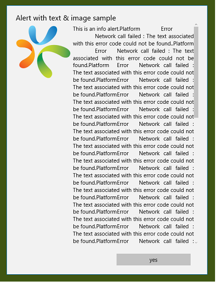
Alert with text wrapping disabled.
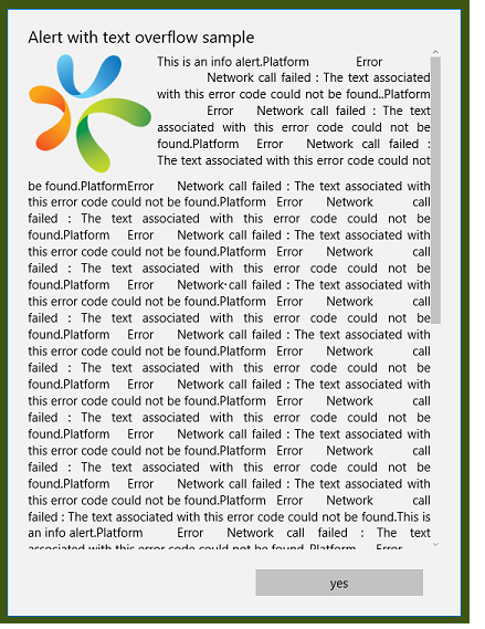
Alert with text wrapping enabled.
Example
  //Creating the alert with the textOverflow:true

var basicProperties = {
    message: "Kony ALert",
    textOverflow: true
};
var platformSpecificProperties = {};

var alert = kony.ui.Alert(basicProperties, platformSpecificProperties);
Platform Availability
Windows 10.
yesLabel Property
Specifies the descriptive Text for the "Yes" label.
Syntax
yesLabel
Type
String
Accessible from Code
No
Example
//Creating the alert with the yesLabel:"Yes"
var alertBasic = {
    message: "Kony Alert",
    yesLabel: "Yes"
};

var alertPSP = {};

var alert = kony.ui.Alert(alertBasic, alertPSP);
Accessible from IDE
Yes
Platform Availability
Available on all platforms

| prem | Copyright © 2012 Kony, Inc. All rights reserved. |
| prem | Copyright © 2012 Kony, Inc. All rights reserved. |