Templates Tab
Templates provide an easy way to display the same information across the forms, pop-ups, calendars, segments, or maps.
The following templates are supported on various channels:
Headers
A header is a section of the form that is docked at the top of the form, and can be reused across the forms. You can create multiple headers for a project, but you can assign only one header to a form. You can reuse the headers across the channels. That is, a header created in the Mobile channel can be reused in the Tablet or Desktop channels.
To create a header template, follow these steps:
-
Click the Templates tab from Project Explorer.
- Expand Mobile, Tablet, or Desktop (depending on which channel you want to create a header template), point to Headers to display a down-arrow. Click this down-arrow and then click New Template. Rename the template, if required.
-
Drag and drop a container widget on the template.
Note: A template requires that you add a container widget (for Flex form: FlexContainer and for VBox form: HBox) before adding other widgets.
-
Drag and drop the required widgets on the container.
- Set the properties of these widgets and save the header template.
Footers
A footer is a section of the form that is docked at the bottom of the form and can be reused across the forms.
To create a footer template, follow these steps:
-
Click the Templates tab from Project Explorer.
- Expand Mobile, Tablet, or Desktop (depending on which channel you want to create a map template), point to Footers to display a down-arrow. Click this down-arrow and then click New Template. Rename the template, if required.
-
Drag and drop a container widget on the template.
Note: A template requires that you add a container widget (for Flex form: FlexContainer and for VBox form: HBox) before adding other widgets.
-
Drag and drop the required widgets on the container.
- Set the properties of these widgets and save the footer template.
Adding a Header or a Footer to a Form
To insert a header or a footer on a form, follow these steps:
- From the Project tab of Project Explorer, expand Mobile, Tablet, or Desktop channel (depending on whether you have created the header or a footer for a mobile, tablet, or desktop channel).
- Expand Forms and click on a required form.
- From the form properties, click Form2 tab.
- For inserting header,
- Click the Edit button against the Header field to open the Header dialog box.
- From the available list, choose a header and then click OK.
- For inserting footer,
- Click the Edit button against the Footer field to open the Footer dialog box.
- From the available list, choose a footer and then click OK.
Segments
A Segment template enables you to define a template for section headers and rows of the segment. This is
primarily useful for achieving common look and feel of section headers along with few widgets
added as part of section header of a segment. For Segment, two sample templates are available starting from Kony Visualizer V8 SP3 GA. One sample for the row and another for the header. 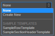
Important: When you add a segment to a form, you can create a new template without going to the Templates section using the Create New option from the drop-down list. You can also edit a template inline in the segment.
To create a segment template, from the Template tab, follow these steps:
-
Click the Templates tab from Project Explorer.
- Expand Mobile, Tablet, or Desktop (depending on which channel you want to create a map template), point to Segments to display a down-arrow. Click this down-arrow and then click New Template. Rename the template, if required.
-
Drag and drop a container widget on the template.
Note: A template requires that you add a container widget (for Flex form: FlexContainer and for VBox form: HBox) before you can add other widgets.
- Drag and drop the required widgets on the container.
- Set the properties of these widgets and save the Segment template.
Creating a Segment Template within a Segment Widget
To create a segment template, follow these steps:
- From the Project tab of Project Explorer, expand either Mobile, Tablet, or Desktop.
- Expand Forms and navigate to the form that contains a segment widget.
- Navigate to the Segment tab, depending on your requirement, click the down-arrow of the row template or a section header template and then click Create New .
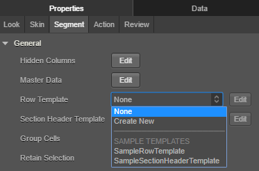
Screen navigates to the Templates section with a blank template. Rename the template, if required. - Drag and drop a container widget on the template.
- Drag and drop the required widgets on the container.
- Set the properties of these widgets and save the Segment template.
Edit a Segment Template within a Segment Widget
To edit a segment template, follow these steps:
- From the Project tab of Project Explorer, expand either Mobile, Tablet, or Desktop.
- Expand Forms and navigate to the form that contains a segment widget with a template. If such a form with a segment and segment template does not exist, create one. The template can be a row template or a Section Header template.
- In the Properties pane, go to the Segment tab.
- On the template(row or Section header template) you want to edit, click the corresponding edit button.
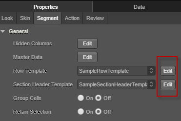
Visualizer navigates to the Templates section in the Project properties pane. - You can modify the template here. Changes made here will reflect across all the forms which use the template you modified.
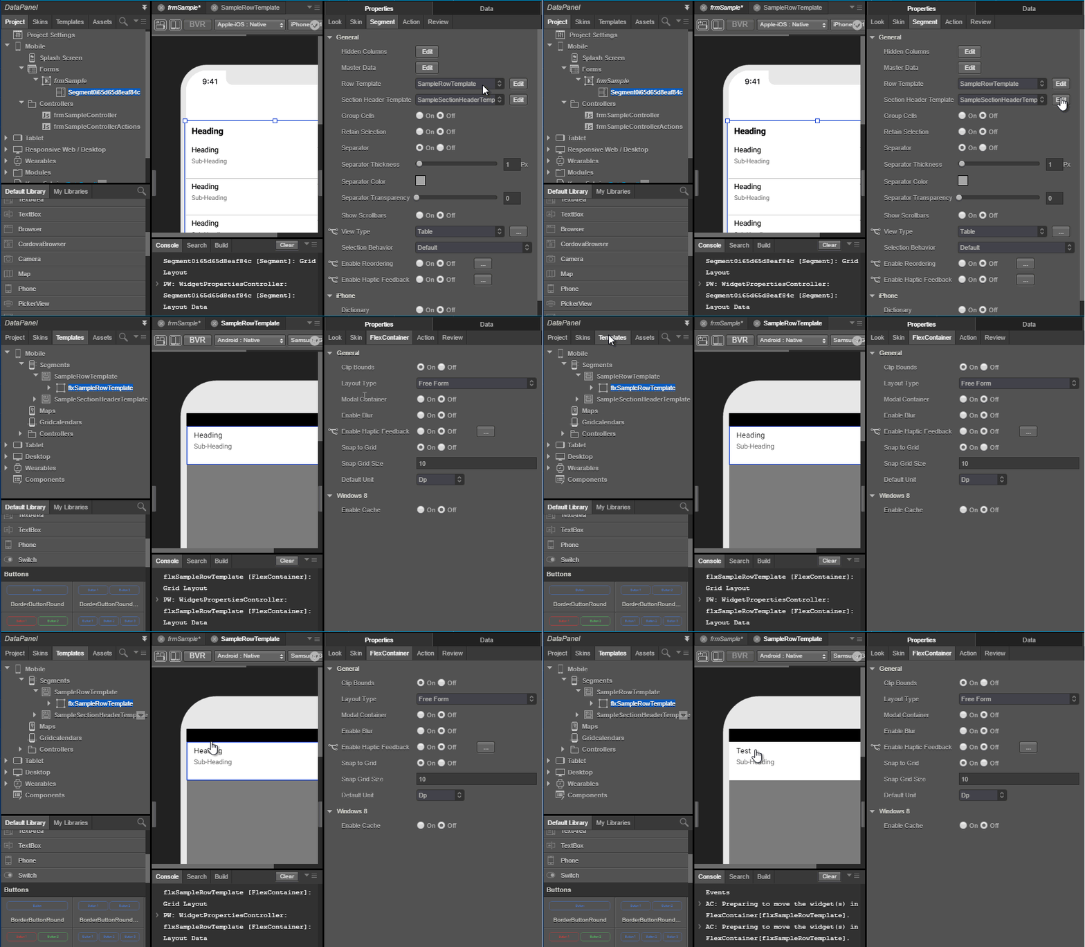
Edit a Segment Template inline within a Segment Widget
To edit a segment template, follow these steps:
- From the Project tab of Project Explorer, expand either Mobile, Tablet, or Desktop.
- Expand Forms and navigate to the form that contains a segment widget with a template. If such a form with a segment and segment template does not exist, create one. The template can be a row template or a Section Header template.
If your segment has both a Row Template and a Section Header Template, you can edit them inline. - Right-click on the segment and then select Enable Template Editing., and then select Row or a Section Header.
You can only edit one template at a time. You must disable the template you are editing to start editing the other template.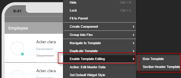
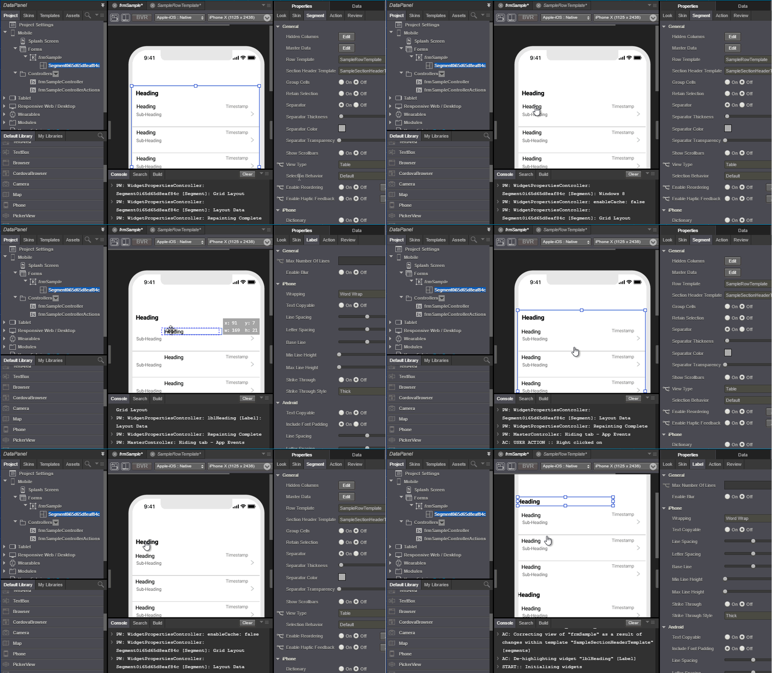
- You can click on each individual item in the template and edit it.
You can also add additional widgets to the template.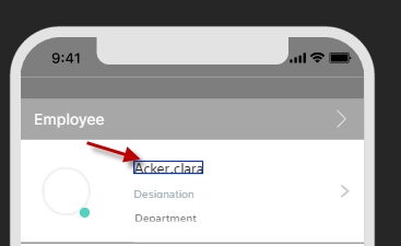
Inserting a Segment Template to a Segment Widget
To insert a Segment template to a Segment widget, follow these steps:
- From the Project tab of Project Explorer, expand Mobile, Tablet, or desktop channel (depending on whether you have created the segment template for a mobile, tablet, or desktop).
- Expand Forms and navigate to the form containing a segment widget.
- Expand this form, and click the segment widget.
- From the Segment properties, click Segment tab.
- The segment templates are available under General > Row Template and Section Header Template list. You may choose to use the template as either Row Template or Section Header Template for the Segment widget.
Note: Kony Visualizer provides some sample templates that you can use.
Duplicate a Template
When you are using a template, if you make any changes to that template, it affects all segments where the template is used. To avoid that, you can duplicate a template and modify that specific template.
To duplicate a template, do the following:
- From the Project tab of Project Explorer, expand either Mobile, Tablet, or Desktop.
- Expand Forms and navigate to the form that contains a segment widget with a template. If such a form with a segment and segment template does not exist, create one. The template can be a row template or a Section Header template.
- Right-click on the segment and then select Duplicate Template.. The template is duplicated and is visible in your list of templates.
Maps
A map template gives you a standard and consistent way of presenting map-related content in your app, such as a map callout (i.e. a pin) that indicates a particular location on a map.
To create a map template, do the following:
- On the Project Explorer, click the Templates tab.
- On the Templates tab, open the channel you want to add a map template to, either Mobile, Tablet, or Desktop.
- Within the channel of choice, hover over Maps until its menu arrow appears, click it, and then click New Template. Kony Visualizer creates a new, empty map template.
- Add a FlexContainer to the new map template to hold all the widgets that you want to characterize the map template. To do so, from the Widget pane of the Library Explorer, in the Container Widgets section, click on FlexContainer and then drag it onto the map template.
- Now that the map template has a FlexContainer, drag other widgets onto the FlexContainer. Arrange them and set their properties according to how you want them to display.
- Save the map template by clicking Save on the File menu (the Project menu in Kony Visualizer).
Inserting a Map Template to a Map Widget
To insert a Map template to a Map widget, follow these steps:
- From the Project tab of Project Explorer, expand either Mobile, Tablet, or Desktop (depending on whether you have created the map template for a mobile, tablet, or desktop).
- Expand Forms and navigate to the form that contains a map widget, and to which you want to add the map template.
- Expand this form and click the map widget.
- From the Map properties, click Map tab.
- Click Edit button against Callout Template field. This results in opening calloutTemplate dialog box.
- From the available list, choose a map and click OK.
Gridcalendars
A Gridcalendar template enables you to define a template for Calendar Day cell. Only one template can be used for each Calendar. The Gridcalendar templates are used:
- to define a Calendar Day cell with custom look and feel.
- to achieve the behavior of having widgets such as an Image and a label for a Calendar Day cell.
- to perform an action on the event of an onclick of a Calendar Day cell.
To create a Gridcalendar template, follow these steps:
- Click the Templates tab from Project Explorer.
- Expand Mobile or Tablet (depending on which channel you want to create a Gridcalendar template), point to Gridcalendar to display a down-arrow. Click this down-arrow, and then click New Template. Rename the template, if required.
-
Drag and drop a container widget onto a template.
Note: You need to add a FlexContainer or HBox to a template before adding other widgets.
- Drag and drop the required widgets on the HBox.
- Set the properties of these widgets and save the Gridcalendars template.
Grids
A Grid template enables you to define a template for DataGrid widget. You can specify a template for cell and cell headers.
Important Considerations:
- You use a Grid template to update the master data of a DataGrid widget.
- A Grid Template is available only when you fork a form for the Desktop : Web Channel.
To create a Grid template, follow these steps:
-
Click the Templates tab from Project Explorer.
- Expand Desktop, point to Grids to display a down-arrow. Click this down-arrow and then click New Template. Rename the template, if required.
-
Drag and drop a container widget on the template.
Note: A template requires that you add a container widget before adding other widgets.
-
Drag and drop the required widgets on the container.
- Set the properties of these widgets and save the template.
Tab Headers
Note: Tab Headers templates are supported only on Desktop Web platform.
A Tab header template enables you to define a template for tab headers with specified widgets. You can use the template on individual tab headers of a Tab pane. This is primarily useful for developers to achieve common look and feel of the tab headers of a Tab Pane widget.
A Tab header templates are used in the following cases:
- To have uniform look and feel of the tab headers with the specified widgets.
- To display different tab headers for different Tab panes.
- To perform an action on a tab header.
Creating a Template for Tab Header
When you want information to be displayed or customized in a tab header of a Tab pane in the application, you have a provision to add a tab headers template.
To create a Tab Header template at the application-level, follow these steps:
- Click the Templates tab from the Project Explorer.
- Expand Desktop, point to Tab Header to display a down-arrow. Click this down-arrow, and then click New Template. Rename the template, if required.
-
Drag and drop a container widget on the template.
Note: A template requires that you add a container widget ( HBox) before you can add other widgets.
- Drag and drop the required widgets.
- Set the properties of these widgets and save the Tab Header template.
Context Menus
Note: Context Menu templates are supported only on Desktop Web platform.
What is a Template for a Context Menu
In Desktop Web, when you right-click a Menu Container or a Box the context specific menu will be displayed with the array of menu items. A Context Menu Template is essentially a template having a Menu Container in which the developer customizes the overall look and feel of the context menu.
Where to use a Context Menu Template
Context Menu Templates are used to display how the data is presented to the end user when a context menu pops up.
Creating a Template for Context Menu
When you want the same template to be displayed across all the Context Menus in an application, you have a provision to add a Context Menu Template.
To create a context menu template at the application-level, follow these steps:
- Click the Templates tab from the Project Explorer.
- Expand Desktop, point to Context Menus. A down-arrow appears. Click this down-arrow, and then click New Template. Rename the template, if required.
-
Drag and drop an MenuContainer on the template.
- Follow the steps described in creating Menu templates.
Menus
Note: Menu templates are supported only on Desktop Web platform.
Menu templates contains a list of menu items that are displayed when you right-click a widget.
To create a menu, follow these steps:
- Click the Templates tab from the Project Explorer.
- Expand Desktop, point to Menus to display a down-arrow. Click this down-arrow and then click New Template. Rename the template, if required.
- Drag and drop an HBox onto a template.
Note: You need to add an HBox to a template before adding other widgets.
- Drag and drop the required widgets on the HBox.
- Set the properties of these widgets and save the Menu template.
| Copyright © 2013 Kony, Inc. All rights reserved. |
