Design a Responsive Web App
Overview
Responsive Web Design is an approach to web-page creation that makes use of flexible layouts, flexible images, and cascading style sheet (CSS) media queries. The goal of Responsive Web Design is to build web pages that can detect a user's screen size and orientation, and then change the layout accordingly. Responsive Web Design is about using HTML and CSS to automatically resize, hide, shrink, or enlarge a website, to make it look good on all devices (desktops, tablets, and phones).
From Kony Visualizer V8 onwards, the Responsive Web Design feature has been implemented in Kony Visualizer. When you resize a web browser screen, content in the browser resizes based on the resizing design. Using Responsive design, you can design a web page for different form factors in a single FlexForm.
Responsive Web Design supports the following features:
- Browser size changes
- Browser zoom-in and zoom-out
- Screen resolution changes
Note: A Progressive Web App (PWA) acts as a progression of a Responsive Web app. For example, if you have a website (web page/web app) that is mobile responsive, you can leverage the new features supported by modern web browsers to make it a Progressive Web App. For more information about Progressive Web Apps, click here.
From Kony Visualizer V8 SP2, the existing Responsive Web Design feature has been enhanced. Prior to Kony Visualizer V8 SP2, Responsive Web Design was achieved through code. From Kony Visualizer V8 SP2 onwards, you can build Responsive Web desktop applications from within Kony Visualizer.
For a more hands-on approach on the Responsive Web Design feature provided by Kony AppPlatform, import and preview the Resort Feature sample app by using Kony Visualizer.
The Responsive Web design feature is currently available only for the Desktop Web platform.
Important: You must enable the Responsive Web feature in the Desktop Web Properties section here.
When your app is open in a browser, if the browser window resizes, content which is in a bigger layout does not resize according to the smaller layout automatically. Responsive web enables you to design your desktop web applications to fit various layouts and create a glitch free browsing experience.
There are three pre-existing breakpoints: Mobile, Tablet, and Desktop These breakpoints help you to resize your web application to pre-set scales. You can either use them or you can create your own custom breakpoint and use it. The ruler in the form assists you in viewing these breakpoints. When you hover on the breakpoint section, the breakpoint area is highlighted in the ruler indicating the screen size.
You can switch between various breakpoints set on the canvas. When you click a break point, the canvas resizes to the width specified on that breakpoint and all the content in the canvas adjusts according to the specified canvas width. You cannot hide the ruler when breakpoints are set for a form.
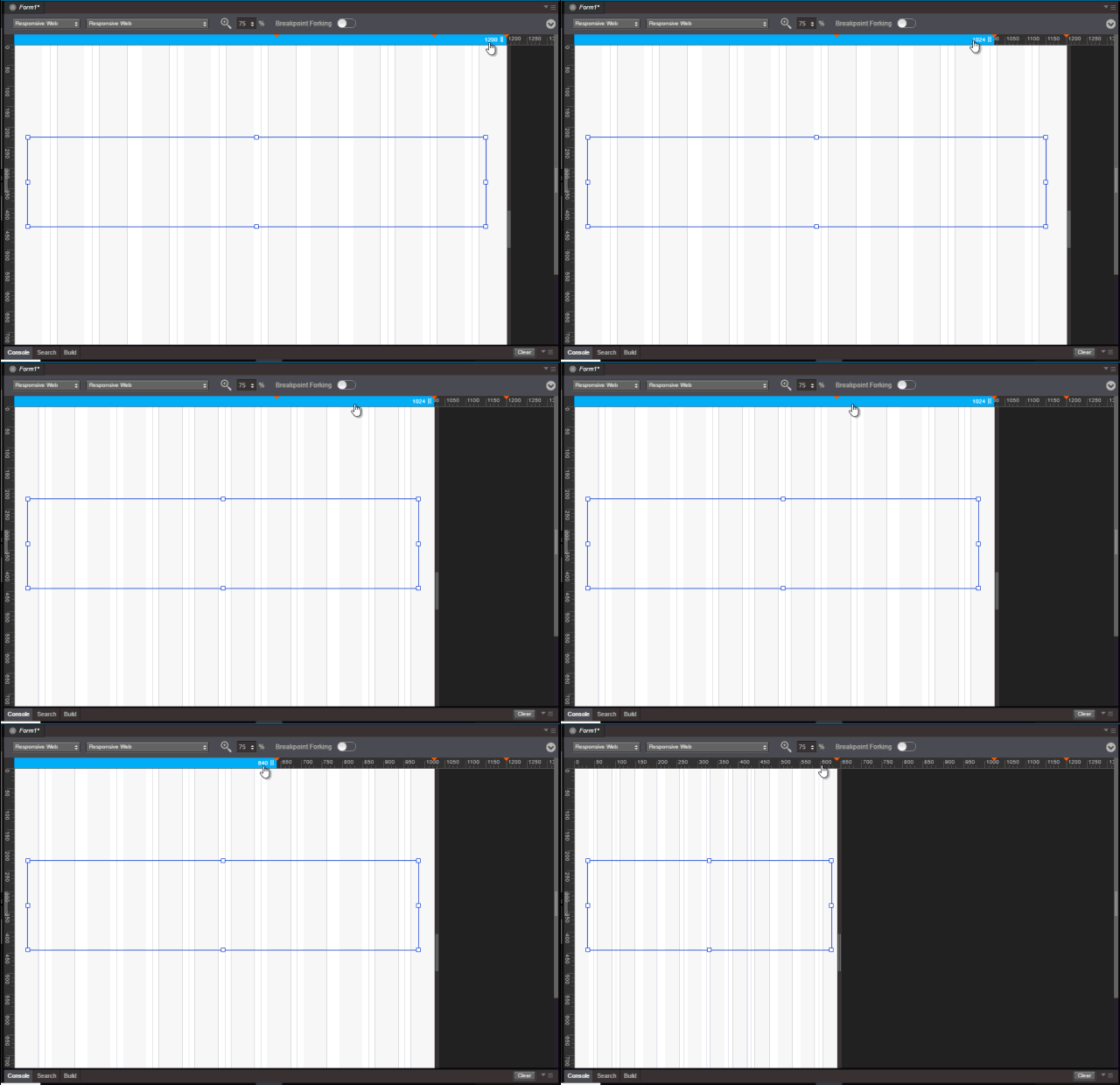
You can resize the breakpoints using the resize handle icon on the right side of the canvas. This provides a quick review so that you can determine the exact width where the content design breaks during the resize. You can also use a key (Command + D key in Mac and Ctrl + D key in Windows) when you reach the required width to insert a breakpoint of a specified width when you are resizing a breakpoint. You can drag a breakpoint in a ruler.
For New projects, you can use the three default values or create a new one by using the Add New button.
- Desktop - 1200 PX
- Tablet - 1024 PX
- Mobile - 640 PX
- Add New - Button
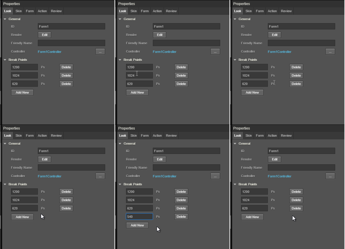
For existing projects, you do not have any default breakpoints. You can add a breakpoint by using the Add New button.
Breakpoints are always sorted from largest to smallest. If you add a new breakpoint which is larger than the existing large breakpoint, the newly added largest one goes to the top.
Important: A new event onBreakpointChange is added to the Actions list in the Properties pane. You can define what happens to the form when the breakpoint changes.
Enable Breakpoint Forking
You can choose the layout for each of the breakpoints separately by using the Breakpoint Forking feature. When this feature is turned on, you can rearrange your layout in the form, specific to each breakpoint. This helps you in defining how you want to display the form in each layout. You can choose the changes at the breakpoint level or a global level for all breakpoints.

Important: When you turn Breakpoint Forking on, you can fork your widgets separately for each breakpoint. If you do not fork your widgets for each breakpoint, the canvas will resize only a few widgets and not all of them.
Limitation
A limitation related to Breakpoint Forking and setting the height of a widget as Preferred/any non-Preferred value is present in a Responsive Web form of Kony Visualizer.
Consider a scenario where you have a Responsive Web form with Breakpoint Forking turned off. You add any widget to the form and under Properties > Look > Flex, set the Height of the widget as Preferred. When you then turn on Breakpoint Forking and select a breakpoint, it is not possible to change the Height of the widget to any non-Preferred value (such as 10 Dp).
The same limitation exists when you first set the Height of a widget as any non-Preferred value (such as 10 Dp), then turn on Breakpoint Forking, and try to modify the Height of the widget to Preferred.
Enable Grid Lines
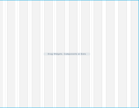
You can choose to enable grid lines on your Responsive Web canvas. These grid lines help you to properly align widgets and other elements of your Responsive Web app. You can use grid lines as reference points while placing various app elements according to the breakpoints that you have specified.
After you enable or disable grid lines for one Responsive Web form, the corresponding setting is applied for all Responsive Web forms in Kony Visualizer. Grid lines for Responsive Web forms are disabled by default. Both these behaviors are applicable from Kony Visualizer V8 SP4 Fixpack 28 onwards.
To enable grid lines for Responsive Web, follow these steps:
- Select a Responsive Web form.
- At the upper-right corner of the Project Canvas, click the down-arrow icon
. A list of options appears.
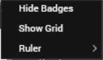
- Click Show Grid.
Note: If grid lines are already enabled and you want to disable this feature, click Hide Grid from the down-arrow icon list.
- Kony Visualizer enables grid lines for your Responsive Web form.
Working with Skins, Widgets, and Components
You can also fork skins for different breakpoints. For Video and Image widgets, the source of images and videos can be forked based on the breakpoint. For Labels, whenever you change a breakpoint in the canvas, the width of the label changes and the content wrapping is adjusted for the breakpoint.
When you drag and drop a widget to the form and make changes, unless you have selected the Breakpoint Forking feature, all changes reflect across breakpoints. If a breakpoint is forked, changes will not reflect in that breakpoint.
When you drag and drop a widget on any breakpoint, the widget is added to all breakpoints. When you delete or rename a widget on a breakpoint, the widget is deleted or renamed on all breakpoints. You can change properties of a widget specific to each breakpoint.
You can use components across breakpoints. You cannot create source components with forked responsive properties. However, you can create instances of responsive components (without contract) within responsive forms. When you add these components to a collection library, the responsive properties (such as custom breakpoints) of these components do not change even when you reuse the component in a different project or form through the collection library. Similarly, widgets with responsive data also retain their responsive configuration when reused. You can use Desktop web templates for the Responsive Web application. You can also create different templates for different breakpoints. Once you publish your responsive web app, you can preview the app in the kdw (desktop web output) mode.
Responsive Web APIs
The following are the APIs, keys, and constants associated with Responsive Web.
- kony.application.setApplicationBehaviors (Breakpoint key)
- kony.application.getCurrentBreakpoint();
- constants.BREAKPOINT_MAX_VALUE
Create a Breakpoint
To create a Responsive Design application, do the following:
- On the File menu (the Project menu in Kony Visualizer), click New Project to open the Start a New Project screen of the New Project wizard.
- Select Create Custom App, and then click Choose. Kony Visualizer opens the Project Type screen of the New Project wizard.
- In the Project Name text box, enter a name for your project.
-
A project name should contain fewer than 14 characters.
- A project name can be alphanumeric. However, the first character of a project should always be a letter.
- Do not use any of the following reserved keywords as a project name: authService, workspace, mfconsole, kpns, middleware, accounts, syncservice, syncconsole, services, admin, middleware, and appdownload.
- Select Kony Reference Architecture, and then click Create. As this is a new project, in the Project Explorer, you will see Responsive Web / Desktop.
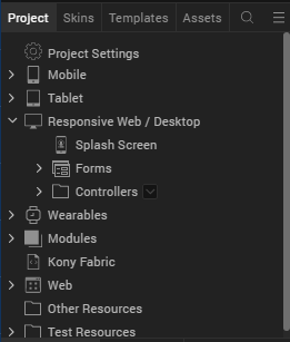
- Right-click Form > New Form. This results in creating a new form with a default name assigned to it.
- You will have three different breakpoints by default.
You can view these breakpoints in the Properties pane.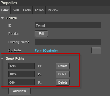
- To add a new breakpoint, click Add New. A new row appears.
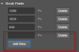
- Enter the breakpoint details. You will see that the new breakpoint is added.
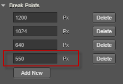
The breakpoint is added and it reflects in the Properties pane and the Canvas.
Create a form with Breakpoint Forking Off
To create a form with Responsive Web with Breakpoint Forking Off, do the following:
- In your Visualizer Project, on the form that you want to use Responsive Web design, in Visualizer Canvas, select Responsive Web.
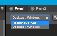
The Responsive web layout appears on Visualizer Canvas.
Tip: You may want to set the view of Canvas to 75%. Setting the canvas to 75% view makes it easier to navigate through three different breakpoints. - Drag and drop a FlexContainer to the form.
- Ensure that this FlexContainer is spread across all three default breakpoints.
Tip: For better visibility on how the canvas changes the FlexContainer in different breakpoints, you may want to change the background color of the FlexContainer. - Add a few TextBox widgets to the FlexContainer.
Tip: Add three TextBox widgets spread across the entire canvas. - Add a few buttons below the FlexContainer in the form.
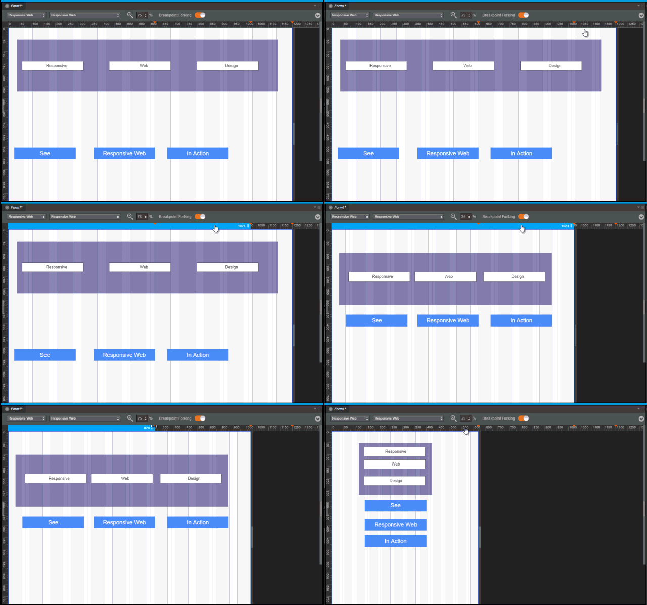
Tip: Ensure that three buttons are spread across the entire canvas. - Using the resize handle, resize the canvas to different breakpoints, observe how the breakpoints change.
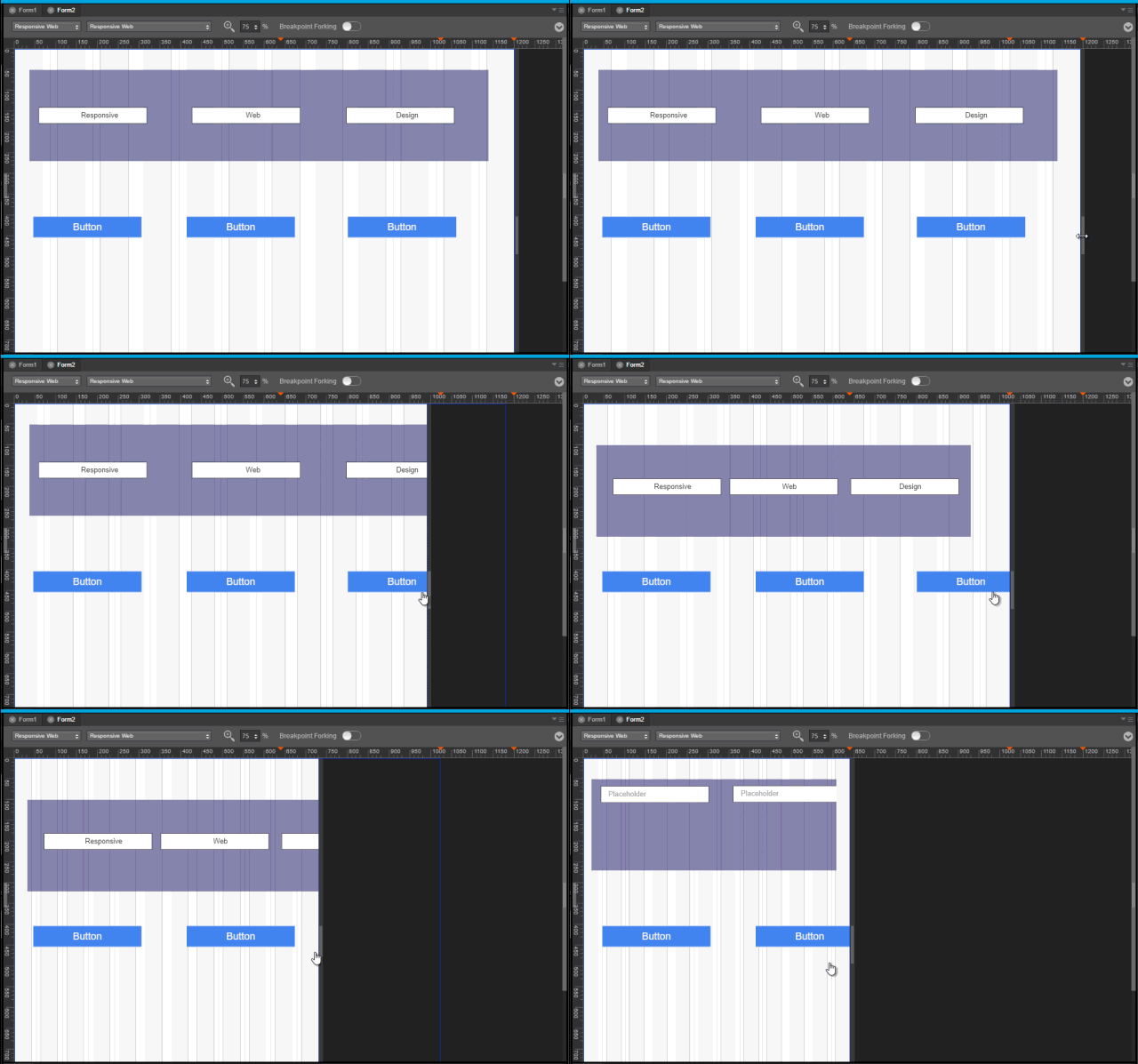
Create a form with Breakpoint Forking On
To create a form with Responsive Web with Breakpoint Forking On, do the following:
- In your Visualizer Project, on the form that you want to use Responsive Web design, in Visualizer Canvas, select Responsive Web.

The Responsive web layout appears on Visualizer Canvas.
Tip: You may want to set the view of Canvas to 75%. Setting the canvas to 75% view makes it easier to navigate through three different breakpoints. - Drag and drop a FlexContainer to the form.
- Ensure that this FlexContainer is spread across all three default breakpoints.
Tip: For better visibility on how the canvas changes the FlexContainer in different breakpoints, you may want to change the background color of the FlexContainer. - Add a few TextBox widgets to the FlexContainer.
Tip: Add three TextBox widgets spread across the entire canvas. - Add a few buttons below the FlexContainer in the form.
Tip: Ensure that three buttons are spread across the entire canvas. -
On Visualizer Canvas, toggle the Breakpoint Forking button.

- At this point, your UI elements are already organized for the largest breakpoint.
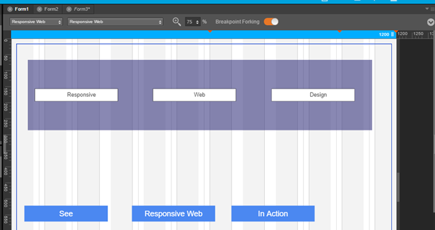
-
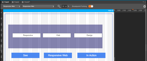
Using the canvas resize handle, resize the canvas to the tablet layout.
-
Reorganize your UI elements for this layout.
-
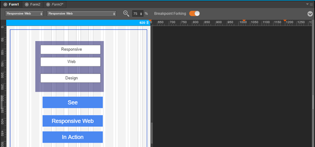
Using the canvas resize handle, resize the canvas to the mobile layout.
-
Reorganize your UI elements for this layout.
- Your form now has three different views for three different breakpoints.
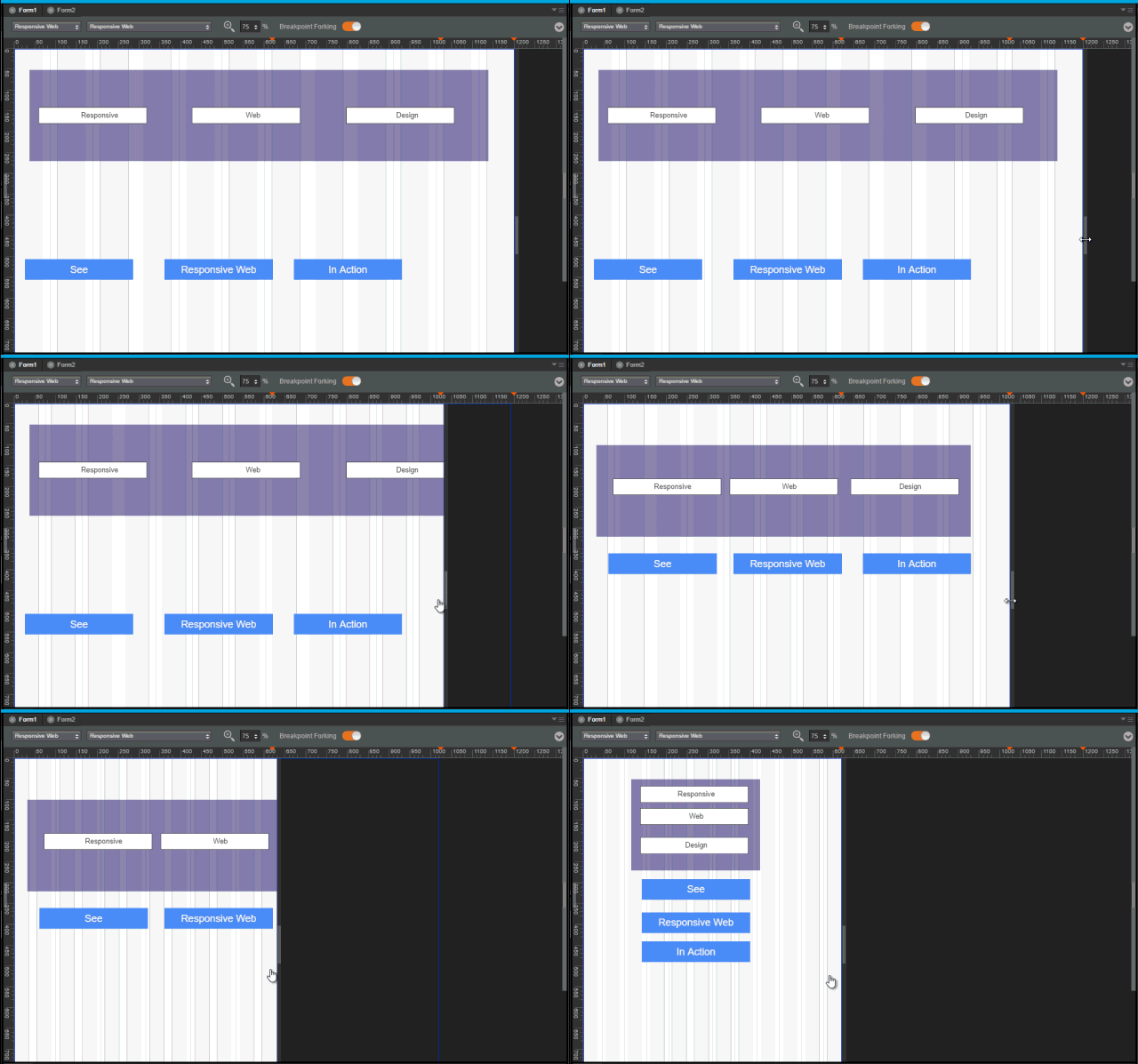
- Using the resize handle, resize the canvas to different breakpoints, observe how the breakpoints change.
- To view your app locally on an internet browser, from the Project Menu, click Run and select Run.
- The project is built for the Responsive web channel and you can view the app in your internet browser.
To invoke any function that is not supported by Visualizer, you can do it through code. Click here for more information.
| Copyright © 2013 Kony, Inc. All rights reserved. |

