
FlexScrollContainer Widget
A FlexScrollContainer is a scrollable container which allows you to scroll the content in horizontal or vertical direction. It can contain any number of widgets within it.
You can add the FlexScrollContainer widget only to the FlexForm. This widget will be available in the Widgets palette when the FlexForm is selected in the app canvas.
Here are some scenarios where you can use the FlexScrollContainer widget:
-
You can display a lot of information in a single screen. You need not scroll the entire page.
-
Scroll bar can be enabled to the container widget area, and you need not scroll the entire page.
-
You can enable paging, and swipe to see a new screen in the place of old screen in the container widget.
Widgets are normally added to your application using Quantum Visualizer, but can also be added from code. For general information on using widgets in Quantum Visualizer, see Designing an Application in the Visualizer User Guide.
For general information on the FlexScrollContainer widget see the FlexScrollContainer topic in the Quantum Visualizer User Guide.
The FlexScrollContainer widget capabilities can be broadly categorized into the following:
- Layout
- Animations
- Scrolling Functionalities
- Data Management
- 3D Touch
- User Input Handling
- Enabling RTL
- Miscellaneous
- Configurations Common To All Widgets
Layout
| Properties | Description |
|---|---|
| anchorPoint | Specifies the anchor point of the widget bounds rectangle using the widget's coordinate space. |
| centerX | Determines the center of a widget measured from the left bounds of the parent container. |
| centerY | Determines the center of a widget measured from the top bounds of the parent container. |
| clipBounds | Child widgets will be clipped to the bounds of the FlexScrollContainer if this property is set to true. |
| contentSize | Specifies the width and height of the container to accommodate all the widgets placed in it. |
| contentSizeMeasured | Specifies the width and height of the container measured in dp. |
| height | Determines the height of the widget and measured along the y-axis. |
| layoutType | Specifies if the arrangement of the widgets either in free form or horizontal or vertical direction. |
| left | Determines the lower left corner edge of the widget and is measured from the left bounds of the parent container. |
| maxHeight | Specifies the maximum height of the widget and is applicable only when the height property is not specified. |
| maxWidth | Specifies the maximum width of the widget and is applicable only when the width property is not specified. |
| minHeight | Specifies the minimum height of the widget and is applicable only when the height property is not specified. |
| minWidth | Specifies the minimum width of the widget and is applicable only when the width property is not specified. |
| top | Determines the top edge of the widget and measured from the top bounds of the parent container. |
| width | Determines the width of the widget and is measured along the x-axis. |
| zIndex | Specifies the stack order of a widget. |
| Methods | Description |
|---|---|
| forceLayout | When this method is called, underlying OS layout cycle is forced to layout the widgets of the FlexContainer. |
Animations
| Methods | Description |
|---|---|
| animate | Applies an animation to the widget. |
| Properties | Description |
|---|---|
| transform | Contains an animation transformation that can be used to animate the widget. |
| widgetSwipeMove | Used to enable and configure the left or right swipe actions for a widget. |
Scrolling Functionalities
| Properties | Description |
|---|---|
| allowHorizontalBounce | Specifies whether the scroll bounce is enabled or disabled in the horizontal direction. |
| allowVerticalBounce | Specifies whether the scroll bounce is enabled or disabled in the vertical direction. |
| animateIcons | Enables the pull to refresh and push to refresh icons to rotate by 180 degrees. |
| bounces | Specifies whether the scroll bounce is enabled or disabled. |
| bouncesZoom | Specifies whether the scroll view animates the content scaling when the scaling exceeds the maximum or minimum limits. |
| decelerating | Returns whether the content is moving in the scroll view after the user lifted their finger. |
| enableGpuScrolling | Enables you to specify how most of the property updates and events for the FlexScrollContainer are handled. |
| enableOnScrollWidgetPositionForSubwidgets | This property enables the FlexScrollContainer widget to iterate into all the widgets that make use of the onScrollWidgetPosition event. |
| enableScrolling | Specifies whether the scrolling is enabled on the container or not. |
| horizontalScrollIndicator | Specifies whether the scroll indicator to be shown or not in the horizontal direction. |
| overScrollX | Used to implement over scrolling behavior while scrolling horizontally. |
| overScrollY | Used to implement over scrolling behavior while scrolling vertically. |
| pullToRefreshI18NKey | Specifies the i18N key for the "Pull to refresh" text when the FlexScrollContainer is pulled from the top. |
| pullToRefreshIcon | Specifies the icon to be displayed when the FlexScrollContainer is pulled from the top. |
| pullToRefreshSkin | Specifies the skin to be applied to the text that is displayed when the FlexScrollContainer is pulled from the top. |
| pushToRefreshI18NKey | Specifies the i18N key for the "Push to refresh" text when the FlexScrollContainer is pushed from the bottom. |
| pushToRefreshIcon | Specifies the icon to be displayed when the FlexScrollContainer is pushed from the bottom. |
| pushToRefreshSkin | Specifies the skin to be applied to the text that is displayed when the FlexScrollContainer is pushed from the bottom. |
| releaseToPullRefreshI18NKey | Specifies the i18N key for the "Release to refresh" text, when the FlexScrollContainer is pulled from the top. |
| releaseToPushRefreshI18NKey | Specifies the i18N key for the "Release to refresh" text, when the FlexScrollContainer is pushed from the bottom. |
| scrollDirection | Specifies the direction in which the widget should scroll. |
| scrollsToTop | Enables you to scroll the FlexScrollCotainer to top on tapping a device’s status bar. |
| tracking | Specifies whether the user has touched the content to initiate scrolling. |
| verticalScrollIndicator | Specifies whether the scroll indicator must be shown in the vertical direction. |
| Methods | Description |
|---|---|
| onScrollEnd | An event callback is invoked by the platform when the scrolling is ended. |
| scrollToEnd | This method gives you the control to scroll to the end of the form. |
| scrollToWidget | This method gives you the control to scroll the FlexForm up to the position of selected widget. |
| Events | Description |
|---|---|
| onDecelerationStarted | An event callback is invoked by the platform when the user stops scrolling but the content still moves before the content actually stops. |
| onScrollEnd | An event callback is invoked by the platform when the scrolling is ended. |
| onScrolling | An event callback is invoked by the platform when the scrolling is in progress. |
| onScrollStart | An event callback is invoked by the platform when the user starts scrolling the content. |
| onScrollTouchReleased | An event callback is invoked by the platform when the user touch is released from the touch surface. |
| onScrollWidgetPosition | This event callback is invoked by the platform when the widget location position gets changed on scrolling. |
| scrollingEvents | This event callback is invoked while scrolling the FlexScrollContainer horizontally or vertically. |
Data Management
| Methods | Description |
|---|---|
| add | Used to add widgets to the Form. |
| addAt | Used to add widgets to the Form at the specified index. |
| clone | When this method is used on a container widget, then all the widgets inside the container are cloned. |
| remove | Removes a widget from the form container. |
| removeAt | Removes a widget at the given index from the Form container. |
| removeAll | Removes all the widget on the container. |
3D Touch
| Methods | Description |
|---|---|
| registerForPeekandPop | Registers a widget to enable 3D Touch peek and pop gestures. |
| setOnPeek | Sets and overrides the existing onPeekCallback for the widget. |
| setOnPop | Overrides the existing onPopCallback for the widget. |
| unregisterForPeekandPop | Unregisters a widget from 3D Touch peek and pop gestures. |
User Input Handling
| Events | Description |
|---|---|
| onZoomEnd | An event callback is invoked by the platform when the zooming has ended. |
| onZooming | An event callback is invoked by the platform when the container is zooming. |
| onZoomStart | An event callback is invoked by the platform when the container is about to zoom. |
| widgetToZoom | An event callback is invoked by the platform to return one of the child widgets of source to zoom. |
| Methods | Description |
|---|---|
| addGestureRecognizer | Allows you to set a gesture recognizer for a specified gesture for a specified widget. |
| removeGestureRecognizer | Allows you to remove the specified gesture recognizer for the specified widget. |
| setGestureRecognizer | Allows you to set a gesture recognizer for a specified gesture for a specified widget. |
| setZoomScale | Allows you the zoom the widgets with an option to animate. |
| Properties | Description |
|---|---|
| bouncesZoom | Specifies whether the scroll view animates the content scaling when the scaling exceeds the maximum or minimum limits. |
| disableZoom | Allows you to enable or disable zooming the FlexScrollContainer. |
| maxZoomScale | Specifies the maximum scale factor that can be applied to the scroll view's content. |
| minZoomScale | Specifies the minimum scale factor that can be applied to the scroll view's content. |
| dragging | Specify whether the user has begun scrolling the content. |
| zooming | A boolean value indicates whether the content view is currently zooming in or out. |
| zoomScale | Specifies the current scale factor applied to the FlexScrollContainer content. |
Enabling RTL
| Properties | Description |
|---|---|
| retainContentAlignment | Helps to retain the content alignment of the widget while applying RTL. |
| retainFlexPositionProperties | Helps to retain the left, right and padding properties while applying RTL. |
| retainFlowHorizontalAlignment | Enables you to change the horizontal flow of the widget from left to right. |
UI Appearance
| Properties | Description |
|---|---|
| backgroundColor | Specifies the background color of the widget in hex format. |
| opacity | Specifies the opacity of the widget. |
| showFadingEdges | Enables you to define the display of fading edges for the FlexScrollForm widget. |
| Methods | Description |
|---|---|
| setContentOffset | Gives you the control to offset a portion of the content in a FlexScrollContainer to bring the widgets in invisible area to visible area. |
Miscellaneous
| Properties | Description |
|---|---|
| contentOffset | Returns the current coordinates of the top left corner of the scrollable region in the item. |
| contentOffsetMeasured | Specifies the x and y coordinates of the top-left of the scrollable region measured in dp. |
| cursorType | Specifies the type of the mouse pointer used. |
| isMaster | Specifies whether the container is a master container. |
| Methods | Description |
|---|---|
| getBadge | Enables you to read the badge value (if any) attached to the specified widget. |
| setBadge | Enables you to set the badge value to the given widget at the upper, right corner of the widget. |
| setDefaultUnit | Specifies the default unit to be used for interpretation of numbers with no qualifiers when passed to layout properties. |
| widgets | Returns an array of the widget references which are direct children of the FlexScrollContainer widget. |
Configurations Common To All Widgets
| Properties | Description |
|---|---|
| accessibilityConfig | Enables you to control accessibility behavior and alternative text for the widget. |
| blur | Enables you to make the widget look unfocused. |
| enable | Allows you to make a widget visible but not actionable. |
| isVisible | Controls the visibility of a widget on the FlexScrollContainer. |
| parent | Helps you access the parent of the widget. |
| enableCache | Enables you to improve the performance of Positional Dimension Animations. |
| info | A custom JSObject with the key value pairs that a developer can use to store the context with the widget. |
| Methods | Description |
|---|---|
| convertPointFromWidget | Allows you to convert the coordinate system from a widget to a point (receiver's coordinate system). |
| convertPointToWidget | Allows you to convert the coordinate system from a point (receiver's coordinate system) to a widget. |
| removeFromParent | Allows you to remove a child widget from a parent widget. |
| setEnabled | Specifies the widget that must be enabled or disabled. |
| setFocus | Specifies the widget on which there must be focus. |
| setVisibility | Use this method to set the visibility of the widget. |
FlexScrollContainer Widget Basics
Creating a FlexScrollContainer Using a Constructor: kony.ui.FlexScrollContainer
var FlexScrollContainer1 = new kony.ui.FlexScrollContainer(basicConf, layoutConf, pspConf);
- basicConf is an object with basic properties.
- layoutConf is an object with layout properties.
- pspConf is an object with platform specific properties.
NOTE: An empty constructor leads to all defaults values and optionally all writable properties can be passed as a dictionary to the constructor.
Example
//Defining the properties of FlexScrollContainer

function testfrm_flexScrollContainer1_onScrollStart_seq0(eventobject) {
    normalform.show();
}

function testfrm_flexScrollContainer1_onScrollEnd_seq0(eventobject) {
    normalform.show();
}

function testfrm_flexScrollContainer1_onScrollTouchReleased_seq0(eventobject) {
    normalform.show();
}

function testfrm_flexScrollContainer1_onScrolling_seq0(eventobject) {
    normalform.show();
}

function testfrm_flexScrollContainer1_onDecelerationStarted_seq0(eventobject) {
    normalform.show();
}


function addWidgetstestfrm() {
    var flexScrollContainer1 = new kony.ui.FlexScrollContainer({
        "id": "flexScrollContainer1",
        "top": "5dp",
        "left": "6dp",
        "width": "97.15%",
        "height": "271dp",
        "zIndex": 1,
        "isVisible": true,
        "enableScrolling": true,
        "scrollDirection": kony.flex.SCROLL_BOTH,
        "horizontalScrollIndicator": true,
        "verticalScrollIndicator": true,
        "bounces": true,
        "allowHorizontalBounce": true,
        "allowVerticalBounce": true,
        "pagingEnabled": true,
        "Location": "[6,5]",
        "onScrollStart": testfrm_flexScrollContainer1_onScrollStart_seq0,
        "onScrollEnd": testfrm_flexScrollContainer1_onScrollEnd_seq0,
        "onScrollTouchReleased": testfrm_flexScrollContainer1_onScrollTouchReleased_seq0,
        "onScrolling": testfrm_flexScrollContainer1_onScrolling_seq0,
        "onDecelerationStarted": testfrm_flexScrollContainer1_onDecelerationStarted_seq0,
        "bouncesZoom": true,
        "zoomScale": 1.0,
        "minZoomScale": 1.0,
        "maxZoomScale": 1.0,
        "layoutType": kony.flex.FREE_FORM
    }, {
        "padding": [0, 0, 0, 0],
        "marginInPixel": false,
        "paddingInPixel": false
    }, {});
    flexScrollContainer1.setDefaultUnit(kony.flex.DP);
    flexScrollContainer1.add();
    testfrm.add(
        flexScrollContainer1);
}

function testfrmGlobals() {
    var MenuId = [];
    testfrm = new kony.ui.Form2({
        "id": "testfrm",
        "contentOffset": {
            "x": "3dp",
            "y": "4dp"
        },
        "contentSize": {
            "width": "5dp",
            "height": "6dp"
        },
        "enableScrolling": true,
        "bounces": true,
        "allowHorizontalBounce": true,
        "allowVerticalBounce": false,
        "pagingEnabled": true,
        "title": "myfrmt",
        "needAppMenu": true,
        "enabledForIdleTimeout": true,
        "skin": "frm",
        "zoomScale": 22,
        "minZoomScale": 1.0,
        "maxZoomScale": 1.0,
        "layoutType": kony.flex.FREE_FORM,
        "addWidgets": addWidgetstestfrm
    }, {
        "padding": [0, 0, 0, 0],
        "displayOrientation": constants.FORM_DISPLAY_ORIENTATION_PORTRAIT,
        "paddingInPixel": false
    }, {
        "retainScrollPosition": true,
        "needsIndicatorDuringPostShow": true,
        "formTransparencyDuringPostShow": "100",
        "inputAccessoryViewType": constants.FORM_INPUTACCESSORYVIEW_DEFAULT,
        "bouncesZoom": false,
        "configureExtendTop": true,
        "configureExtendBottom": false,
        "configureStatusBarStyle": false,
        "extendTop": false,
        "titleBar": true,
        "footerOverlap": false,
        "headerOverlap": false,
        "inTransitionConfig": {
            "transitionDirection": "fromLeft",
            "transitionEffect": "none"
        },
        "outTransitionConfig": {
            "transitionDirection": "fromRight",
            "transitionEffect": "none"
        }
    });
    testfrm.setDefaultUnit(kony.flex.PX);
}
Customizing Appearance
You can customize the appearance of the FlexScrollContainer using the following properties:
- Events: Defines the scrolling events for FlexScrollContainer widget.
- padding: Defines the space between the content of the widget and the widget boundaries.
- skin: Specify the skin to be applied to the FlexScrollContainer widget.
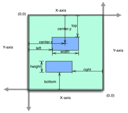
Flex Layout Properties
The below image represents the flex layout properties:
Important Considerations
The following are the important considerations of a FlexScrollContainer:
- If you set the scrollDirection as kony.flex.SCROLL_VERTICAL or kony.flex.SCROLL_BOTH, you have to set a value in the height property.
- When a widget is placed inside a horizontal parent widget. For example: Segment, it will take 40% of the parent widget or the available free space of the widget.