
Dashboard
The Dashboard is a visual summary of information. System administrators can use the dashboard to get a comprehensive graphical view of total
The Dashboard is the first page you visit after logging in. you will initially see a Certificate Status box.
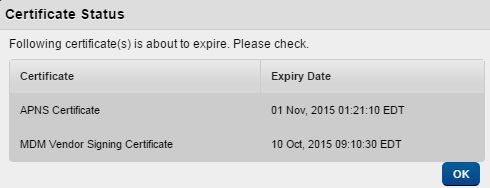
The Certificate Status screen displays information on all certificates that are about to expire. Based on the information on a Certificate Status screen, an administrator can renew certificates before they expire.
Expiry dates for all certificates used across the Kony Management suite are calculated and notifications are sent. The first notification is sent four weeks before the certificate expiry date. A second notification is sent to the administrator two weeks before the certificate expiry date. A notification is sent every day in the last week of certificate expiration.
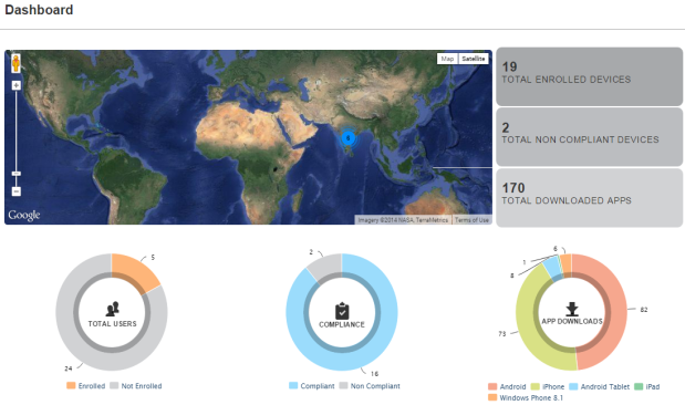
The following table describes the components of the Dashboard:
| Component Description | |
|---|---|
| Map | The Map displays the actual location of the total |
| Total |
This label displays the total number of the enrolled devices to EMM. For example, the label in above image indicates that total 19 devices are |
| Total Non-Compliant Devices Label | This label displays the total number of non-compliant devices. For example, if the label displays 1 device. It indicated that only once device is out of compliance. |
| Total Downloaded Apps Label |
This label displays the total number of downloaded apps on devices. Important: The App Downloads count will increase when an app policy is targeted to a user or group irrespective of whether the app (publicly available on a store) is actually installed on the device or not. |
| Pie Charts | A circular chart that represents the distribution or participation of each item (represented by a slice) of a certain total that is represented as the overall pie value. For example, |
You can perform the following activities from the Dashboard:
- Using the Map View
- Viewing the Enrollment Summary Chart
- Viewing the Compliance Summary Chart
- Viewing the App Downloads Summary Chart
Using the Map View
This window displays the location details on a map. You can also view it in satellite format. You can freely scroll through the area through hand tool. You can use the zoom tool to change the size of the visible area.
The view menu gives the following options:
- Setting Labels: Select the Labels option to view the labels for geographical locations.
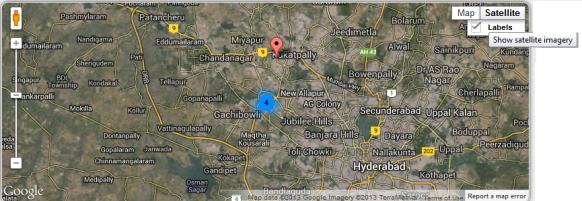
- Orient grid North:The screen rotates such that the top of the screen points north. Not the geographical north is taken as reference, but the north of the currently selected grid.
- Go to Target:
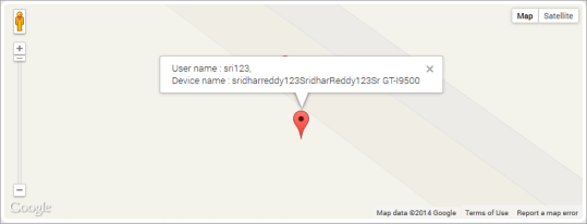
- Click the red icon on map to view the User Name and the Device Name. Double-click the red icon to open the Device details page.
- Click the Total Enrolled Devices label to open the Device List page.
- Click the Non Compliant Devices label to open the Device List page.
Important: There may be a mismatch between the number shown on maps and actual enrolled devices for several reasons:
• If location tracking is disabled for certain devices
• If there is any delay in retrieving the location data
Windows devices should not be shown in the maps.Note: If you are using a free Google Maps license, when the limit is reached you will see an error - 'Geo coder failed due to:OVER_QUERY_LIMIT'. In such cases it is recommended to move to a business license.
- Click the red icon on map to view the User Name and the Device Name. Double-click the red icon to open the Device details page.
Viewing the Enrollment Summary Chart
Enrollment Summary Chart displays the number of Users with
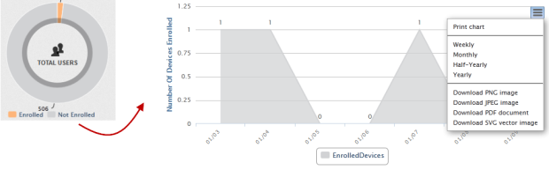
The Enrollment Summary chart includes the following components:
| Components Description | |
|---|---|
| Color Codes | The color codes indicates the distribution of each item (represented by a slice) For example, in above pie chart, orange color represents the Users with enrolled devices and blue color represents the Users with not enrolled devices |
| Chart Context Menu | Double-click the pie chart to view the chart details. Click the Chart Context menu in the top right corner of the chart. You get following options:
Click the Chart Context menu to
|
| Chart Details |
|
Viewing the Compliance Summary Chart
Compliance Summary chart displays the number of devices in compliance versus not in compliance in the pie graph.Click the pie chart to view Compliance Summary chart.
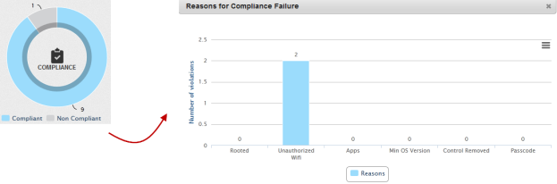
The Compliance Summary chart includes the following components:
| Components Description | |
|---|---|
| Color Codes | The color codes indicates the distribution of each item (represented by a slice) |
| Chart Details | Double-click the pie chart to view the Reasons for Compliance Failure chart details.
|
Viewing the App Downloads Summary Chart
App Download Summary Chart displays the number of downloaded apps for all the supporting platforms. This shows the total number of app downloads from the system. This includes all enterprise apps and any others pushed through the system. Click the pie chart to view App Downloads Summary Chart.
Important: The App Downloads count will increase when an app policy is targeted to a user or group irrespective of whether the app is actually installed on the device.
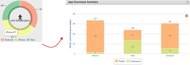
The App Download Summary chart includes the following components:
| Components Description | |
|---|---|
| Color Codes | The color codes indicates the distribution of each item (represented by a slice). |
| Chart details | Double click the pie chart to view the Reasons for Compliance Failure chart details.
|
Note: App Download Summary dashboard displays an incorrect number of downloaded apps due to following reasons.
It also counts apps pushed through the app policy even though apps are not downloaded on a device.
If a user clicks the Cancel button, it increments the download count
| Copyright © 2018 Kony, Inc. All rights reserved. |